15 Best Shopify Dropshipping Stores 2026
15 winning Shopify dropshipping stores broken down, how the best use framing, trust, and product-page design to sell globally sourced products.
Dropshipping winners are not selling products. They’re selling a frame that makes a globally sourced item feel inevitable to buy.
In home and decor, the frame is usually luxurious and tasteful. In gifts, it’s novelty and trust at speed. In utility, it’s problem-solution clarity and proof. In performance gear, it’s specs, credibility, and reassurance.
The pattern across these stores is simple.
The better they can shape perception and reduce uncertainty, the less the customer cares where the item ships from.
Key Takeaways From 15 Successful Shopify Dropshipping Stores
- Aesthetic arbitrage prints money when the site looks like a showroom, not a catalog (Warmly Decor, Venetto Design).
- Narrative beats manufacturing in decor. If the product story is strong, the margin becomes believable.
- Luxury positioning is fragile without proof. No reviews, no UGC, no objection handling means you’re asking people to trust “vibe” (Warmly Decor’s weakness).
- Configuration reduces purchase anxiety. Clear set breakdowns, variants, and “what’s included” visuals prevent regret (Venetto Design).
- Legacy trust is a cheat code but it can make PDPs lazy and sterile (Brookstone).
- Gifting PDPs must prove the exact thing being bought. Personalization needs reassurance: print quality, placement, preview accuracy (Firebox).
- Marketplace-style volume stores win with mechanics, not romance. Deal framing, urgency, seller signals, and just enough proof (Inspire Uplift).
- Lifestyle brands must show “community life” on-page. If your positioning is identity or mindfulness, zero reviews kills credibility (Notebook Therapy).
- Community brands should sell context, not just cuteness. Social proof can carry, but story should pull (Subtle Asian Treats).
- Ecosystems raise AOV effortlessly when the kit logic matches the buyer identity (Ridge Wallet).
- Problem-solution pages convert hardest when clarity + proof stack right under the hero (Pillow Slides, Pet Clever).
- Premium pricing needs reassurance near the CTA. If reviews are buried, you lose hesitant buyers at the moment that matters (Ridge, Solo Stove).
- Outdoor buyers buy engineering. Specs, comparisons, and validation are non-negotiable (Trekology’s gap is missing proof).
Home And Decor Dropshipping Stores
1. Warmly Decor
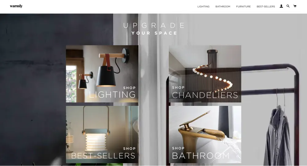
Warmly Decor wins through aesthetic arbitrage. They source high-end-looking fixtures from global manufacturers but frame them using the visual language of a luxury Italian showroom. By using sophisticated fonts, editor’s picks, and high-ticket pricing, they decouple the product from its manufacturing cost. They prove that in home decor, perception of luxury is more important than brand heritage.
- Positioning: High-ticket minimalist home fixtures. They bridge the gap between "AliExpress lighting" and "Luxury Showroom."
- Marketing: Pinterest-driven. They dominate search results for "Mid-century modern lighting" and "Minimalist bathroom fixtures."
- Website: High-end gallery feel. Uses premium typography and massive high-res imagery to justify high prices.
- Products: Pendant lights, minimalist mirrors, and architectural bathroom faucets.
- Shipping & Returns: Free worldwide shipping (usually 15–30 days). Returns accepted within 30 days of receipt; customer typically pays return shipping.
- Customer Profile: Affluent homeowners (ages 30–55) and interior designers seeking a "Pinterest-perfect" aesthetic without designer showroom prices.
Warmly Decor Product Page Analysis
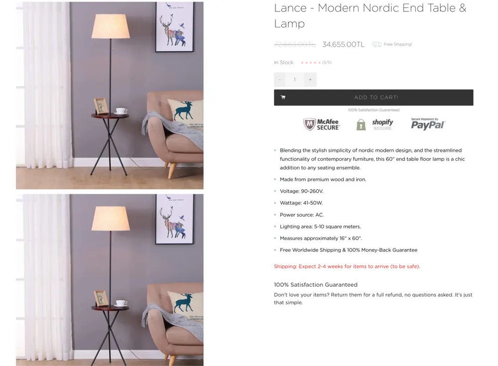
Warmly Decor’s PDP is doing pure visual selling, but it’s fragile.
Even though I really looked at and liked many of their products, I believe that they could do much better with their product pages.
The page relies almost entirely on aesthetic staging and price anchoring to signal luxury, with no reviews, no social proof, no comparison context, and no real objection handling. You are expected to trust the vibe.
The product description is technically adequate but emotionally flat, and there’s no brand story, use-case framing, or differentiation beyond “looks expensive.”
2. Venetto Design
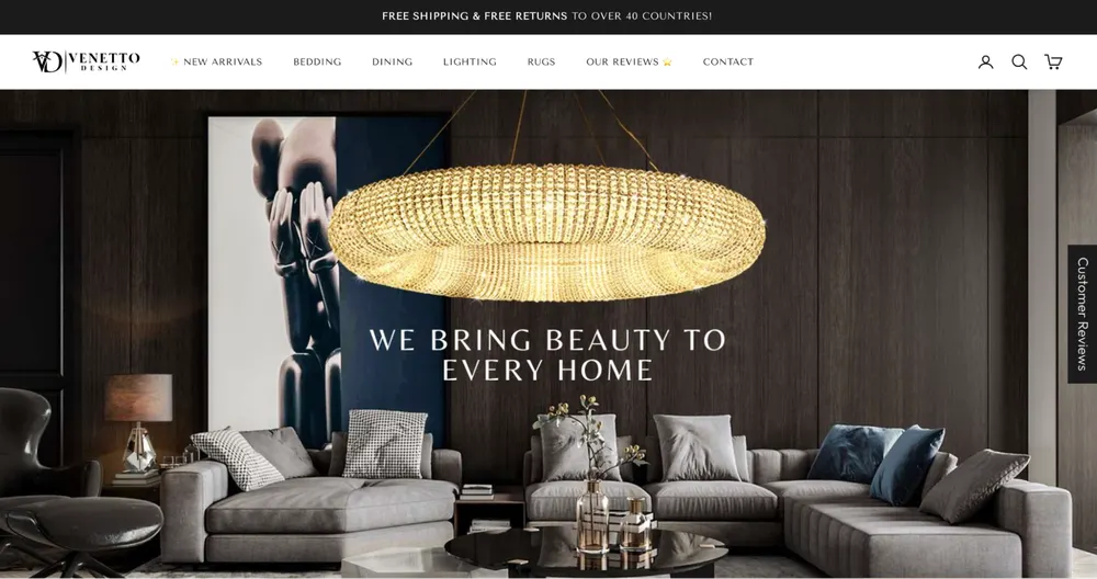
Venetto Design wins with their narrative. They wrap globally sourced products in a European luxury narrative. Aesthetic arbitrage allows them to command luxury margins without luxury manufacturing.
- Positioning: Luxury artisan dinnerware for the "Instagrammable" dinner party.
- Marketing: High-end lifestyle imagery. Marketed through home-styling influencers.
- Website: Elegant, editorial, and high-fashion. Looks like a designer brand from Europe.
- Products: Unique ceramic sets, crystal glassware, and gold cutlery.
- Shipping & Returns: Free global shipping. 30-day "Worry-Free" trial.
- Customer Profile: Home entertainers and foodies (ages 28–50) who want their table to look professionally styled.
Venetto Design Product Page Analysis
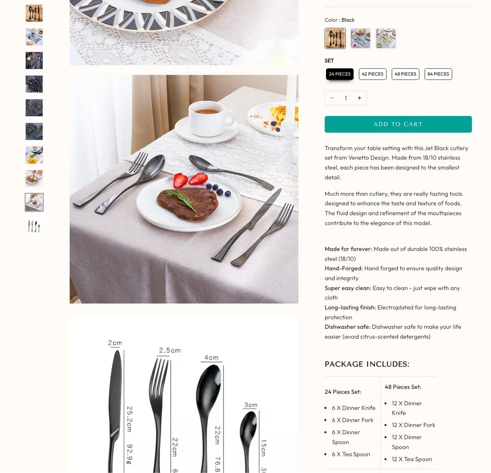
Their product page reduces uncertainty fast. Lots of angle, lifestyle shots, close-ups, so you can judge quality without guessing.
Makes the choice feel configured, not random. Clear set-size options (24/42/48/84), color variants, and a visual package includes breakdown. That removes the “what am I actually getting?” anxiety.
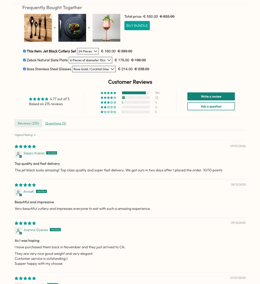
Adds proof and upsell without killing momentum: reviews and a frequently bought together bundle that raises AOV while the buyer is already in decision mode.
Viral Gifts Dropshipping Stores
3. Brookstone
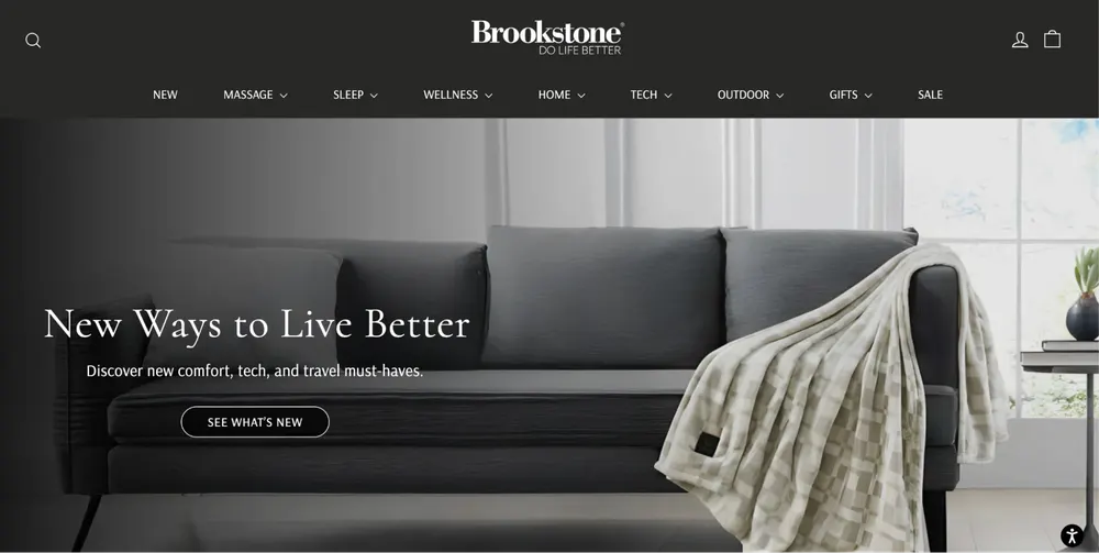
Brookstone realized their most valuable asset wasn't their inventory, but their Name. They now act as a "Vetting Machine" for smaller inventors and tech brands.
- Positioning: The "Curated World of Innovation." They have moved from being a manufacturer to a high-end curator of wellness, tech gadgets, and luxury home essentials. They position themselves as the authority on "tomorrow's products, today."
- Marketing: They leverage legacy trust. While most dropshippers struggle to prove they are "real," Brookstone uses 50+ years of brand history to sell $5,000 products. They use aggressive Email Marketing and Loyalty Programs (Brookstone Rewards) to turn one-time gift buyers into lifetime wellness enthusiasts.
- Website: A masterclass in High-Ticket Marketplace UX. Built on Shopify, the site uses deep categorization (Massage, Sleep, Tech, Wellness) and content rich product pages. They prioritize long, descriptive titles (e.g., "Osaki Theramedic 4D LT Massage Chair") to dominate SEO for specific high-end model names.
- Products: A mix of private label basics such as pillows, blankets alongside high-ticket Dropshipping for 3rd-party brands (Osaki, Loftie, Jaxx). They focus on oddball but functional luxury, I am talking about things like self-heating teapots and portable infrared saunas.
- Return and Shipping: 30-day return policy. Crucially, for many items, the customer coordinates and pays for return shipping, which is a classic dropshipping move to protect margins on bulky items. They offer route shipping protection as an upsell, which is pure profit.
- Customer Profile: Suburban Baby Boomers who remember the mall stores and trust the name for "gift-giving," and Tech-Savvy Gen X/Millennials looking for biohacking and smarthome upgrades.
Brookstone Product Page Analysis
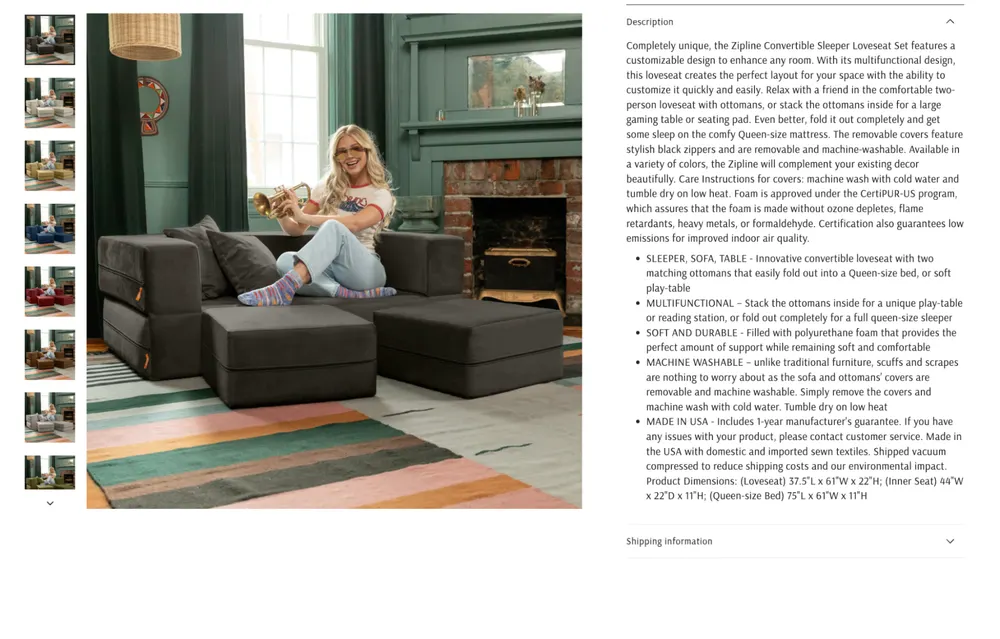
Brookstone’s PDP is informative but emotionally not so alive. It reads like a spec sheet wrapped in legacy branding, relying almost entirely on the Brookstone name to carry trust instead of the page doing any selling itself. The product description is long, detailed, and technically solid, but it’s unstructured and exhausting, with no scannable hierarchy, no visual proof points, and no narrative framing around why this product matters in someone’s life.

The reviews section is especially weak for a premium marketplace. An empty review section is doing nothing to encourage contribution or signal demand. In such cases where the review for the individual product is empty, the best practice is to show reviews for other products in a more general reviews section. There’s no UGC, no social validation, no comparison logic, and no guided reassurance for a high-consideration purchase. The result is a PDP that feels authoritative but sterile. It explains the product, but it doesn’t build desire, momentum, or confidence beyond “trust us, we’re Brookstone.”
4. Firebox
Firebox is truly a successful store there is no doubt about that. But here is a great example of why you should not sacrifice your brand identity for SEO. Let’s look at their positioning.
Positioning: "Not for Everyone." This is their actual slogan. They don't want to be a general gift shop. You can look at their X and Instagram accounts and you will see that they position themselves as “Not for Everyone”. And on Instagram you can even see the laughing emoji right next to “Not for Everyone” 😂. However, when you read the bottom of their homepage you directly see this copy where they contradict with themselves.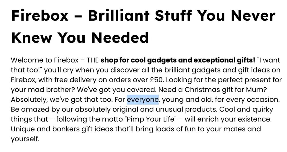
Marketing: Curated Edgy Humor. Their marketing relies on "The Mystery Box" and "WTF" products. They use witty, slightly sarcastic copywriting in their emails and social media that makes the brand feel like a person with a personality, rather than a store.
Website: A masterclass in "The Scroll of Discovery." The homepage is designed like a social media feed. It is vibrant, video-heavy, and focused on trending now. They use bold colors and high-contrast photography that makes the products pop.
Products: A mix of Viral Tech, Weird Food, and "Mash-up" Personalization. They are famous for things like "Personalized Face Suitcases," "Spreadable Gin," and high-end retro gaming gadgets.
Return and Shipping: 30-day "no-quibble" return policy. Because they are a high-volume global store, they have optimized shipping routes from the UK to the US/EU, offering tracked delivery that is much faster than standard dropshipping.
Customer Profile: Urban Millennial Gift-Hunters (ages 20–40). These are people who want to be the "best gift giver" at the party and are looking for items that will spark a conversation or a laugh.
Firebox Product Page Analysis
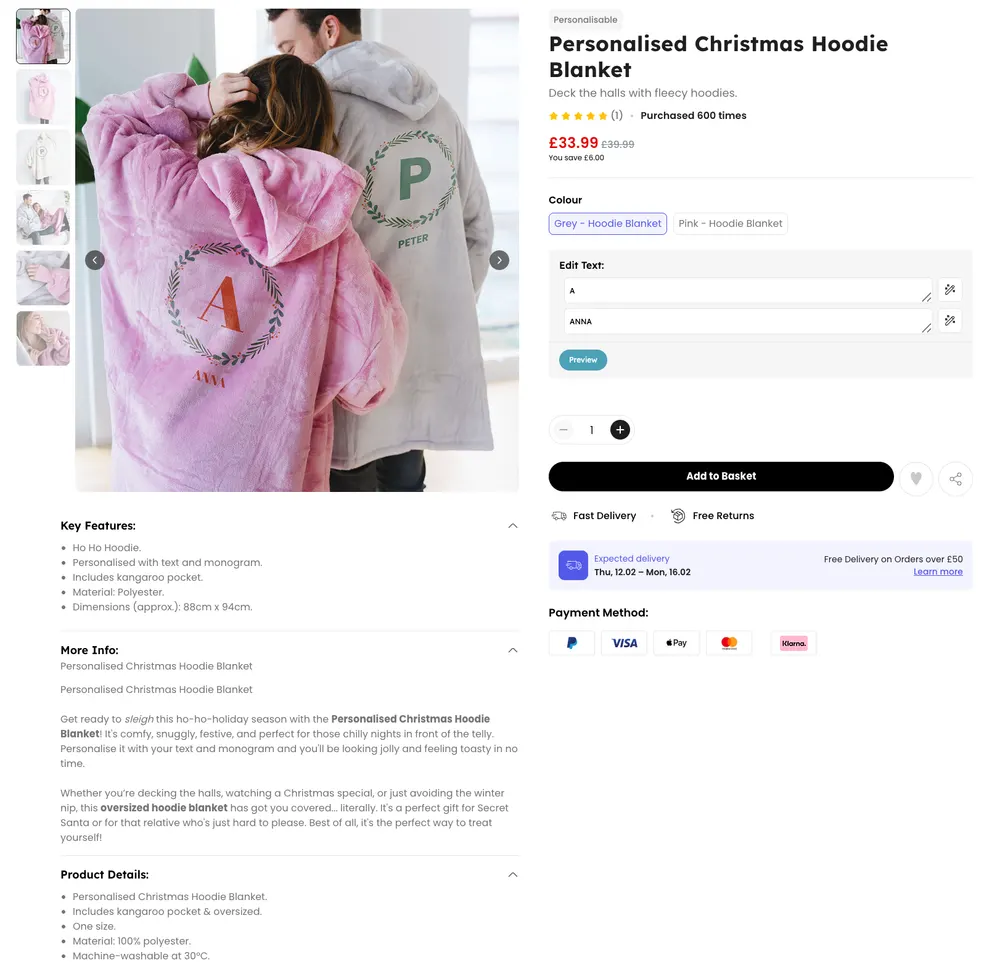
Firebox’s PDP is built for conversion-first gifting, not brand myth.
It sells the product through a loud hero lifestyle shot, a “purchased 600 times” badge, and a frictionless personalization module that gets you editing immediately, which is smart for impulse buyers.
But the page is thin on trust for the exact thing you are buying. There’s basically no real social proof (1 review), no customer photo gallery, and no “what arrives in the box” clarity beyond a few dropdown sections.
The copy is serviceable but generic, the specs are buried, and the personalization experience lacks reassurance around print quality, placement, and how the preview maps to the final output. It will work for price-led seasonal gifting, but if a buyer hesitates on quality or wants proof the personalization won’t look cheap, the PDP doesn’t do much to catch them.
5. Inspire Uplift
Inspire Uplift wins by operating like a testing engine. They do not fall in love with products; they fall in love with data. By launching massive volumes of products and killing losers fast, they always surface the next clever solution before competitors.
- Positioning: A "Global Marketplace" for clever solutions to everyday problems.
- Marketing: High-volume Facebook and Pinterest ads targeting viral gadgets for the home.
- Website: Massive general store catalog organized by "Giftable" categories.
- Products: Everything from kitchen slicers to posture correctors and pet toys.
- Shipping & Returns: Shipping typically takes 10–20 days. Return windows vary by item and seller.
- Customer Profile: Suburban moms and impulse gift shoppers looking for "neat" gadgets.
Inspire Uplift Product Page Analysis
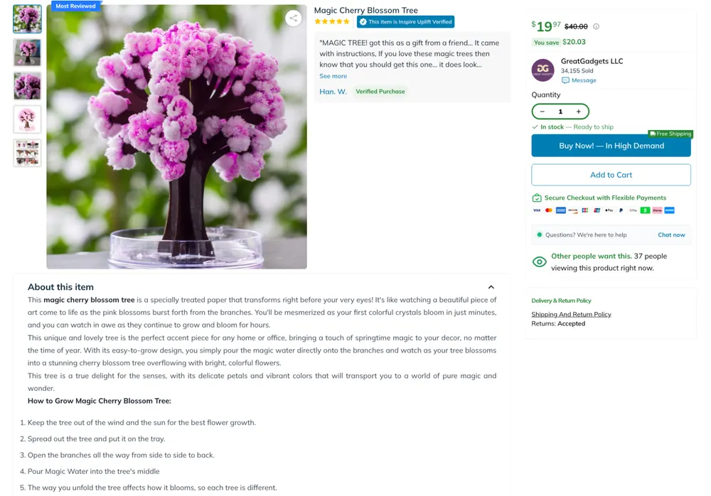
Inspire Uplift’s PDP feels exactly like a marketplace listing, and that’s why it works for them. It leads with deal framing, seller credibility, stock status, and urgency CTAs, then backs it up with a visible verified review snippet and a straightforward “About this item” block.
The copy is functional and instruction-like, which fits a “clever solutions” catalog, but it’s also thin on differentiation, brand voice, or any reason to trust the product beyond the platform mechanics. The page is optimized for impulse conversion, not conviction: good enough social proof and clarity to get a click, but not much storytelling, comparison context, or deeper objection handling if someone hesitates.
Aesthetic And Stationery Dropshipping Brands
6. Sage & Sill
Sage & Sill wins by integrating themselves into their customer’s lifestyle. By acting as a plant-care educator and source of inspiration, they build trust first and convert later. Customers buy from them because they already helped them succeed as plant parents.
- Positioning: The "Urban Jungle" supplier. They sell the lifestyle of a modern, plant-obsessed apartment dweller.
- Marketing: Instagram community building. They provide plant-care tips and "Greenery" inspiration rather than just selling pots.
- Website: Earthy, calm, and organized by "vibe" or "room type."
- Products: Unique planters, plant hangers, and botanical-themed home accessories.
- Shipping & Returns: Standard shipping 10–20 days. 30-day return window; items must be in original packaging.
- Customer Profile: "Plant Parents" (Millennials, ages 24–38) living in urban environments who view plants as a mental health necessity.
Sage & Sill Product Page Analysis
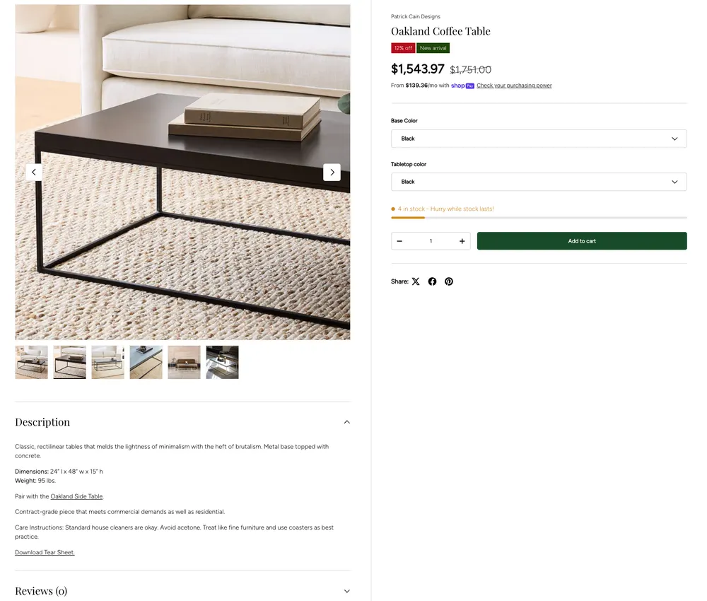
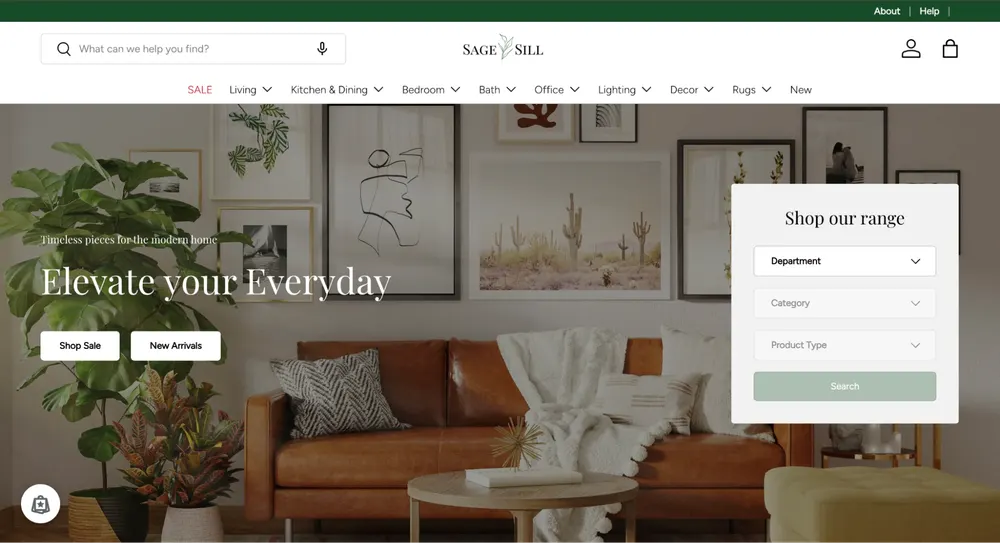
Sage & Sill’s PDP feels like a brand that’s trying to be lifestyle-led, but the page doesn’t fully cash that check yet.
The structure is there, clean layout, clear info, and a reviews module that signals trust but with zero reviews it reads more like an unfinished template than a living community.
The product description does the job functionally, but it doesn’t carry the “plant parent” emotion they are selling, no calm reassurance, no tiny wins, no room-based use-case framing, no “this is how it makes your space feel” layer.
For a dropshipping store, it’s not bad at all, but compared to Inspire Uplift’s conversion-first marketplace energy, this one needs more soul, less catalog. Right now it looks like it wants to be a plant-care educator brand, but the PDP still feels like a standard product listing wearing earthy colors.
7. Notebook Therapy
Notebook Therapy wins by selling mindfulness as an aesthetic. Through extreme visual consistency, they create a collector mindset where customers want the full set to preserve the look, not just the function.
- Positioning: Zen-inspired, aesthetic stationery for mindful creativity.
- Marketing: Purely "Aesthetic" marketing. Soft pastel photography and "Plan With Me" videos.
- Website: Minimalist and calming. Uses soft animations to enhance the "Zen" feel.
- Products: Bullet journals, washi tape, and "Tsuki" artist line.
- Shipping & Returns: Free worldwide tracked shipping on orders over $40. 30-day full refund policy.
- Customer Profile: Creative Gen Z and Millennial students and professionals into journaling and "Studygram" culture.
Notebook Therapy Product Page Analysis
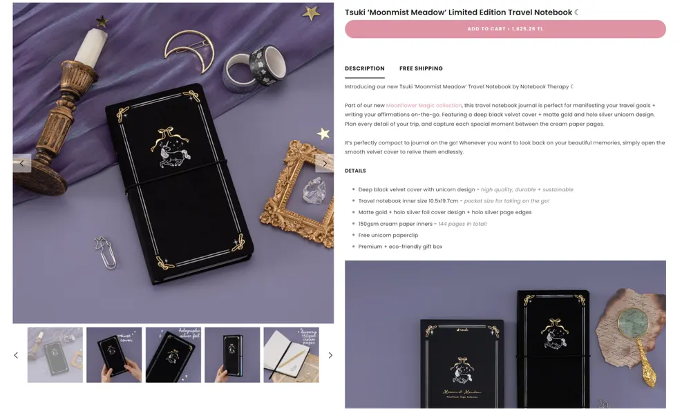
Notebook Therapy’s PDP is doing what their brand promises.
It sells the feeling first and the product second.
The page is ultra-consistent visually, soft palettes, clean typography, and lots of image variants that make the items feel collectible and “complete-the-set,” which is exactly how you create a journaling aesthetic loop.
The description is solid and on-brand, but the page is under-proven socially.
With no reviews, there’s no community signal to match the “Studygram” positioning, so it ends up feeling curated and pretty rather than lived-in and trusted. For a product that’s basically emotional utility, the vibe is strong, but the credibility layer is thin.
Culture And Community Dropshipping Stores
8. Subtle Asian Treats
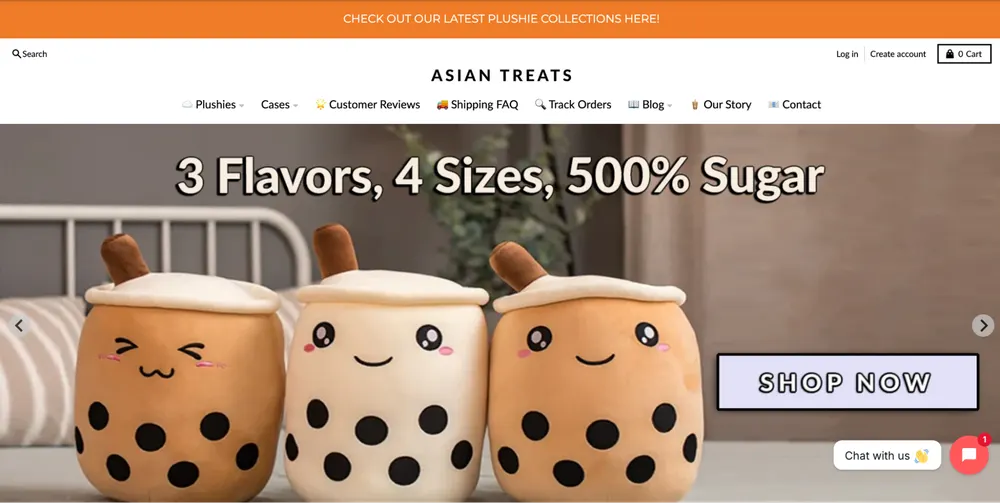
Subtle Asian Treats wins through cultural identity signaling. Their products act as community badges, allowing customers to express heritage and belonging while creating inherently shareable content.
- Positioning: Cultural identity via "Kawaii" food-themed accessories.
- Marketing: TikTok and Instagram Reels focusing on the "Chonky" and "Squishy" nature of their plushies.
- Website: Extremely cute (Kawaii design). High focus on "Bundle & Save" offers.
- Products: Boba plushies, Ramen pillows, and food-themed tech accessories.
- Shipping & Returns: Worldwide shipping (15–30 days). 30-day satisfaction guarantee; replacements for lost or damaged items.
- Customer Profile: Asian diaspora Gen Z and fans of Japanese/Korean "cute" culture worldwide.
Subtle Asian Treats Product Page Analysis
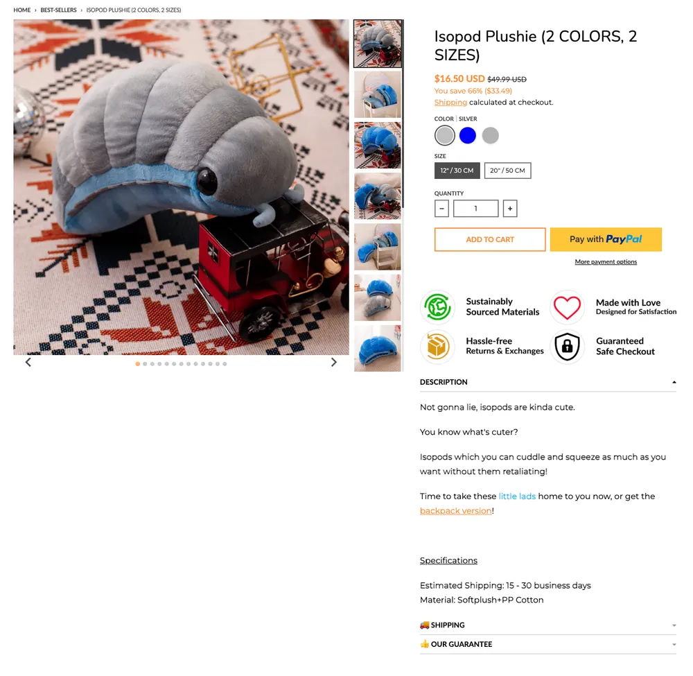
Subtle Asian Treats’ PDP is doing a lot of the right things for trust and conversion, but it’s uneven.
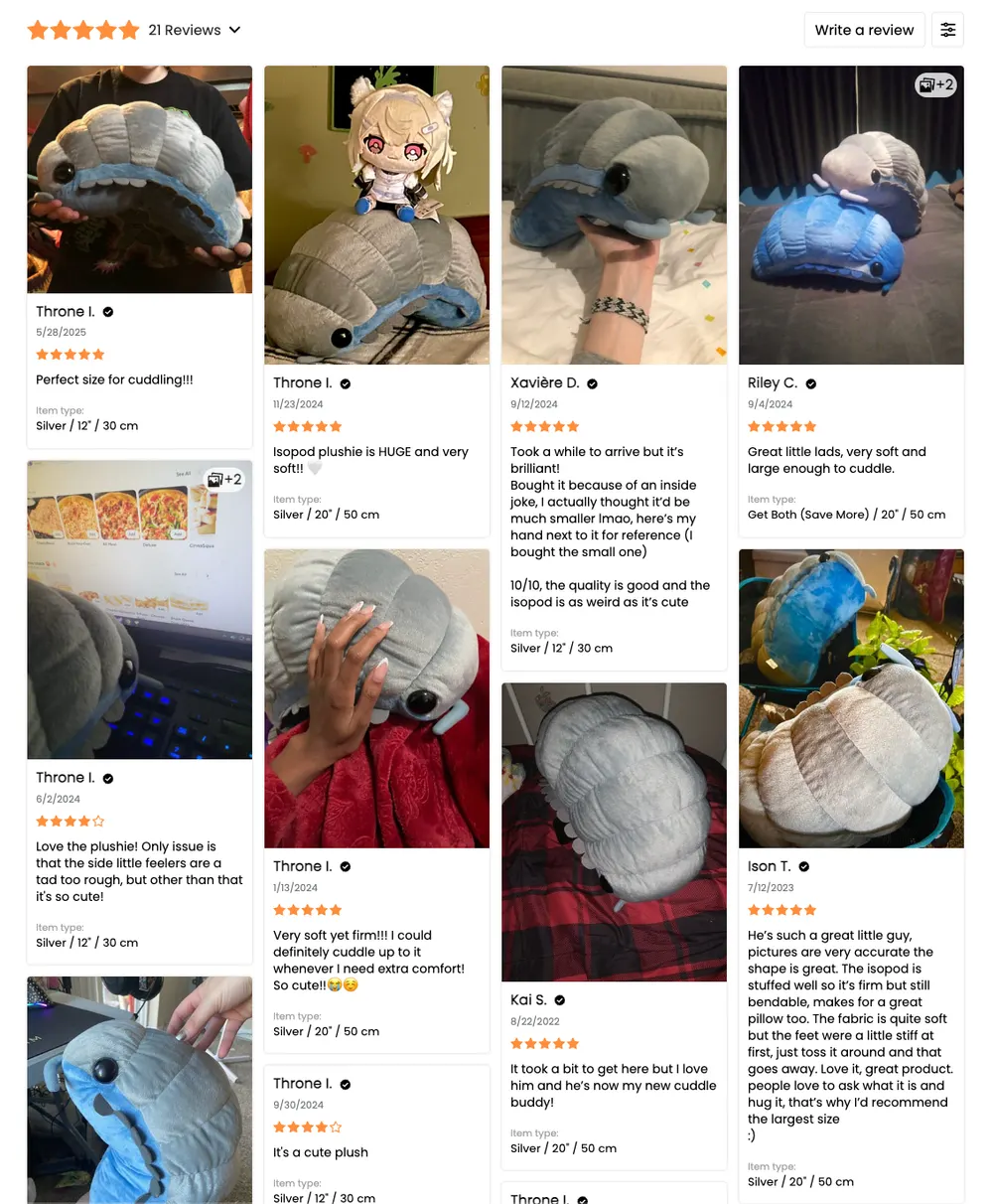
The photo-heavy review grid is the real closer here, it instantly proves scale, softness, and “this is what you’ll actually get,” and the variants plus clear shipping details remove most of the usual dropship friction.
But the page still underuses its own identity.
The product story is thin, the description reads like a placeholder, and there’s almost no emotional framing for why this plush matters beyond “cute.” For a brand built on cultural belonging and shareability, the PDP should lean harder into context and vibe, not just specs. As it stands, social proof and logistics carry the page, but the brand voice and narrative aren’t doing their share of the selling.
9. Ridge Wallet
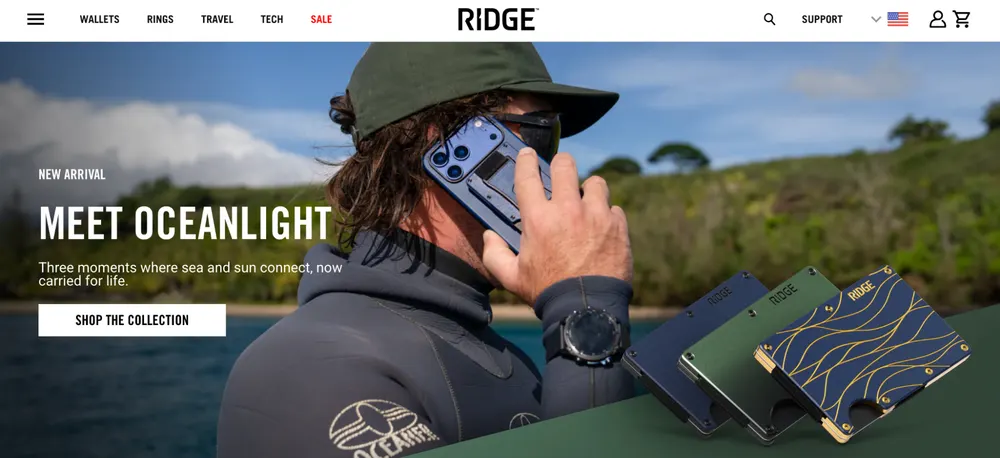
The real genius of Ridge Wallet is their gear system. They realized that the type of man who buys a $100 carbon fiber wallet is the same man who wants his keys, his ring, and his backpack to match that same look.
If you go to their site, you'll see they sell kits. You don't just buy a wallet, you buy the "Carbon Fiber Kit" (wallet + keycase + pen). This effectively doubles their average order value.
Positioning: "Carry Less. Live More." They took a casual commodity (the leather wallet) and transformed it into a tactical and minimalist performance tool. They position themselves as the "ultimate upgrade" for the modern man.
Marketing: Mostly influencer domination. They are famous for sponsoring high-level tech and "Gear" YouTubers. Their ads focus on durability. They showi the wallet being run over by cars, dropped from heights, etc.
Website: The site uses carbon fiber textures, metallic colors, and exploded-view diagrams that make the wallet look like a piece of aerospace technology.
Products: Minimalist metal wallets, KeyCase organizers, and performance luggage.
Shipping & Returns: They offer Fast Global Shipping from local hubs. Their policy is a lifetime warranty. This is rare for a viral product.
Customer Profile: Men (ages 25–45) who love tactical gear, tech gadgets, and minimalism. They are the "Outdoor Master" crowd, basically people who value durability and performance.
Ridge Wallet Product Page Analysis
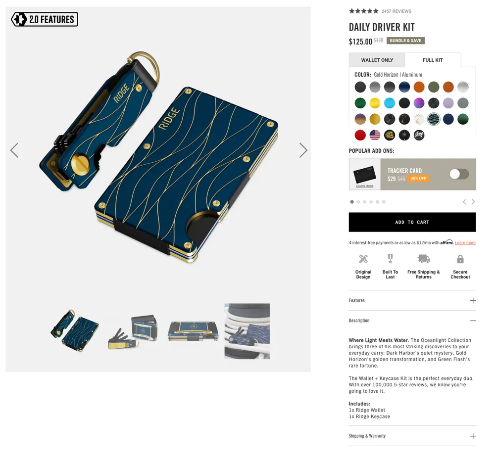
Ridge Wallet’s PDP is built like a conversion machine, and it mostly earns the price.
The page leads with clean hero visuals, heavy variant selection, and an obvious kit framing that pushes AOV without feeling forced, and the “popular add-ons” slot is a smart upsell.
Features and description are actually useful, not fluff, and the durability, warranty, and “built to last” vibe match the tactical positioning.
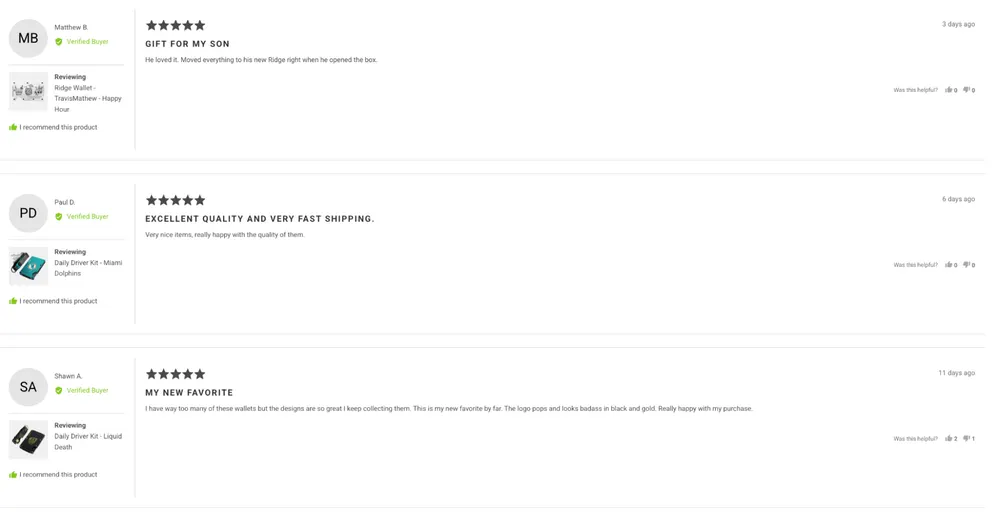
The weak spot is social proof placement. Reviews exist and are strong, but they are buried so far down that they function more like a footer than a closer, and the review layout feels flat compared to how hard the top of the page sells. If someone hesitates at $125, they have to scroll too much before the page starts doing the trust work.
Problem Solution And Utility Dropshipping Stores
10. Pillow Slides
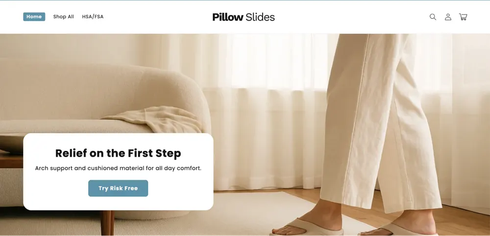
Pillow Slides win through extreme problem-solution clarity. They sell relief, not footwear, using sensory marketing that makes comfort immediately understandable and desirable. They partnered with services like TrueMed to allow customers to use their pre-tax Health Savings Account (HSA) dollars to buy the slides. Pillow Slides true genius lies in using medical benefit branding to transform a slipper into a HSA-eligible essential health tool.
- Positioning: The "Walking on Clouds" solution for foot pain and home comfort.
- Marketing: Problem/Solution TikTok ads showing immediate relief from hard floors.
- Website: They have a simple, conversion-focused landing page style. Large trust badges and reviews.
- Products: Cushioned foam recovery slides.
- Shipping & Returns: 7–15 days shipping. 30-day risk-free trial; free replacements for sizing issues.
- Customer Profile: People with foot pain (Plantar Fasciitis), healthcare workers (nurses), and retirees.
Pillow Slides Product Page Analysis
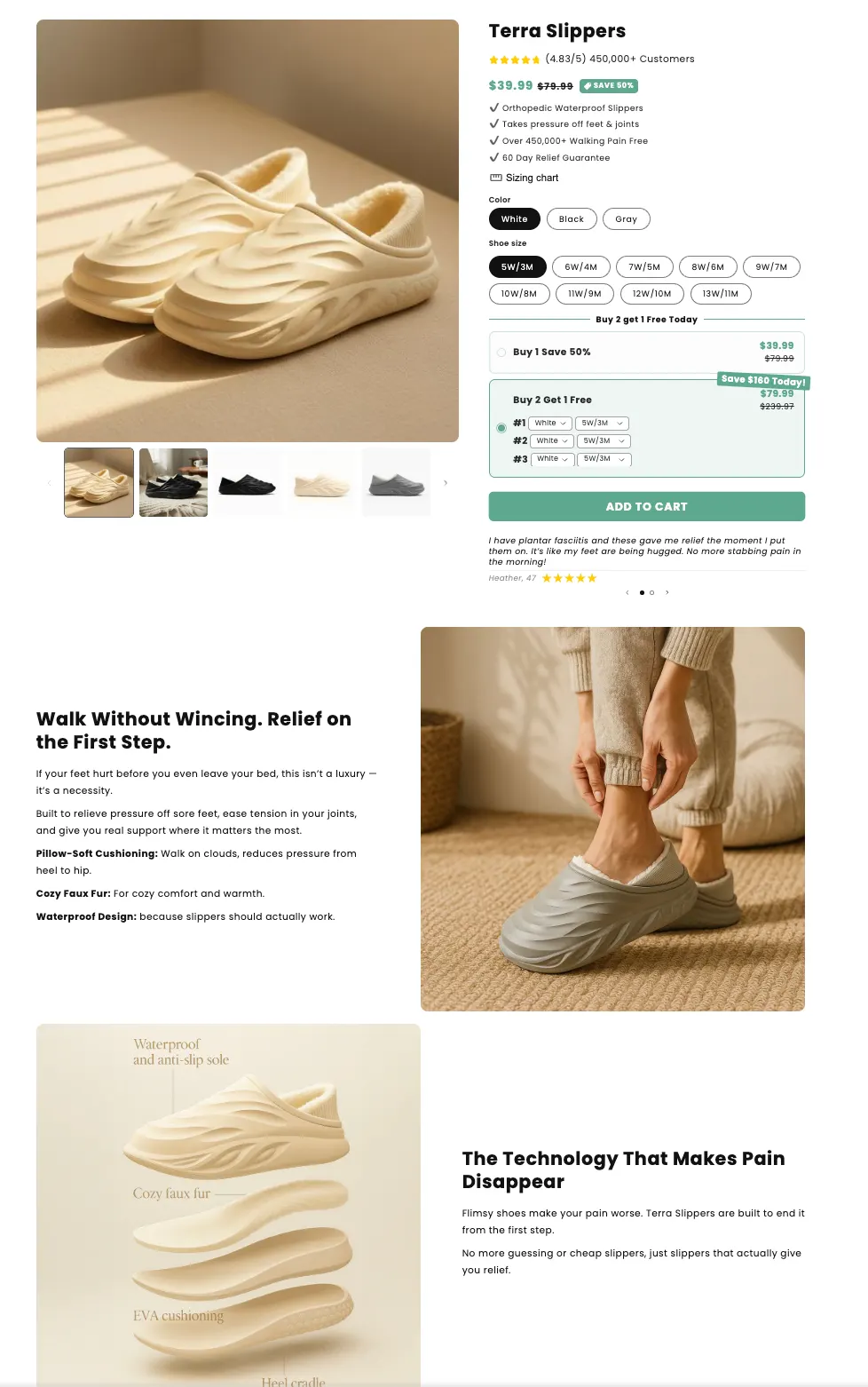
Pillow Slides’ PDP is basically a perfectly tuned conversion page for a pain-relief buyer.
It leads with instant clarity (what it is, who it’s for, what problem it solves), then backs the claim up with the exact stuff that reduces hesitation. Strong review density, visible rating distribution, real customer photos, and testimonials that match the target personas (nurses, people with plantar fasciitis, everyday home wear).
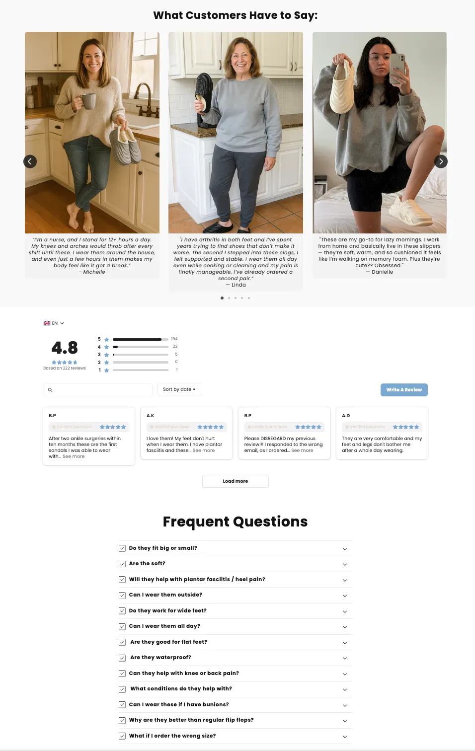
The layout sells comfort visually with lifestyle shots and the exploded tech layer diagram, while the copy stays sensory and benefit-first instead of generic material talk. Nothing feels random and that’s the best feeling. Every section is there to move a skeptical, pain-motivated buyer from “maybe” to “fine, I’ll try it.”
11. Pet Clever
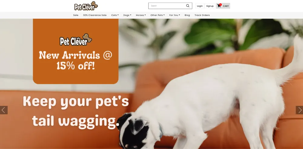
Pet Clever wins by selling peace of mind. Their ads create instant aha moments by solving long-standing pet problems in seconds, justifying premium pricing. Their wide range of products also is what’s elevating their success.
- Positioning: Practical "problem-solving" gear for frustrating pet moments.
- Marketing: "Pain Point" video ads on Facebook.
- Website: Review-heavy. Every product has dozens of photo reviews to build trust.
- Products: From no-pull harnesses, pet car seats, and calming grooming tools to many other products for pets.
- Shipping & Returns: 10–20 days shipping. 45-day return policy; often offers replacements without return for damage.
- Customer Profile: Engaged "Pet Parents" (ages 30–60) looking for functional upgrades for their dogs/cats.
Pet Clever Product Page Analysis
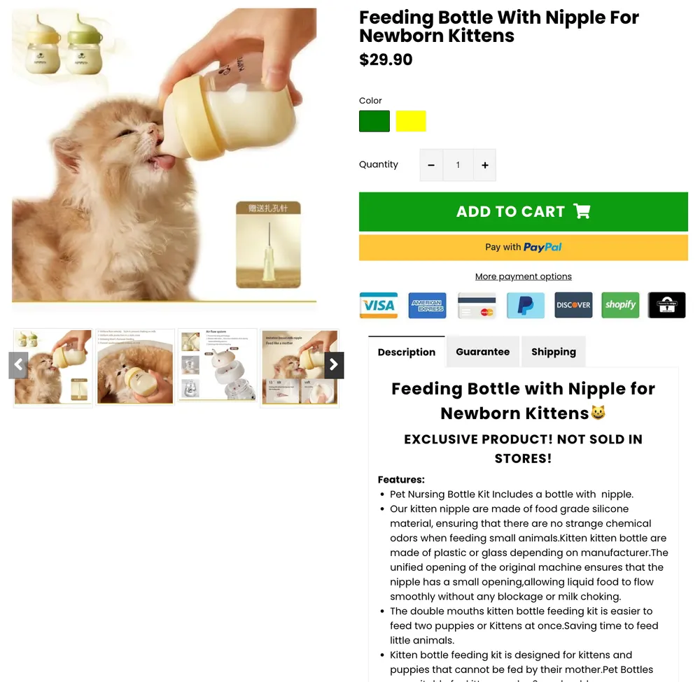
Pet Clever’s PDP feels like a conversion machine built for scale, not romance.
And I like it.
The layout is all about getting the buyer to click with minimal friction. The big CTA, loud trust signals, and a constant “this works” tone is what you need on your dropshipping store’s product page.
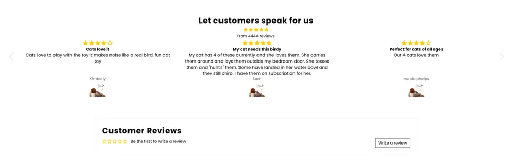
The smart move is how they keep the review section from looking dead by showing overall store or adjacent-product reviews even when the exact SKU is thin, so the page still borrows credibility. But it’s still a generic dropship template vibe, the description reads functional not distinctive, and there’s little brand voice or differentiation beyond “problem solved.”
For a Walmart for pets kind of look, it’s good enough and honestly aligned, but it wins by volume and proof stacking, not by depth or storytelling.
12. Solo Stove
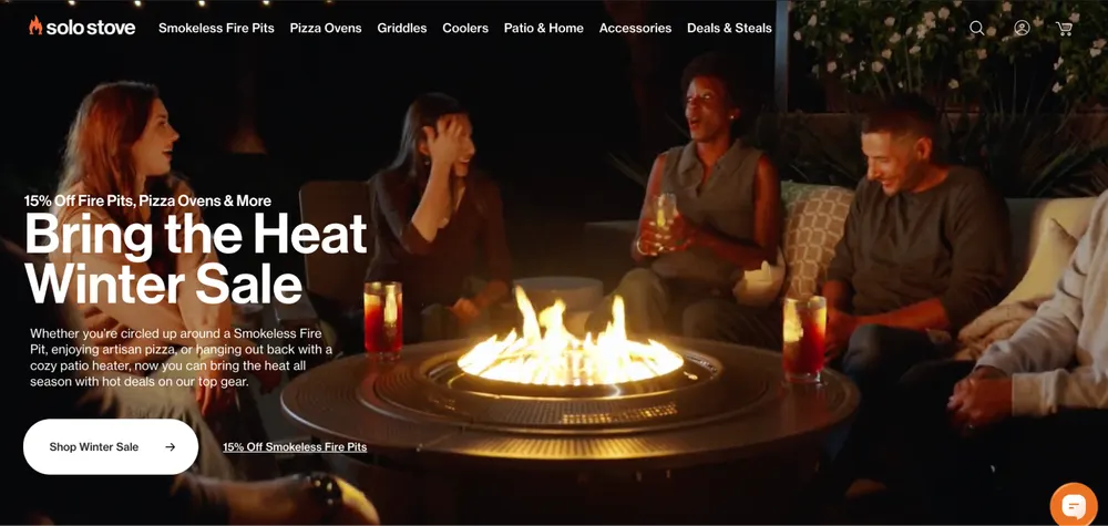
Solo Stove has great products, let’s start with that.
And they didn't market a generic warmth or friendship. They marketed the absence of a negative.
In other words, by focusing entirely on being "Smokeless," they solved the number one reason why people wouldn’t want to use fire pits. They turned a chore into a satisfying experience.
- Positioning: "Smokeless Fire Pits." They don't sell "outdoor decor"; they sell a technological solution to the problem of smelling like smoke and getting ash in your eyes. They position themselves as the "Performance Gear" of the backyard.
- Marketing: Visual proof and the aha moment. Their marketing is genius because it’s highly visual. They use 3D animations to show how their signature 360 Airflow Design works. When a customer sees how the air is pulled through the bottom to burn the smoke before it leaves the pit, they have an aha moment and immediately want to upgrade their fire pit to this smarter one.
- Website: They engineered aesthetics. Their site looks like a mix between a high-end tech brand and an outdoor adventure shop. They use technical diagrams, performance specs (how hot it gets, how fast it burns), and massive amounts of UGC showing the secondary burn.
- Products: Fire pits and stoves. They have the "Bonfire" (flagship), the "Yukon" (massive), and the "Lite" (for hikers). Like The Ridge, they’ve built an ecosystem of accessories: shields, stands, and even a pizza oven attachment.
- Shipping & Returns: The "Risk-Free" Hearth. They offer Free Shipping and a Lifetime Warranty. Because a fire pit is a "buy-it-once" item, the lifetime warranty is the ultimate trust-builder that justifies the $300+ price tag..
- Customer Profile: "The Backyard Hero." Suburban homeowners who love hosting, campers who value efficiency, and "Gear Junkies" who want the best-performing version of everything they own.
Solo Stove Product Page Analysis
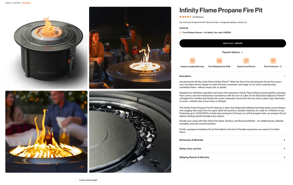
Solo Stove’s PDP feels like a premium tech brand selling an outdoor product, and it mostly nails it. The image stack does real work, clean hero, lifestyle proof, close-up detail, and the “smokeless” story is reinforced by diagrams and tight benefit framing.You instantly get why this is different from a generic fire pit.
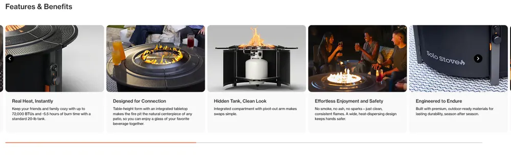
The Features & Benefits section is especially strong because it translates specs into outcomes and makes the product feel engineered, not decorative.
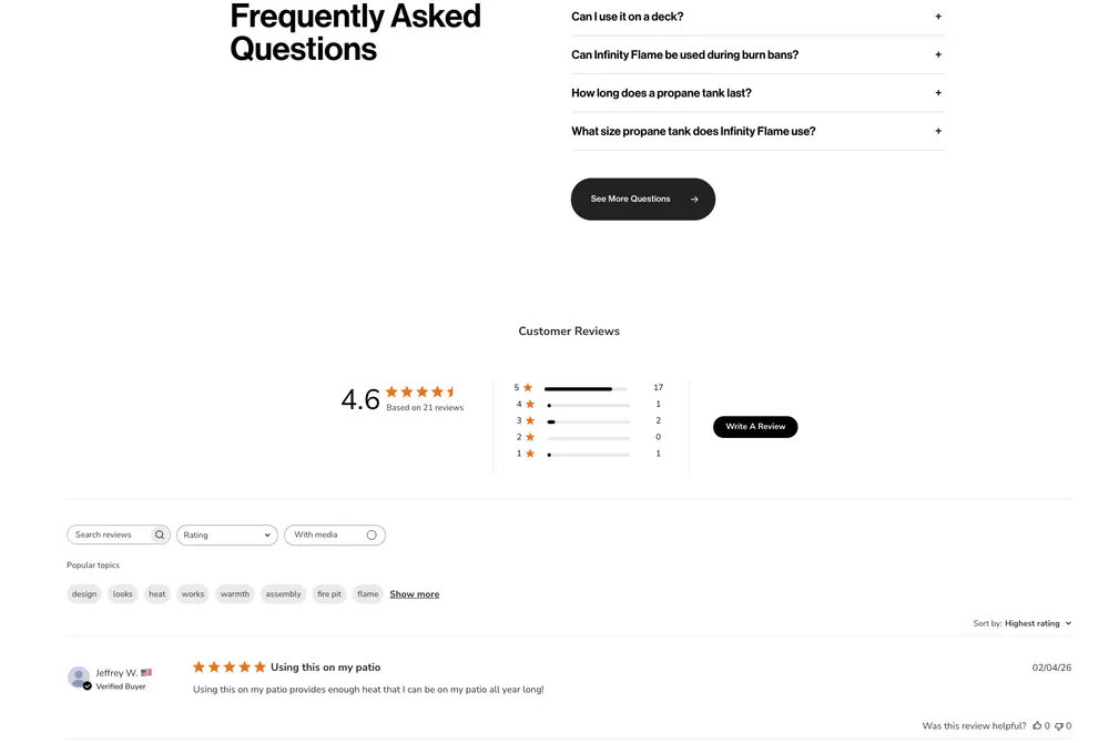
The weak point is social proof placement.
Reviews exist, but they’re buried so far down that they don’t support the moment of purchase, especially at $599. If someone hesitates at the price, the page makes them scroll to earn reassurance instead of surfacing it near the add-to-cart.
13. Fresh Juice Blender
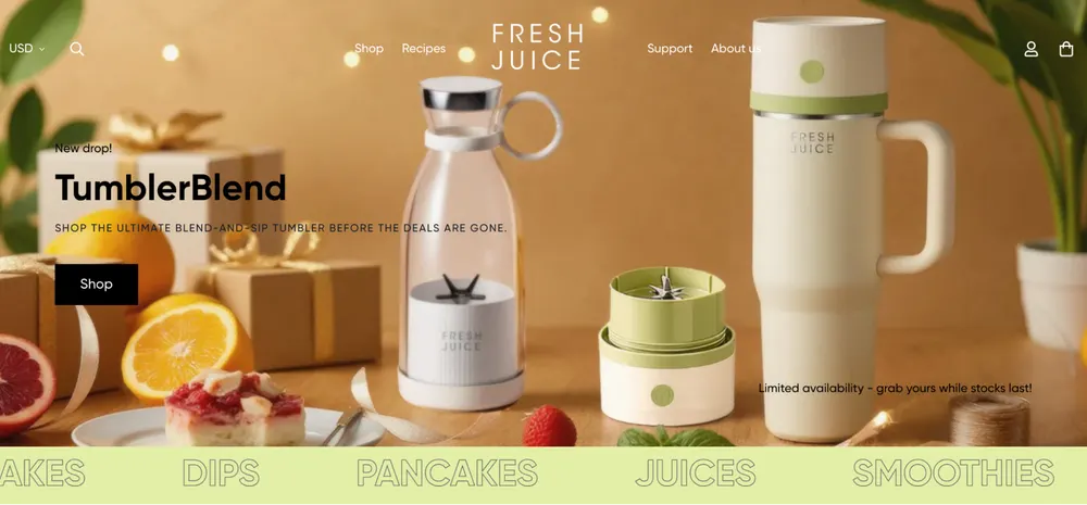
Fresh Juice Blender wins by prioritizing design over raw utility. By making the product look like decor, they tap into the aesthetic kitchen trend and differentiate from function-first competitors.
- Positioning: The "Apple of Kitchen Gadgets". Sleek, modern, and healthy.
- Marketing: Influencer "Day in the Life" reels. They show the blender in white kitchens or gym bags.
- Website: Minimalist, single-product focus. Extremely high-quality 3D renders.
- Products: Bottle-shaped portable blenders.
- Shipping & Returns: Free worldwide shipping. 30-day refund policy for non-defective items (with restocking fee).
- Customer Profile: Health-conscious Millennials and Gen Z "Aesthetic" fans who want their gadgets to look like decor.
Fresh Juice Blender Product Page Analysis
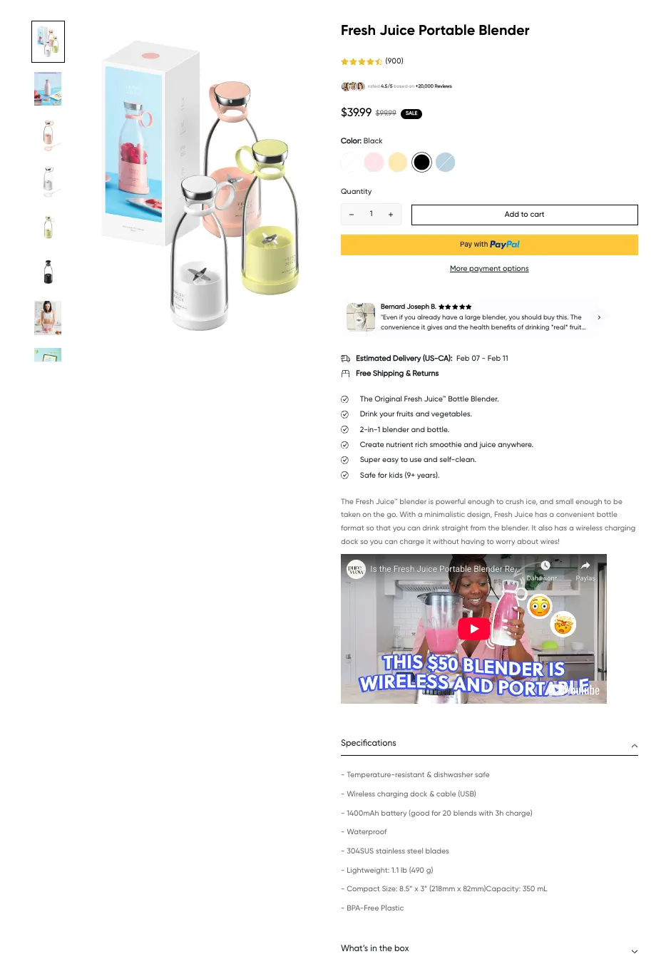
Fresh Juice Blender’s PDP executes the aesthetic-first product strategy very effectively, and it largely delivers on it. The above-the-fold section feels polished, premium, and conversion-focused. This combines strong product visuals with clear pricing, variant selection, and fast trust signals.
What I also really liked is the sticky add-to-cart that maintains purchase momentum while scrolling.
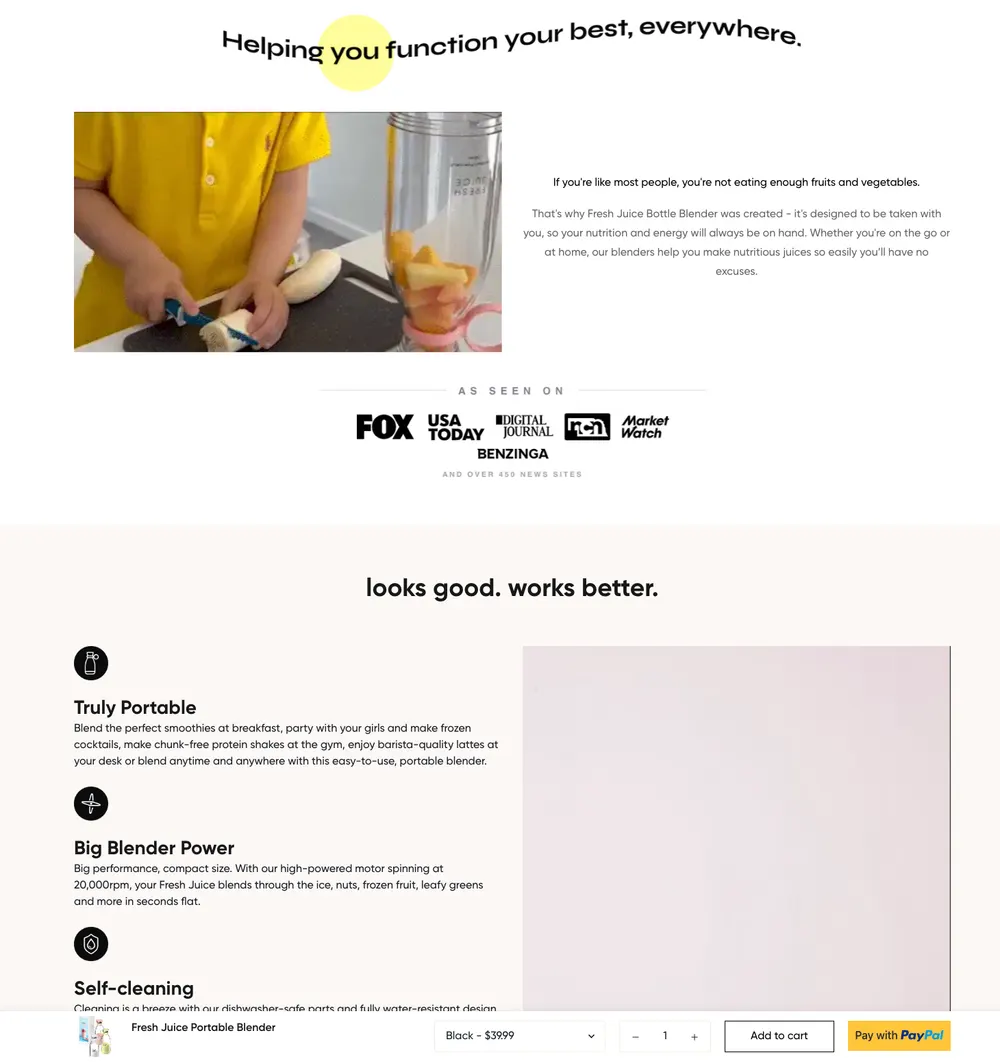
The page leans beautifully on visual appeal and brand vibe.
The storytelling stays somewhat surface-level and relies on reviews to reinforce trust later in the journey. It performs well because the layout stays clean, the messaging is concise, and the overall UX removes friction, making the review section feel like final validation rather than the primary persuasion driver.
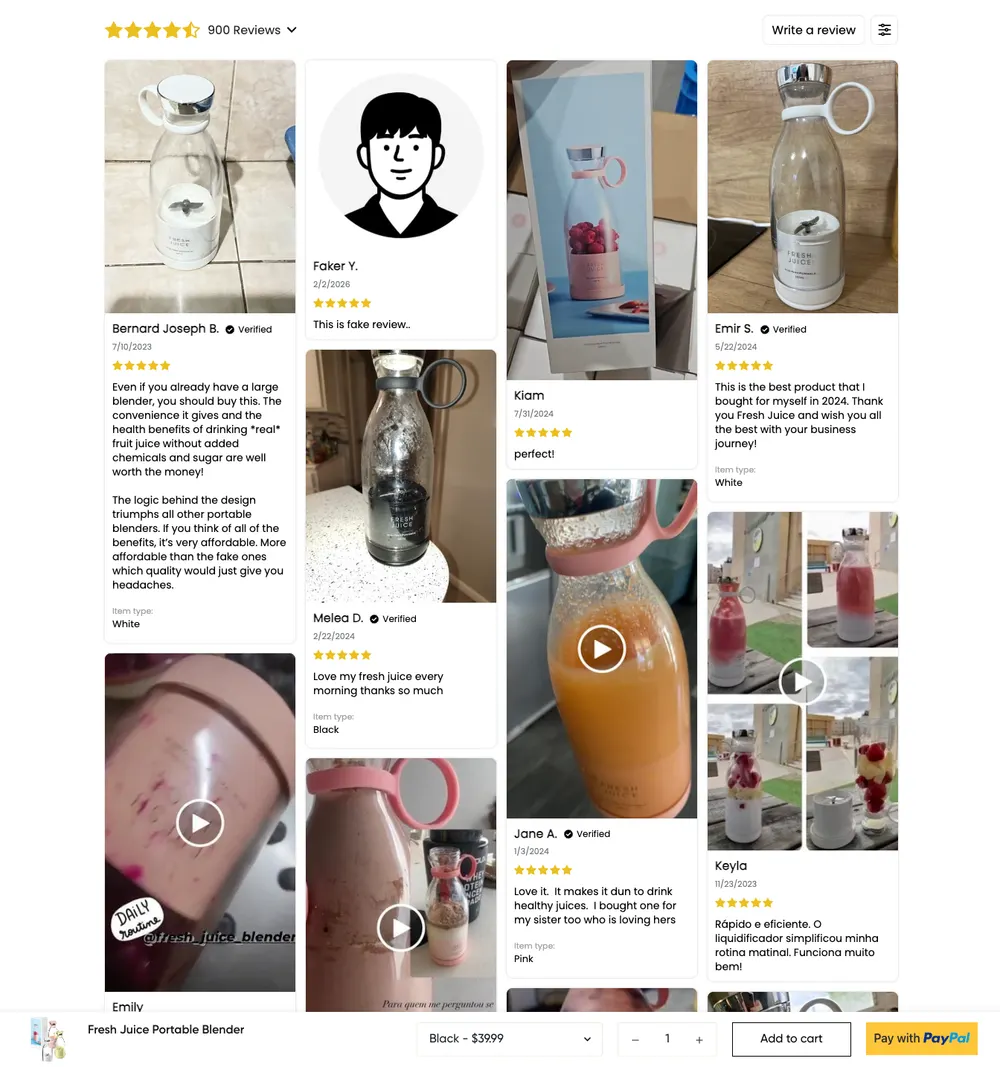
The page flow is intentionally built as a guided experience, which makes placing social proof lower on the page less risky compared to faster decision-style PDPs.
14. Outdoor Master

Outdoor Master wins through pro-lite positioning. They borrow trust through certifications and sponsorships, giving customers professional-grade confidence without premium-brand pricing.
- Positioning: High-performance outdoor gear that doesn't "break the bank."
- Marketing: SEO and Amazon-to-Shopify bridge marketing.
- Website: Rugged and professional. High focus on "Technology" explainers (MIPS, UV400).
- Products: Ski goggles, cycling helmets, and electric SUP pumps.
- Shipping & Returns: Free shipping on all products. 30-day return policy and dedicated warranties for gear.
- Customer Profile: "Weekend Warriors" (ages 25–50) who want quality gear without premium-brand pricing.
Outdoor Master Product Page Analysis
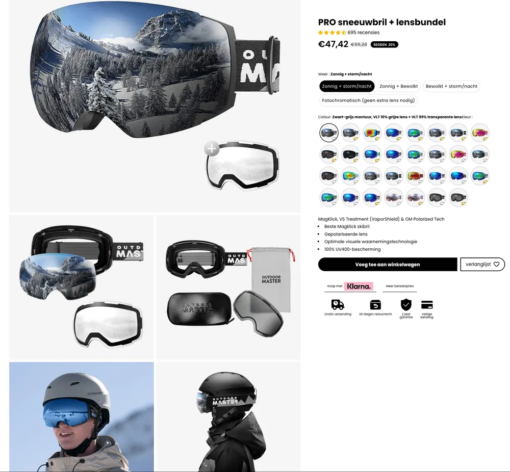
Outdoor Master’s PDP follows the same scroll-driven conversion style seen in aesthetic-forward gadget brands, and it mostly executes it well.
The top of the page is visually strong and conversion-focused, with clear product visualization, rich variant selection, and fast trust signals that reduce hesitation early.
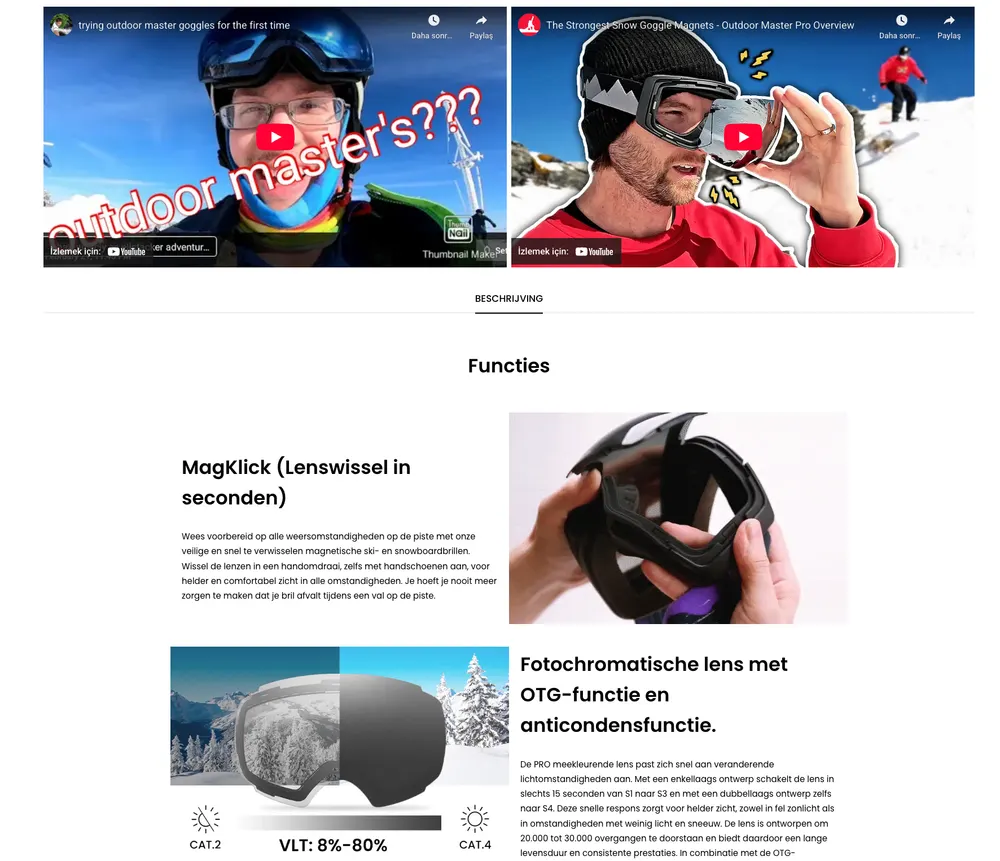
The page encourages exploration through feature explanations, video demonstrations, and technology breakdowns, which helps justify performance claims without overwhelming the shopper.
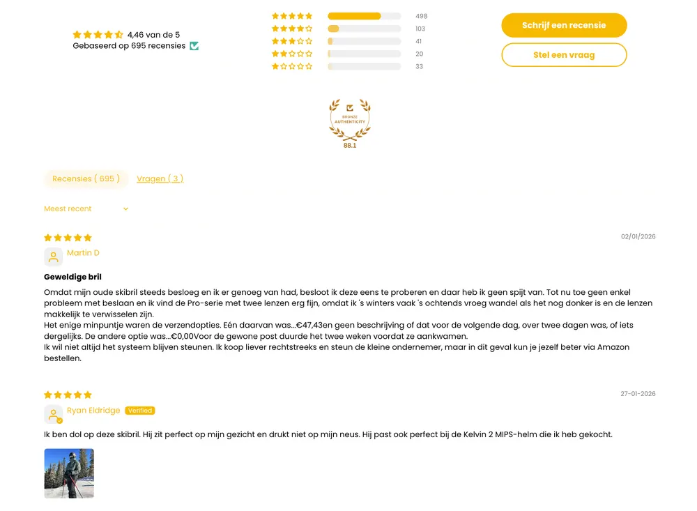
Similar to Fresh Juice Blender, social proof sits lower on the page, but the layout naturally pushes users downward, so reviews feel like reinforcement rather than the main persuasion driver.
The main weakness is that the storytelling leans slightly toward feature validation rather than emotional positioning, making the product feel reliable and professional but slightly less aspirational.
Overall, the experience is clean, structured, and credible, which fits their pro-accessible brand positioning well.
15. Trekology
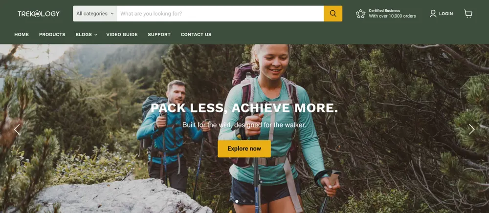
Trekology is another Shopify dropshipping store that does a lot of things well. In the outdoor niche, "specs" (weight, folded size, material denier) are everything. Trekology’s genius is that they don't market "fun"; they market "Engineering." By being the "lightest" and "most compact" in their price bracket, they win the logical part of the customer's brain that is comparing 5 different products at once.
- Positioning: The "Affordable Ultralight" outdoor brand. They target hikers and campers who want professional-grade, lightweight gear without the "Big Brand" (REI/Patagonia) price tag.
- Marketing: They use the "Amazon-to-Shopify Bridge." They dominated Amazon search results for "portable camping chair" first, then moved that massive social proof (thousands of 5-star reviews) over to their Shopify store to build a loyal direct-to-consumer brand.
- Website: Extremely functional and high-trust. They use comparison charts to show how their gear is lighter and smaller than competitors.
- Products: Ultralight inflatable pillows, portable camping chairs, trekking poles, and sleeping pads.
- Shipping & Returns: They utilize a global network of warehouses (USA, Europe, Asia) to provide 3-5 day shipping in major markets. They offer a 30-day money-back guarantee and a 1-year warranty on all gear.
- Customer Profile: "Weight-conscious" backpackers, hikers, and motorcycle campers who need gear that fits in small spaces.
Trekology Product Page Analysis
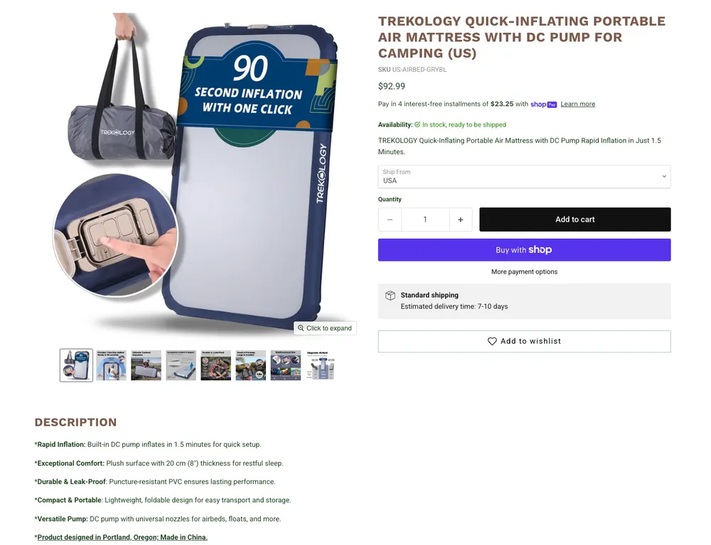
Even though I like the products and the product imagery, I must say that they are missing huge on the opportunity to convert more.
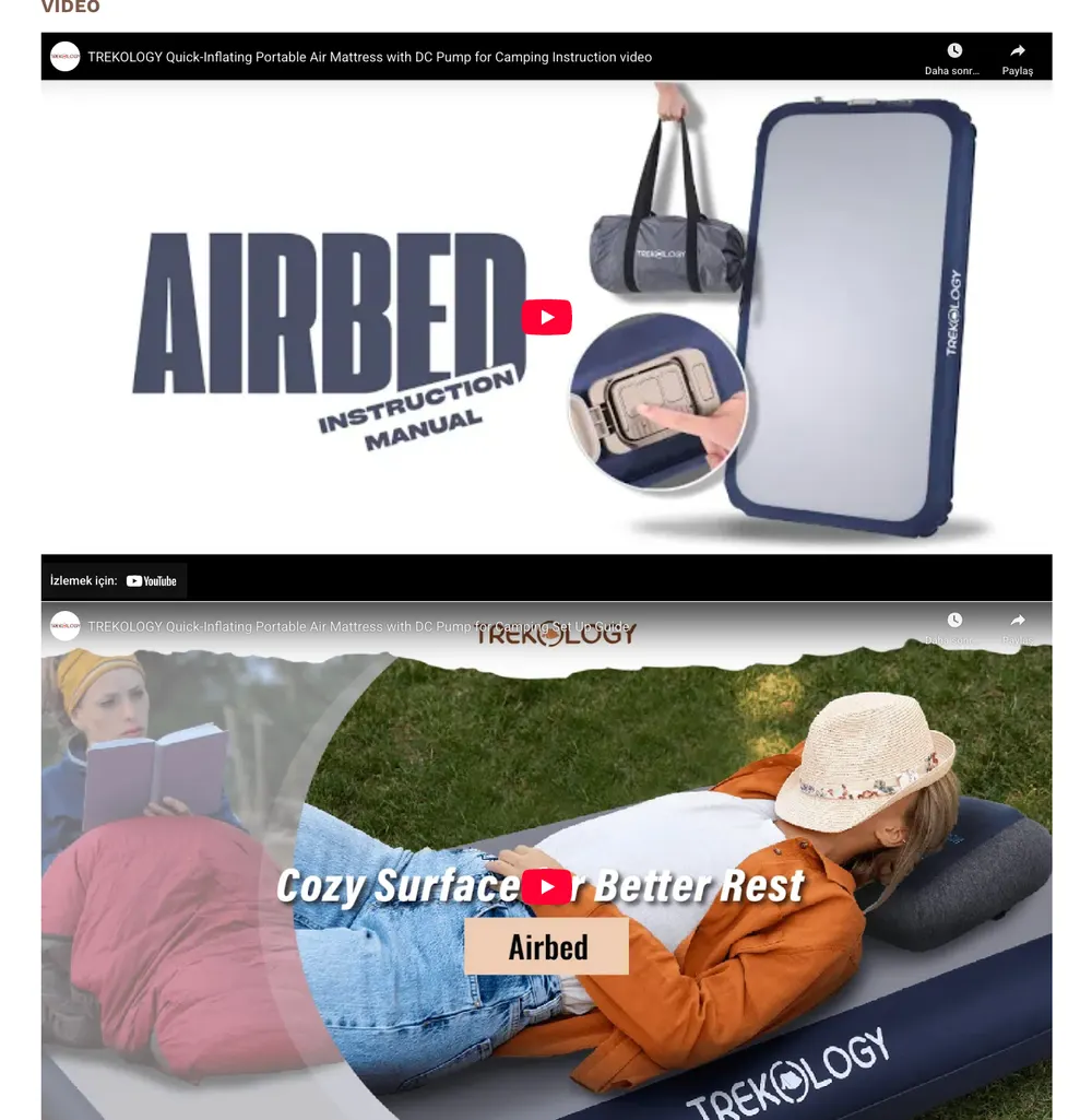
There’s basically no real social proof on the page, and the “description” reads like a spec sheet. The videos help a lot, but without reviews, comparisons, or real-world validation, it feels unfinished for an outdoor buyer who wants confirmation.
What separates dropshipping winners
Across all fifteen, the supplier is never the story, the frame is. The winners shape perception (a showroom, a movement, a problem solved), stack proof exactly where doubt creeps in, and turn the product page into a guided, low-uncertainty decision. Get those right and the customer stops caring where the package ships from.
It's the same lesson the best Shopify print-on-demand stores prove from the other side: fulfillment is a commodity, brand and conversion are not. Keep going with more conversion playbooks.
Frequently asked questions
What makes a dropshipping store successful?
Framing and trust, not sourcing. Winners shape perception (luxury, novelty, problem-solved) and reduce uncertainty with proof and clear product pages, so the customer stops caring where the item ships from.
Is dropshipping still profitable in 2026?
Yes, but not as a generic "general store." The profitable ones compete on positioning, perceived quality, and conversion. Where the brand and the product page feel intentional, the margins hold.
How do dropshipping stores justify premium prices?
Aesthetic arbitrage: showroom-grade visuals, premium typography, and editorial framing make a globally sourced product read as high-end, backed by specs, guarantees, and reassurance near the buy button.
Do dropshipping product pages need reviews?
Almost always. Buried or missing social proof is the single most common weakness on this list, especially above $100. Reviews with real photos near the CTA are what close hesitant buyers.
Shopify, the fastest route to a high-converting, on-brand product page, plus the app ecosystem (reviews, bundles, upsells, BNPL) the winners rely on.