Best Shopify Print on Demand Stores 2026
A breakdown of 20 successful Shopify print-on-demand stores, the brand narratives, trust signals, and product-page moves that turn POD into real brands.
We analyzed so many print on demand shops, their stories, websites, products, pages, and reviews that there is one pattern that is hard to not catch.
These 20 print on demand businesses are successful because:
Their real genius is that they make the customer forget it is print on demand.
It is either their powerful story and/or turning print on demand into an art/handwork that drives their sales and success.
If your goal is to be inspired by them, you must stop thinking like a "POD Seller" and start thinking like a brand architect.
Don't build a store, build a powerful brand with a powerful story in which your POD products are the gemstones.
Key Takeaways From 20 Successful Shopify Print on Demand Stores
- They don’t sell “POD products.” They sell a brand narrative. The item feels like a souvenir from a story, an aesthetic, or a community.
- The customer forgets fulfillment because the offer feels intentional. Clear positioning, tight product selection, and a consistent visual identity do the heavy lifting.
- Most winners pick one dominant engine: emotion (gift), identity (values), scene (subculture), or scale (volume).
- They build trust strongly at the point of purchase. Strong visuals, reviews that actually help decisions, and clear expectations reduce “POD anxiety.”
- The product page is treated like a guided decision, not a catalog entry. They remove friction with simple choices and obvious CTAs.
- Perceived quality is designed, not claimed. Fabric, printing method, embroidery, packaging, and close-up product imagery do more than adjectives.
- They use variety strategically, not randomly. Either tight curation that feels like a collection, or massive breadth with a proven volume play.
- Marketing sells the identity, the page closes the deal. Content, UGC, community, or mission gets attention; the PDP must earn the checkout.
- Returns and policies are part of conversion. The best brands use policies to signal confidence and reduce risk, not hide information.
Now let’s get to the best Shopify POD stores in 2026.
Volume Driven Print On Demand Stores
1. The Oodie
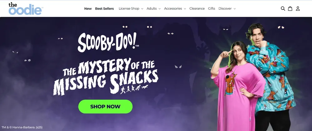
The Oodie ranks first because it solved the ‘POD looks cheap’ problem by using very thick, high-quality fleece that feels premium.
- Positioning: The category king of "Wearable Comfort." They transformed a blanket into a high-end fashion statement.
- Marketing: Aggressive UGC (User Generated Content) and influencer gifting. They dominate TikTok and Instagram by showing "real people" lounging in their products. They use scarcity marketing with limited-edition "drops" (e.g., Disney collections).
- Website: High-conversion design using "Buy More, Save More" bundles (AOV hacking) and "Buy Now, Pay Later" options (Klarna/Afterpay) to make $100 hoodies feel affordable.
- Products: Oversized wearable blankets, robes, and sleepwear with licensed patterns.
- Return/Shipping: 30-day "no questions asked" returns. They utilize local warehouses in the US, UK, CA, and AU to keep shipping under 5-7 days.
- Customer Profile: Gen Z and Millennials who prioritize "homebody" culture and cozy aesthetics.
The Oodie Product Page Analysis
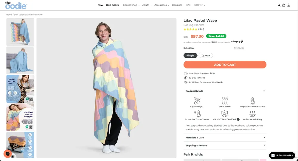
Another reason why we love The Oodie is because their product page explains comfort in a very literal, product-first way. They use simple benefit claims like cooling feel, moisture control, and temperature balance, instead of ambigous language.
That supports their core promise of “wearable comfort” by making the value feel real and understandable, not decorative.
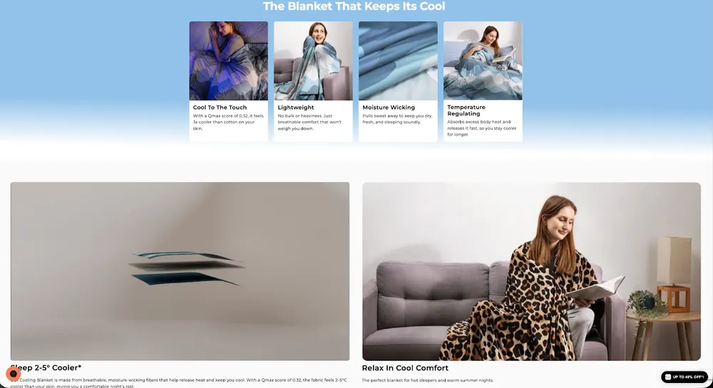
The close-up fabric visuals back up those claims. The lifestyle shots keep the product grounded in everyday home use.
Overall, it reinforces trust and perceived quality without changing the brand tone, exactly in line with their mass-appeal, high-comfort positioning.
2. Threadheads
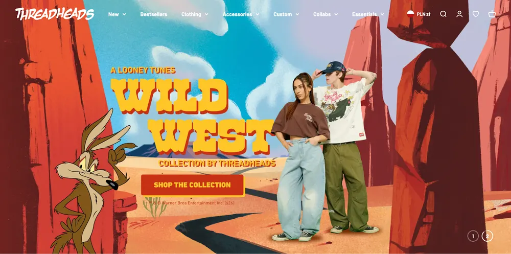
Threadheads wins by replacing the limitless catalog of traditional POD with a tightly curated, artist-driven aesthetic that makes their store feel like a boutique gallery rather than a generic print shop.
- Positioning: Premium, artist-designed graphic apparel with a heavy focus on cool, sarcastic, and pop-culture themes. They position themselves as the anti fast fashion alternative to stores like Redbubble or Amazon.
- Marketing: They are masters of email marketing and retargeting. Their emails are genuinely funny and written in a relatable, slightly irreverent voice. They also use artist spotlight campaigns to build a story behind the designs, making the products feel like "limited art" rather than mass-produced shirts.
- Website: One of the cleanest Shopify layouts in the industry. They use high-resolution lifestyle mockups that look like they were shot on the streets of Melbourne. The navigation is incredibly intuitive, allowing you to filter by style.
- Products: Premium 100% cotton tees, hoodies, and tote bags. They focus on the feeling of the fabric as much as the design, using heavy-weight cotton to justify their price.
- Return & Shipping: They offer a "100% happiness guarantee" which includes easy returns and exchanges. A strong move for a POD store that builds massive trust. They ship from hubs in Australia, the US, and Europe to keep delivery fast.
- Customer Profile: Creative professionals, students (ages 20–40) who want to wear funny or artistic designs without looking like they bought a cheap tourist shirt.
Threadheads Product Page Analysis
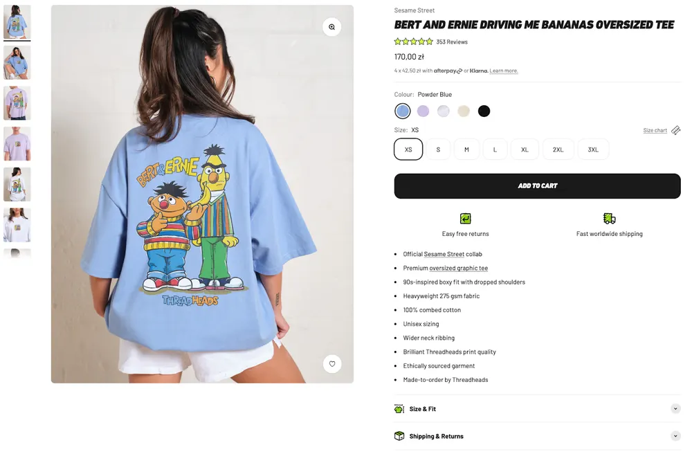
Threadheads’ product page works because it does three things extremely well. It proves quality, removes fit anxiety, and builds trust at scale.
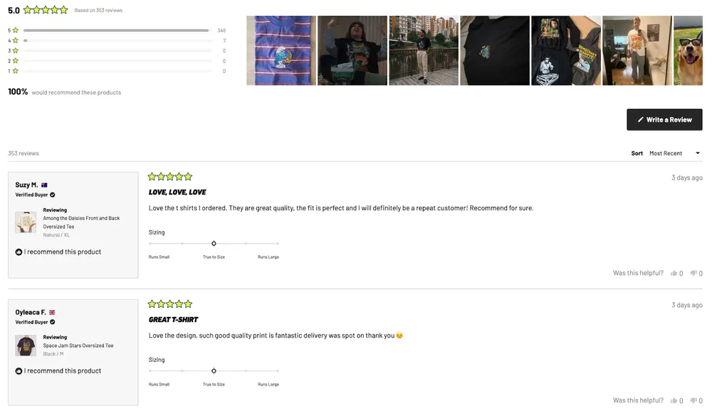
The page leads with strong lifestyle imagery and clear product specs, then immediately backs the price with fabric details, size and fit guidance, and a huge number of verified reviews with real photos.
Social proof isn’t buried, it’s unavoidable, and it answers the two biggest POD objections upfront, “will this feel cheap?” and “will it fit me?”
The result is a PDP that feels closer to a fashion retailer than a print shop.
3. Famous In Real Life
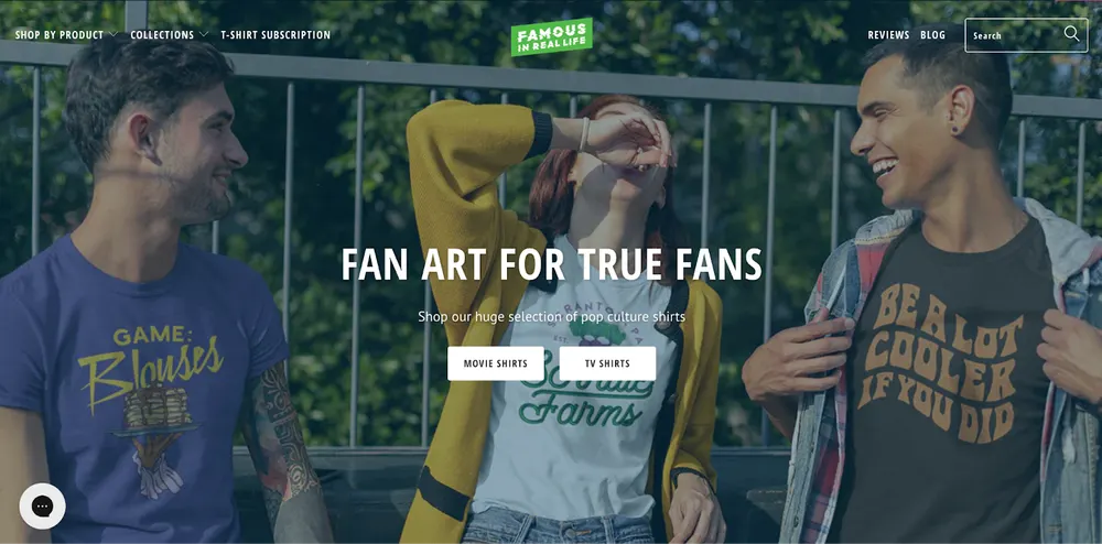
Famous In Real Life is the Walmart of POD. They win through massive variety and low-friction pricing.
- Positioning: Pop-culture, booze, and "Dad-humor" t-shirts.
- Marketing: High-volume Facebook ads focusing on humor. They use "Mystery Shirt" offers to clear inventory/increase orders.
- Website: Optimized for mobile "impulse" shopping with a focus on "Trending Now" sections.
- Products: Graphic tees for every hobby (Drinking, Movies, Gaming).
- Return/Shipping: 30-day window; "Shirt of the Month" subscription model.
- Customer Profile: 25–45-year-olds looking for "funny shirts" for weekend wear.
Famous In Real Life Product Page Analysis
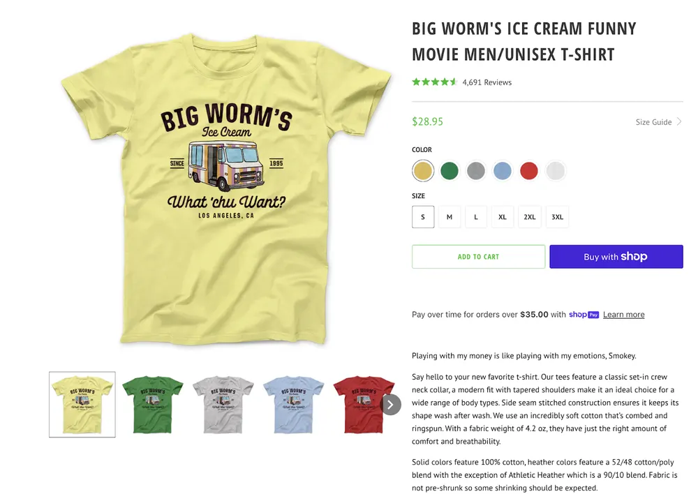
Famous In Real Life’s product page is built for volume and impulse. I believe that their page is well aligned with their brand positioning.
It’s basically a low price, simple variant picks like color and size.
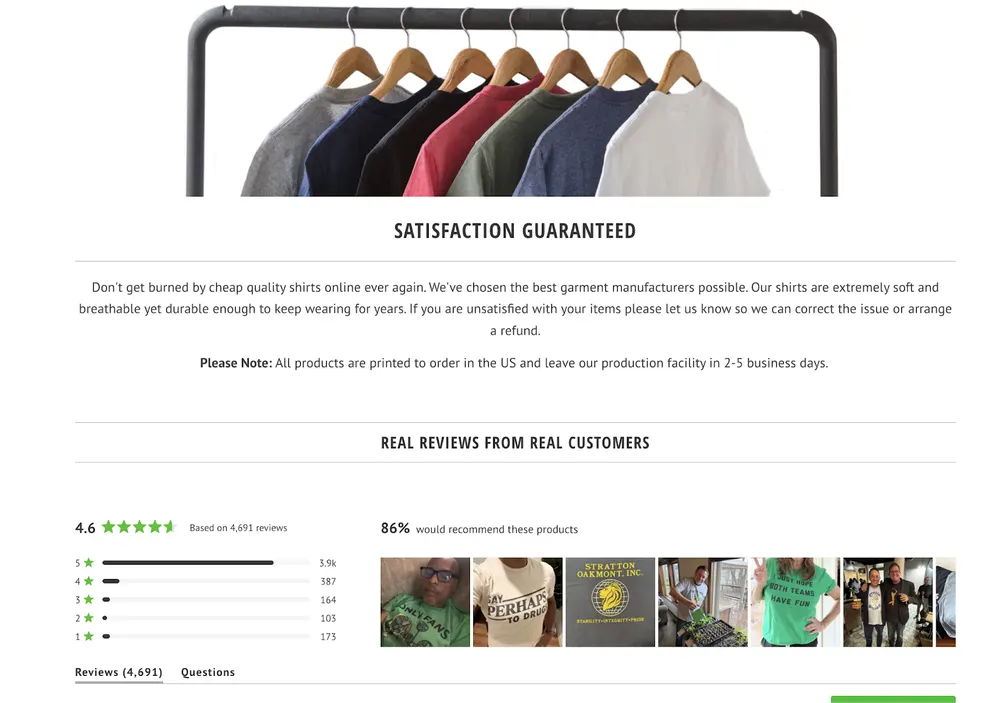
The always-visible CTA get you to cart fast, while the real conversion engine is trust stacking, like the massive review count, the “satisfaction guaranteed” block, and the big UGC-heavy review wall that basically says “thousands of people bought this, you’ll be fine.”
Memory Driven And Personalized Gift Print On Demand Brands
4. Crown & Paw
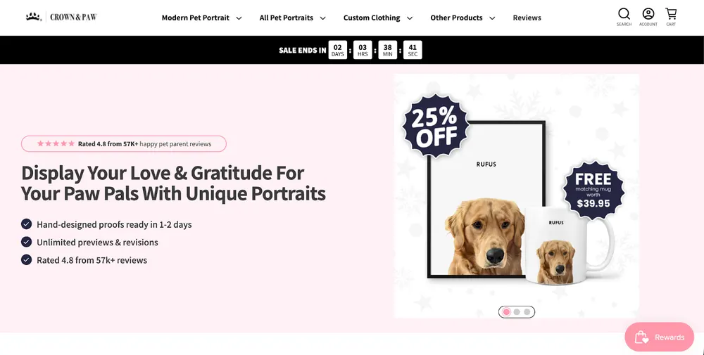
Crown & Paw uses a "Hybrid-POD" model. Digital artists edit the file, then it is sent to a POD printer. This human touch justifies the high position on our list and this is why we love them.
- Positioning: The pioneer of "Renaissance-style" pet portraits. They treat pets as family royalty.
- Marketing: Emotional storytelling. Their ads focus on the reaction of the pet owner seeing the finished product. They lean heavily on Facebook/Instagram retargeting.
- Website: A masterclass in customization flow. The process of uploading a photo is seamless, and they use progress bars to keep the user engaged.
- Products: Custom canvases, pillows, and mugs featuring user-uploaded pet photos blended into historical paintings.
- Return/Shipping: No returns on custom art, but they offer Unlimited Revisions, which eliminates the fear of "what if it looks bad?"
- Customer Profile: Pet parents (ages 25–55) with high discretionary income who view their pets as children.
Crown & Paw Product Page Analysis
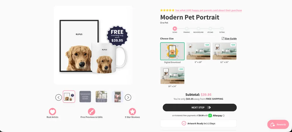
The Crown & Paw product page is built to remove anxiety around customization and shift the decision from “will this look good?” to “when can I order?”.
The step-based flow, size-first choice, and constant progress indicators frame the product as a guided experience, not a risky custom order.
The free mug bundle and digital download option lower friction while nudging AOV up. Overall, the page perfectly matches their positioning as a sentiment-driven, human-assisted POD brand where reassurance and emotional payoff matter more than the object itself.
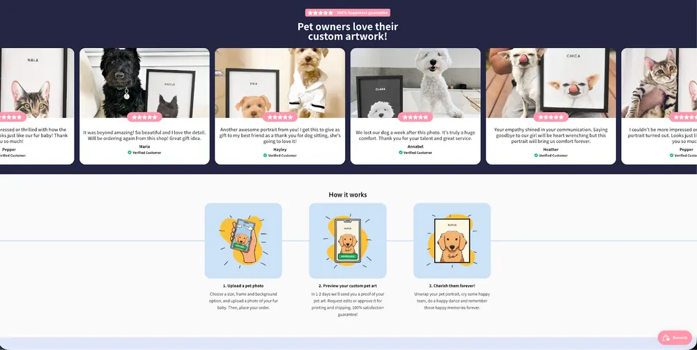
Trust is strongly stacked everywhere.
Real artists, free previews and edits, 1–2 day artwork readiness, and dense social proof with emotional testimonials, including grief and memorial stories, which directly validates the emotional use case.
5. Paw & Glory
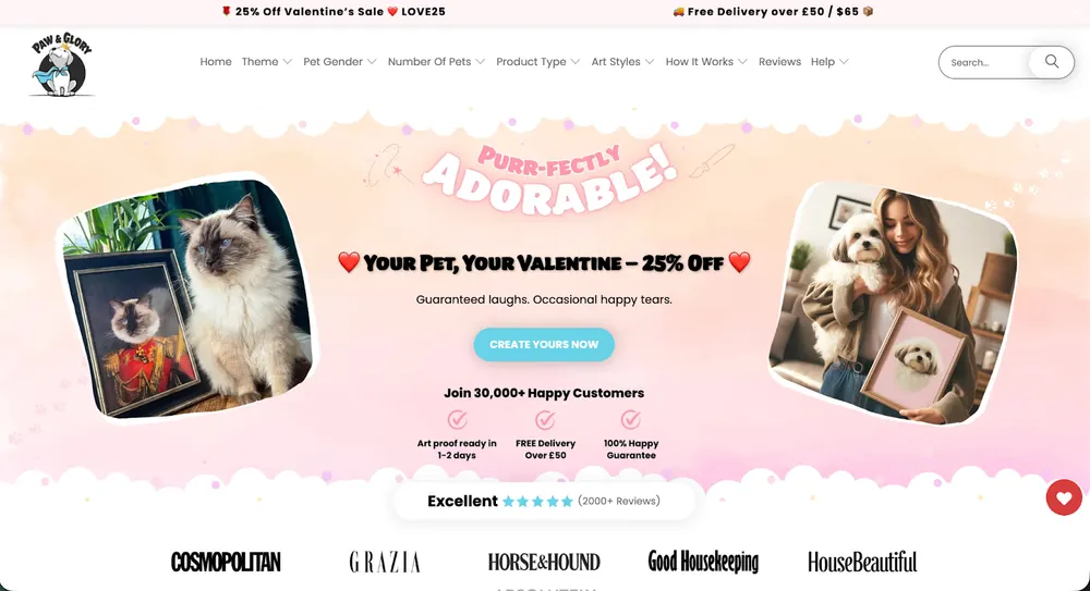
Paw & Glory sells emotionally meaningful products for pet owners with a clean, modern visual language. The product is not just a print, it’s a keepsake meant to be displayed at home.
- Positioning: Modern, minimalist pet keepsake brand.
- Marketing: Calm, emotional Facebook and Instagram creatives. They lean into the “pet as family” idea without over-dramatizing it.
- Website: Clear customization flow with a simple UI and limited choices. Emotion is carried more by social proof than by heavy copy.
- Products: Custom pet portraits, framed prints, canvases.
- Return/Shipping: No returns due to customization; previews and revisions remove purchase risk.
- Customer Profile: Ages 25–50, pet owners who treat pets as part of their home and interior aesthetic.
Paw & Glory Product Page Analysis
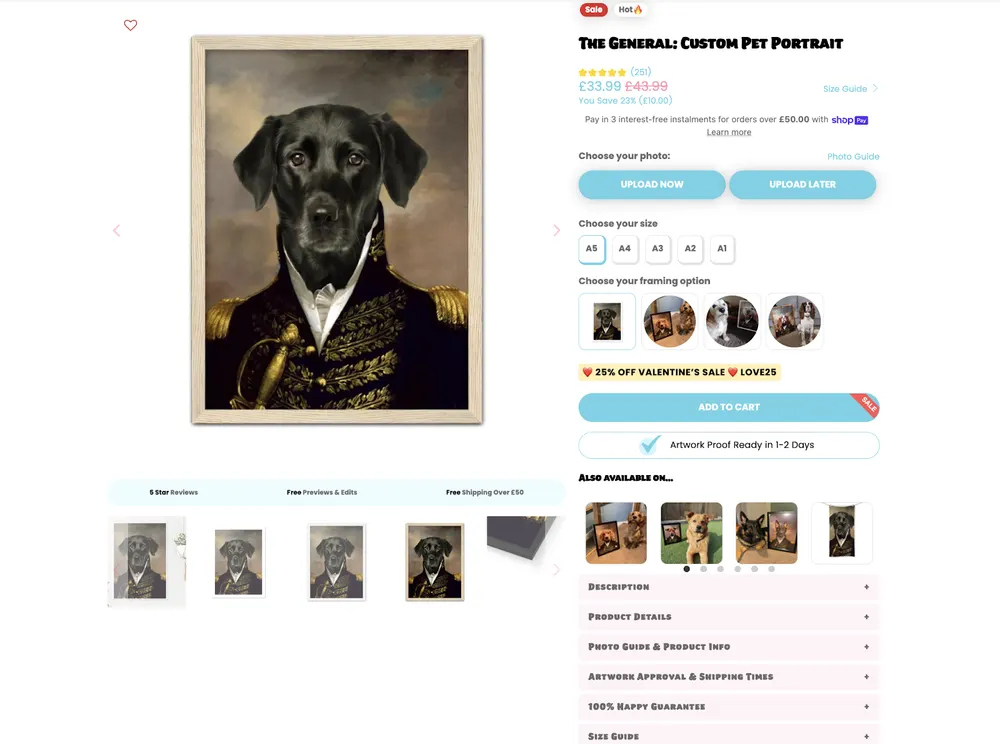
The Paw & Glory product page is designed to eliminate uncertainty and make customization feel safe and controlled. The page leads with the finished artwork, then immediately moves the user into action with clear upload CTAs and size selection, keeping momentum high.
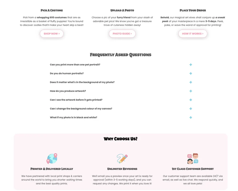
Trust is reinforced everywhere.
Visible reviews, free previews and edits, 1–2 day artwork proof, and repeated approval messaging, which shifts the mindset from custom risk to guided process.
I love that the playful copy adds warmth without distracting from the core promise, while the structured FAQs and step-by-step flow quietly answer objections before they arise.
Overall, the page supports their positioning perfectly by turning a custom portrait into a low-friction, emotionally reassuring purchase rather than a speculative art order.
6. Turned Yellow
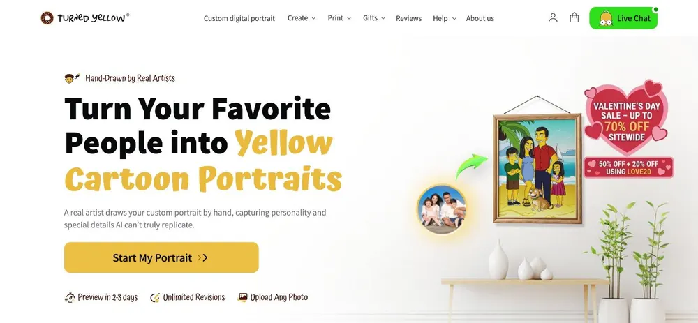
Turned Yellow is a text-book POD store. They have no inventory and very low overhead. They are selling Service-as-a-Product via POD. What I’m most impressed with is the whole step-by-step ordering process.
- Positioning: Custom portraits in the style of The Simpsons.
- Marketing: "Comparison" ads. They show the original photo next to the "Yellow" drawing.
- Website: Simple 3-step funnel (Upload -> Artist Draws -> Review).
- Products: Digital files, canvases, and posters.
- Return/Shipping: Unlimited revisions; digital delivery option (no shipping cost).
- Customer Profile: Families and couples looking for unique anniversary/birthday gifts.
Turned Yellow Product Page Analysis
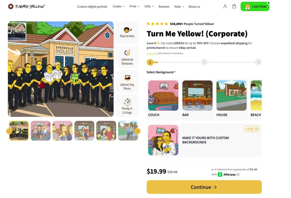
Turned Yellow’s product page is another favorite of mine on this list. It is essentially a guided ordering funnel disguised as a product page, and that’s the whole point.
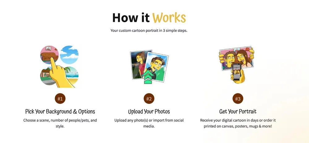
You’re not shopping, you’re commissioning.
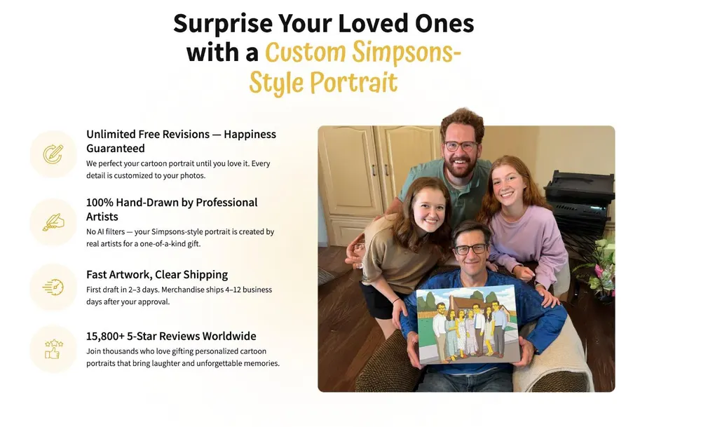
The UI pushes you step by step.
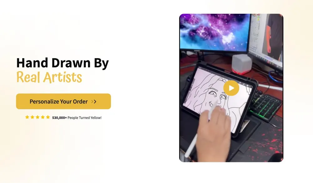
Pick a background, upload photos, approve the result. That structure removes uncertainty and makes the value obvious, especially for gift buyers. Trust is built strongly with social proof and process clarity. Like some of the other businesses on our list, real artists, unlimited revisions, clear delivery timelines, and massive review counts front and center.
7. The Night Sky
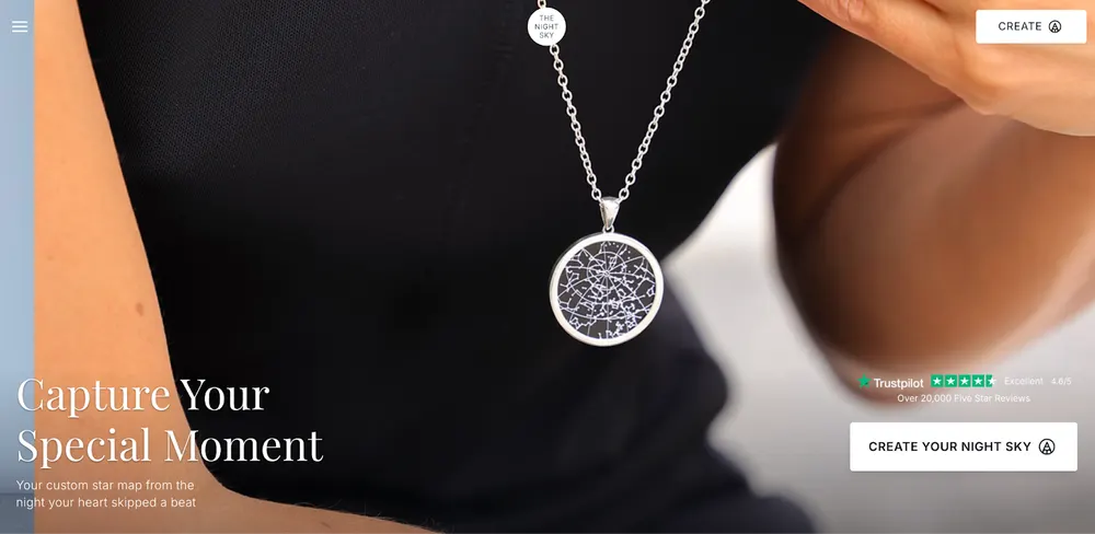
The Night Sky turned publicly available data, namely astronomical charts, into a luxury gift.They have zero inventory costs and their designs are generated by the customer, making the business highly automated and scalable.
- Positioning: Personalized star maps. They sell the alignment of the stars from any specific date and location (weddings, births, anniversaries).
- Marketing: Purely emotional. Their ads don't say "buy a poster"; they say "remember the night we met." They are a favorite for gift guide bloggers and Pinterest home decor influencers.
- Website: Incredibly clean and high-end. Their "star map generator" is built directly into the Shopify storefront, allowing users to enter a date/location and see their unique map change instantly.
- Products: High-quality printed posters, framed prints, and even jewelry featuring the star map.
- Shipping & Returns: Because products are 100% unique to a specific time/place, they do not accept returns, but they offer high-speed "Express" shipping worldwide.
- Customer Profile: Romantic partners, new parents, and sentimental gift-buyers.
The Night Sky Product Page Analysis
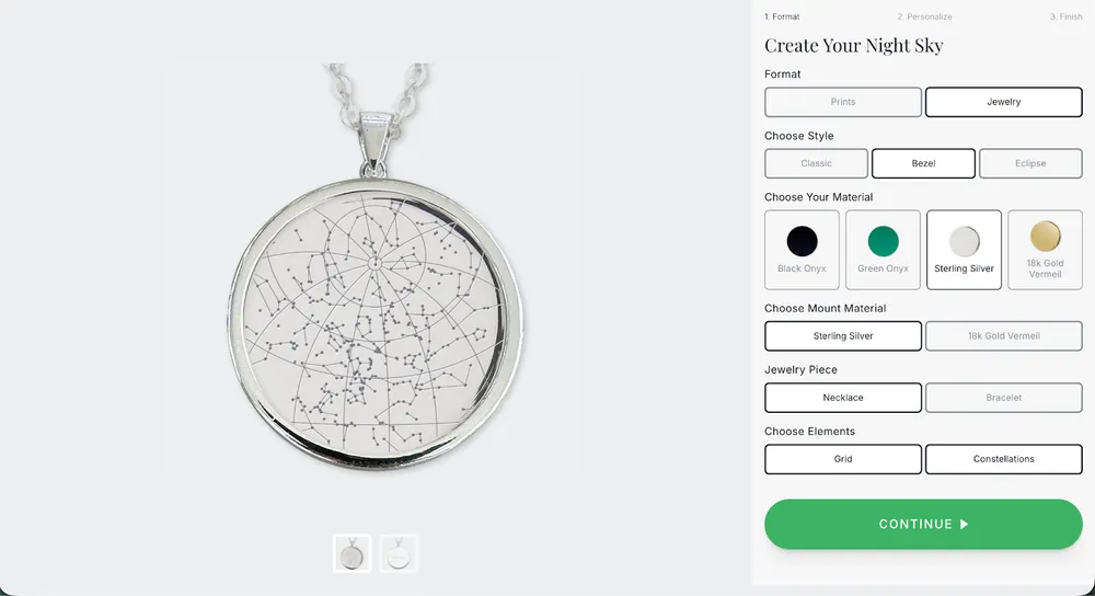
The Night Sky’s product page is basically another guided product builder, and that matches the whole “personalized moment” positioning: stepper flow, instant visual preview, and structured inputs (place, date, optional time, message) turn an emotional gift into a simple checklist.
Here are the steps of the product builder:
1st Step
2nd Step
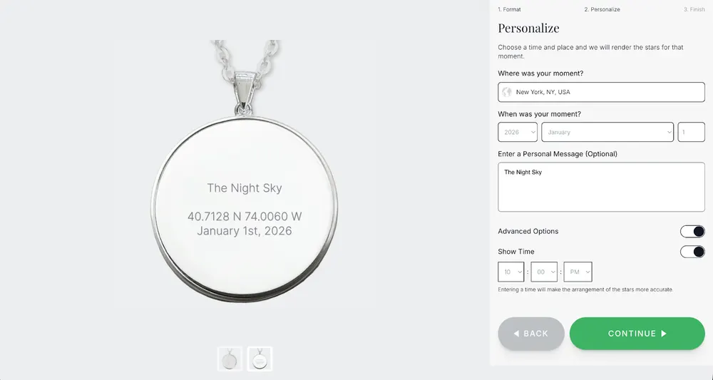
3rd Step
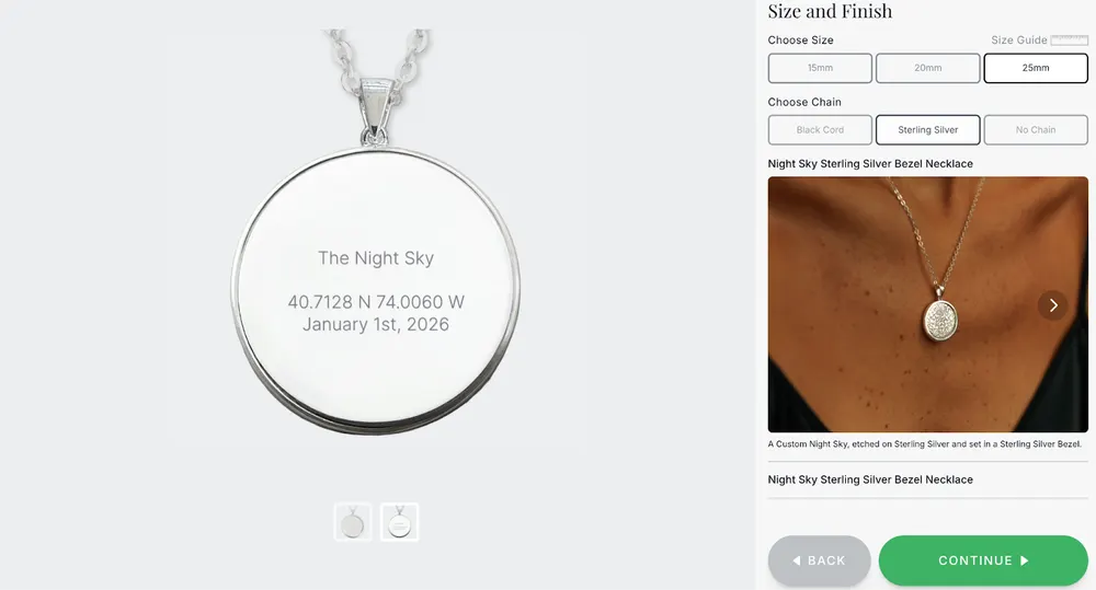
It’s clean and high-trust because it leads decisions in a logical order and keeps the CTA obvious.
Even though I really like the step-by-step builder, The Night Sky has some weak spots too.
For example, it’s option-heavy with its format, style, materials, mount, chain, elements, plus advanced toggles. So, a non-committed shopper can get decision fatigue, and the UI doesn’t explain tradeoffs enough (what “grid vs constellations” changes, why bezel vs classic matters).
Also, key buying reassurance is not front-and-center inside the builder. I am basically talking about the price context, delivery timeline, “no returns because custom” logic. So, you are relying on the funnel to carry confidence instead of answering objections early.
8. Canvas Freaks
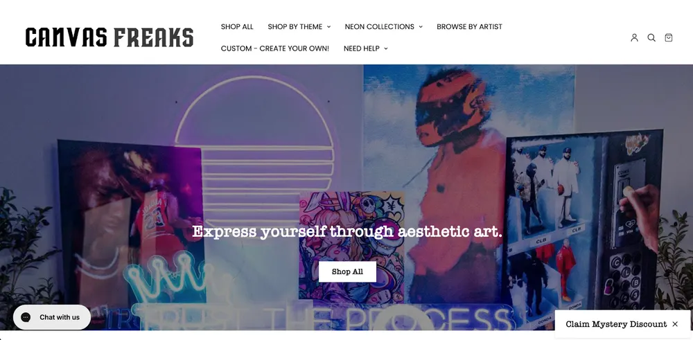
Canvas Freaks focuses on AOV (Average Order Value). they highlight that their products are "Handmade in the USA" and have a "Processing time of 14+ days." In most industries, long wait times are bad. In their business, it signals craftsmanship. They’ve successfully convinced the customer that they aren't just buying a plastic light from a shelf, they are buying a custom-built piece of tech-art.
- Positioning: High-impact, large-scale wall art for modern homes. They position themselves as the "ultimate gallery for your walls," specializing in multi-panel canvas sets that transform a room.
- Marketing: They are masters of Facebook and Instagram advertising. Their ads don't just show the art; they show the art in a room (living rooms, gaming dens, offices). They lean heavily into Retargeting, if you look at one canvas, their ads will follow you with a "10% off" coupon to close the deal.
- Website: The site is designed for Visual Impact. They use high-resolution room mockup software that allows customers to see exactly how large a 5-panel canvas will look over a standard-sized sofa. This removes the size anxiety that often stops people from buying art online.
- Products: Single-panel canvases, multi-panel (3 to 5 piece) canvas sets, and framed posters featuring everything from abstract art to licensed pop culture and motivational quotes.
- Return & Shipping: Since canvases are bulky and expensive to ship, they have a strict "no returns for change of mind" policy, but they offer a 100% Damage Guarantee. If the canvas is scratched or the frame is warped during shipping, they send a replacement immediately.
- Customer Profile: New homeowners, man cave enthusiasts, gamers, and office managers looking to decorate large empty wall spaces.
Canvas Freaks Product Page Analysis
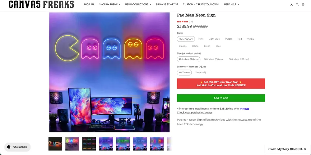
Canvas Freaks’ product page is built like an AOV-focused configurator. Big in-room hero image to kill size anxiety, clear variant selection (color, size, add-on remote), discount banner, and a loud Add to Cart that keeps the purchase decision simple even at a high price point.
The visual approach works because neon is a look product, and the gallery doing lifestyle variants is the main selling asset here.
Some weak spots are the copy under the CTA is thin and generic for a $300–$800 item, so it doesn’t answer the real objections such as brightness levels, power source, mounting, materials, warranty, and estimated delivery timeline.
Reviews exist, but trust could be stacked harder on-page with build-quality proof, close-up detail shots of tubing, and a short “what happens after you order” flow so the 14+ day processing reads as craftsmanship instead of uncertainty.
Aesthetic First Fashion Print On Demand Brands
9. Jolie Noire
Jolie Noire used POD to launch a brand that looks like it belongs in Vogue, proving that print-on-demand is just a fulfillment method, not a brand identity.
- Positioning: Elevating the "Black Girl Aesthetic" through high-end minimalist design.
- Marketing: Storytelling and editorial photography. They market themselves as a "Fashion Label" first, POD store second.
- Website: Extremely sleek, fashion-forward, and minimalist.
- Products: Sweatshirts, joggers, and tees with artistic silhouettes of Black women.
- Return/Shipping: No returns (final sale) except for damage.
- Customer Profile: Women looking for sophisticated, empowering casual wear.
Jolie Noire Product Page Analysis
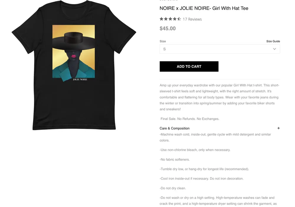
Jolie Noire’s product page does the basics right for a fashion-first POD brand. There is a clean layout, clear price, simple size selection, and the care & composition section adds real credibility because it tells people how to treat the garment instead of hiding behind vibe.
The weak spots are conversion, not aesthetics.
The product imagery is limited to a standard mockup style. There is not enough real-on-body/lifestyle context to sell fit, drape, and fabric. Social proof is light with 17 reviews with no real images that won't carry trust alone, and the main product description is generic and doesn’t specify the stuff shoppers actually decide on.
Also, “Final Sale. No refunds. No exchanges.” feels like a confidence killer.
10. FIERCEPULSE
Fiercepulse wins by rebranding slow print-on-demand fulfillment as "sustainable craftsmanship" and using bold, technical designs to transform a basic commodity into a premium identity statement.
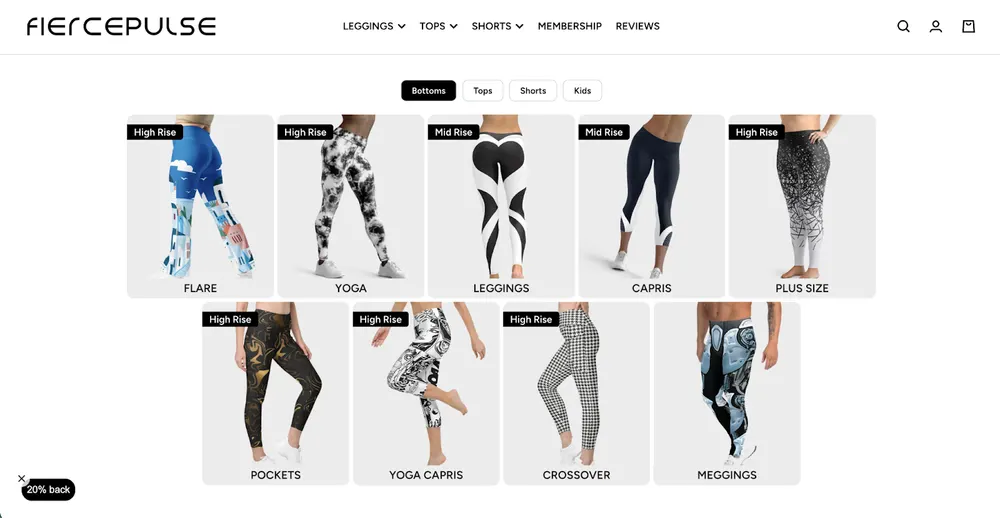
- Positioning: High-performance, bold-patterned athleisure.
- Marketing: Influencer-driven. They focus on the "squat-proof" nature of their leggings and target yoga and fitness enthusiasts who find Nike/Lululemon "boring."
- Website: Clean, "Aspiring-Premium" look with high-quality 3D mockups that look like real photography.
- Products: All-over-print (AOP) leggings, sports bras, and shorts.
- Return/Shipping: No "change of mind" returns due to their sustainable print-to-order model.
- Customer Profile: Women who want to make a statement at the gym.
FIERCEPULSE Product Page Analysis
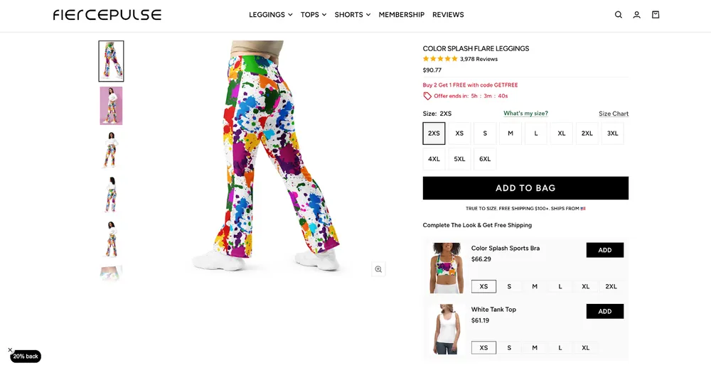
FiercePulse’s product page leans heavily on images and reviews to carry the conversion, and that’s both its strength and weakness. They do have many image variants, including one close-up, which helps visually, but it’s still not enough to explain the product.
There is no real product description: no clear fabric specs, compression level, waistband structure, fit intent, or performance explanation.
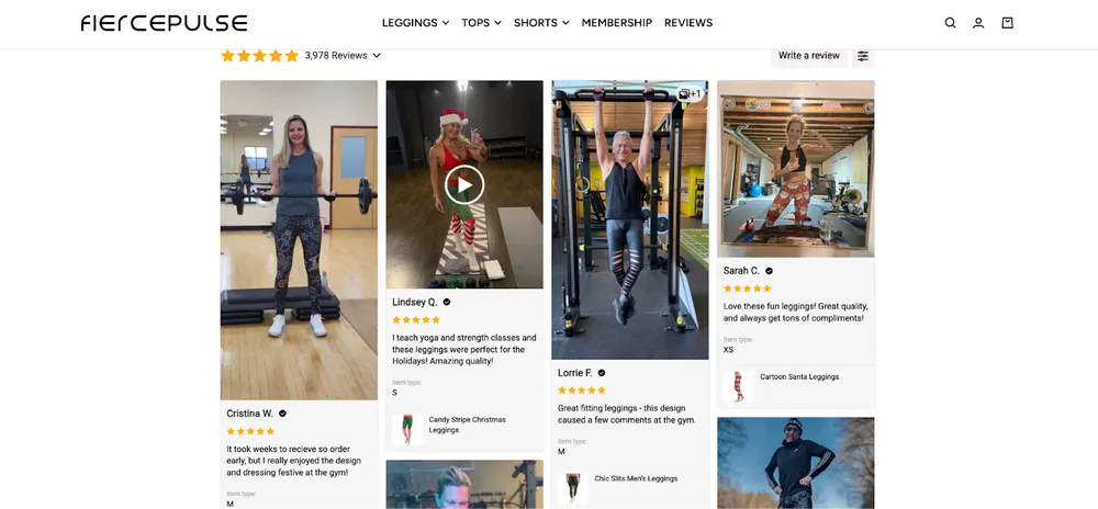
Quality is implied through UGC rather than stated. So the page works mainly because of social proof and visual repetition, not because it clearly communicates what the product is or why it performs well. As a PDP, it’s under-explained and fragile, even if the business itself is doing fine.
11. UMAI Clothing
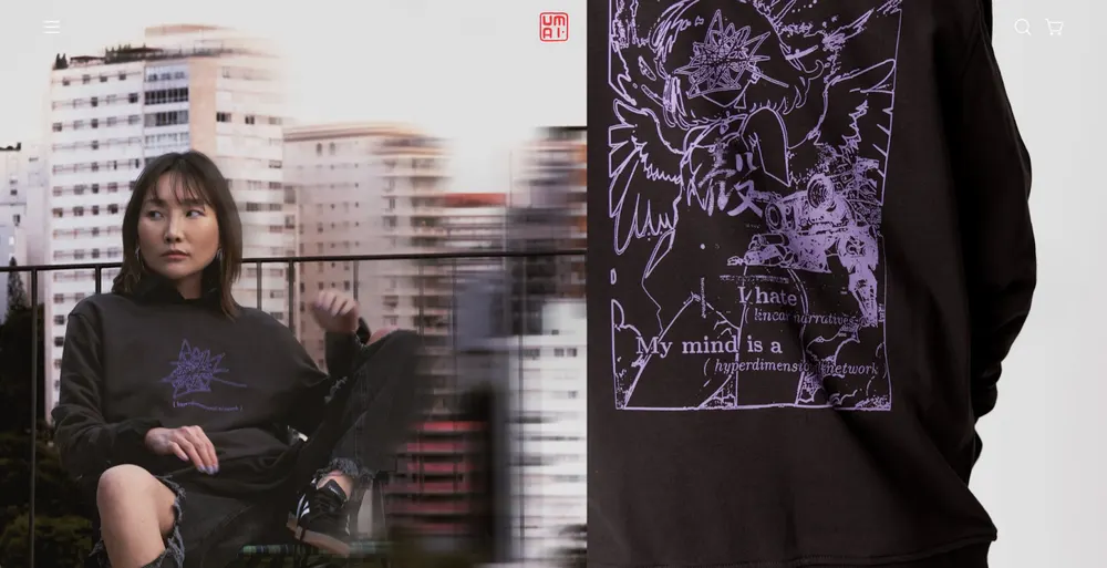
UMAI Clothing occupies the gap between cheap anime merch and high fashion. This paves the way for high profit margins. If you love anime, you should check their products out. They truly stand out with their style.
- Positioning: High-art, "Dark" Anime streetwear.
- Marketing: Collaborations with independent Japanese-style artists. They avoid "generic" anime and focus on "Original Characters."
- Website: Sleek "Dark Mode" design with high-quality lifestyle photography.
- Products: DTG (Direct to Garment) and AOP hoodies and tees.
- Return/Shipping: 30-day quality guarantee.
- Customer Profile: "Mature" anime fans who want high-quality art, not just logos.
UMAI Clothing Product Page Analysis
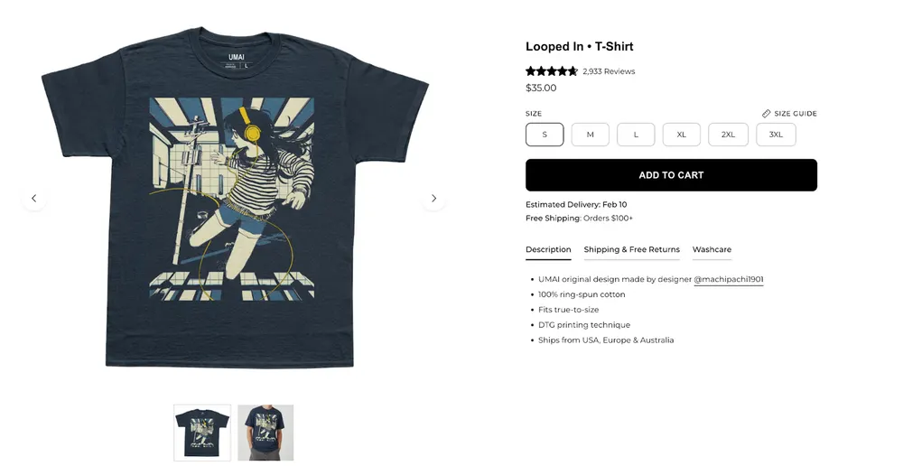
UMAI’s PDP sells “artist-first streetwear” instead of generic anime merch. The product is framed as an original design with credits to the designer. It builds confidence with quick, scannable bullets that remove the usual POD doubts about the fit, print method, where it ships from, delivery estimate.
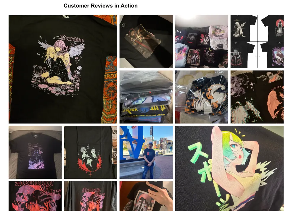
The real conversion engine is the social-proof section.
It has a dense customer reviews in action gallery that shows the prints on real shirts and in real lighting, which makes the art feel legit and premium.
What’s still missing is clearer fabric weight and print durability expectations.
12. Midcentury Style Shop
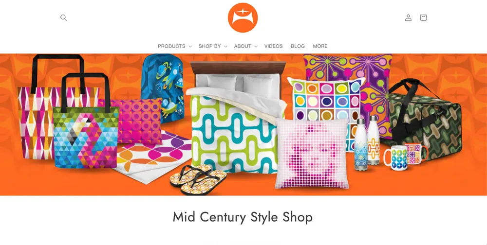
Midcentury Style Shop targets an Aesthetic rather than a demographic. If you love MCM style, you are their customer regardless of age or location.
- Positioning: Retro 1950s/60s "Atomic Age" home decor.
- Marketing: Pinterest and YouTube. They create content around "How to style a Mid-Century home," featuring their own products.
- Website: Color-themed collections (e.g., "The Turquoise Collection") to encourage multiple purchases.
- Products: Pillows, clocks (sometimes non-POD), mugs, and rugs.
- Return/Shipping: Standard POD quality guarantee.
- Customer Profile: Vintage collectors and "Mid-Century Modern" architecture fans.
Midcentury Style Shop Product Page Analysis
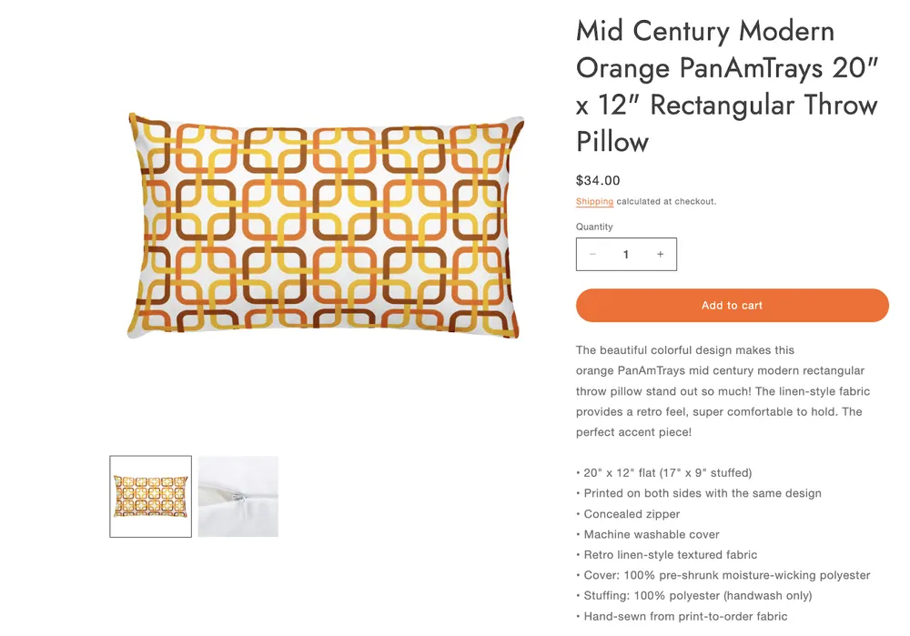
Midcentury Style Shop’s product page works because it removes uncertainty for a decor purchase without over-selling. The specs aren’t there for filler, they answer real buyer questions early with the exact size, fabric feel, washability, zipper, and materials, which matters when you’re buying something meant to live on a couch, not a shelf.
What’s missing is persuasion, not clarity. The page assumes the buyer already wants the style and doesn’t actively push the emotional upside or show how the pillow transforms a space.
With stronger in-room imagery and light social proof, this same structure could convert much harder without changing the aesthetic.
Subculture Print On Demand Brands
13. Bad Monday
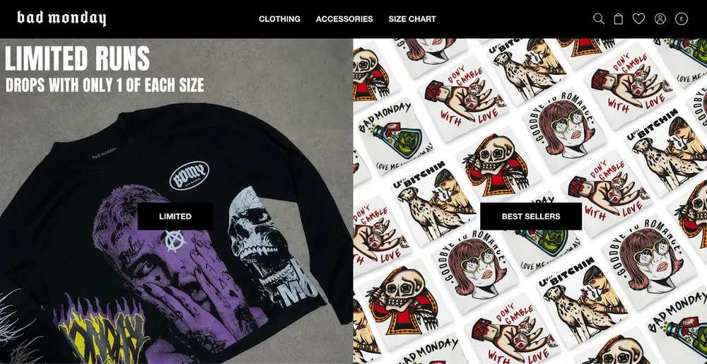
Bad Monday proved that niche art, namely traditional tattoos, can be scaled into a global brand. They don't just put a drawing on a shirt, they build a lifestyle around the art style.
As discussed in the beginning of our post, this is what makes the buyer forget it is just another POD business.
- Positioning: Tattoo-culture streetwear. They bridge the gap between alternative subculture and mainstream fashion.
- Marketing: They utilize "Drop Culture" (releasing limited-run designs to create FOMO). Their Instagram is a masterclass in aesthetic consistency, featuring heavily tattooed models and high-contrast photography that fits the Bad Monday vibe.
- Website: Dark, edgy, and high-energy. It feels like a premium streetwear brand rather than a print-on-demand shop.
- Products: Apparel, hoodies, tees, bombers, featuring "Flash Tattoo" style artwork; skulls, roses, and traditional ink styles.
- Shipping & Returns: 30-day return policy; they offer a "Priority Insured Shipping" upsell at checkout which is a great revenue booster.
- Customer Profile: Young adults (18–35) who are part of the tattoo community or love the alt aesthetic but want high-quality clothing.
Bad Monday Product Page Analysis
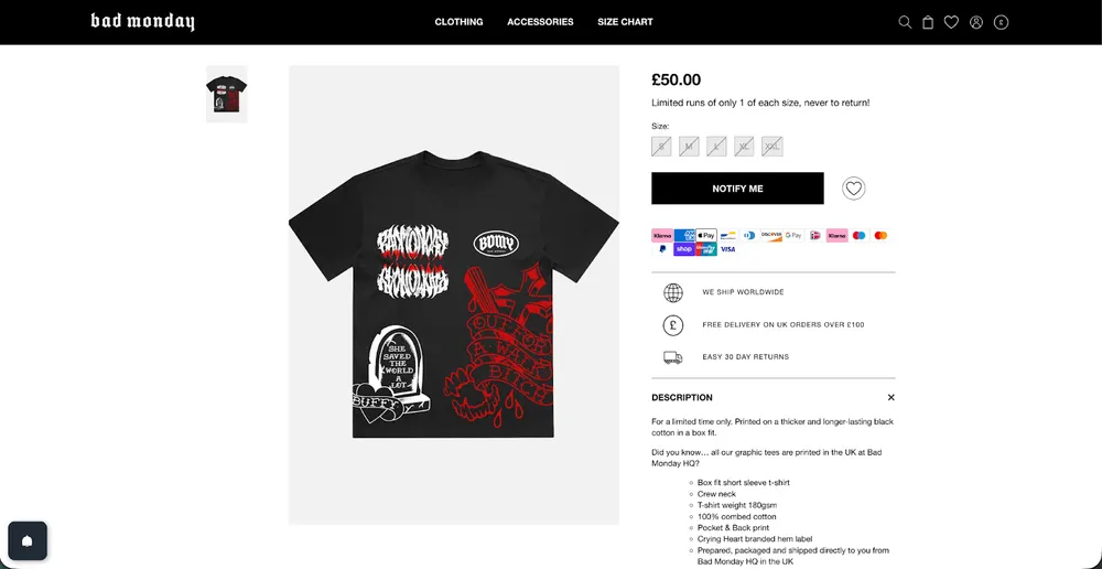
I must say that even though Bad Monday is a great brand, they have a huge room for improvement on their PDP.
Their product page is clean and decisive, but the product description is very minimal and leaves storytelling potential unused, especially given how expressive the designs are.
Similarly, relying on a single primary product image limits how much attitude and detail the artwork can communicate.
With richer descriptions and more alternative visuals showing fit, texture, and styling, the page could better translate the brand’s creative energy into higher conversion, without changing its core aesthetic.
Despite all these, the brand and products are too good to be low on the list considering the creativity and style.
14. Dumbclub
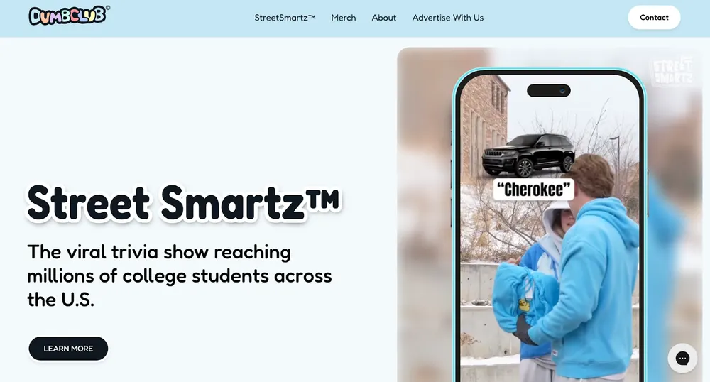
Dumbclub uses embroidery POD through Printful/Printify to create a higher-perceived value than standard ink printing. And honestly, one reason why I love them is because Dumbclub’s genius lies in weaponizing self-deprecating irony and chaotic TikTok anti-marketing to make their brand feel like an exclusive inside joke rather than a corporate business.
- Positioning: Playful, low-stakes streetwear with a focus on "being a bit of an idiot."
- Marketing: Viral TikTok stunt marketing. They film themselves doing silly things in public wearing their "Dumb" hoodies.
- Website: Interactive and energetic with Discord community links.
- Products: Character-driven embroidered and printed apparel.
- Return/Shipping: 14-day policy.
- Customer Profile: College students and Gen Z looking for ironic fashion.
Dumbclub Product Page Analysis
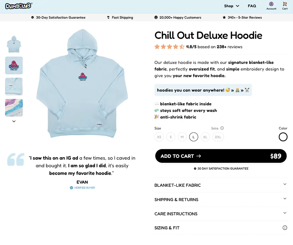
Dumbclub’s PDP is definitely one of my favorites on the list. It is strong because it sells the why and the risk removal right where the decision happens.
Trust bar up top, rating and review count near the title, a short intro that names the real differentiator (blanket-like inside, oversized fit, embroidery), then scannable bullets, clear size and color, and a big CTA with price that’s hard to miss.
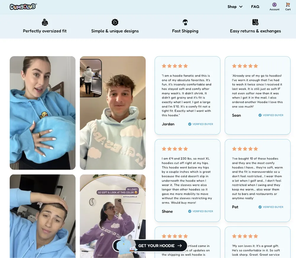
The page keeps reinforcing confidence as you scroll with UGC-style photos, verified-buyer reviews, and collapsible sections for shipping/returns, care, and sizing so objections get answered without cluttering the hero.
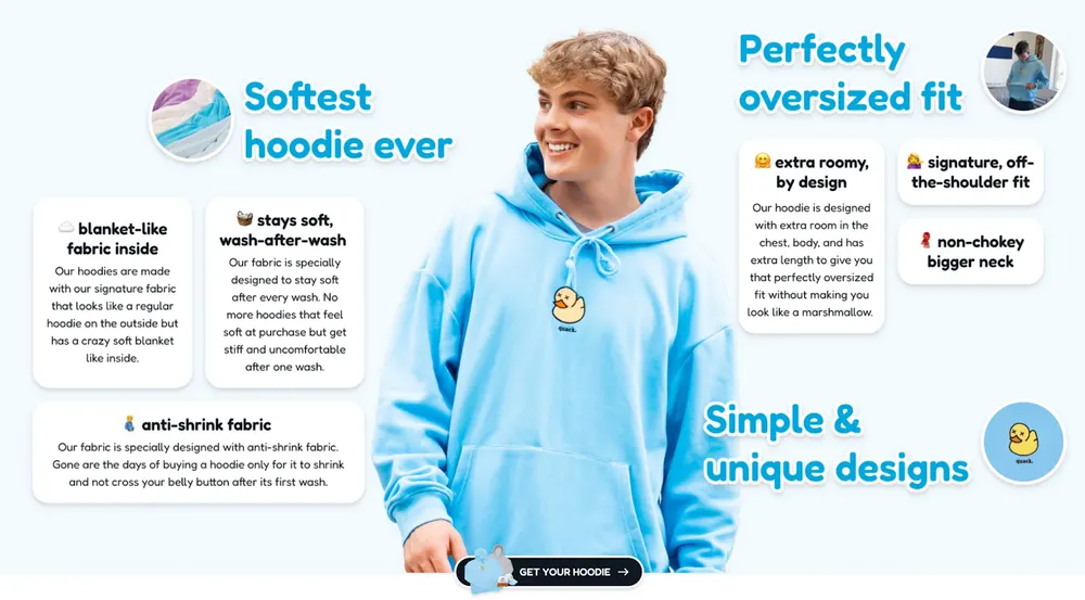
Adding more concrete garment specs would make it a flawless PDP but it is still one of the best on our list.
15. Vapor95
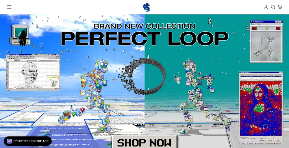
Vapor95 proved that sub-niche mastery is better than broad appeal. Instead of selling cool shirts, they sold the uniform for the Vaporwave community. They even sell physical vinyl records and retro tech to complete the brand world.
- Positioning: The "Home of the Aesthetic." They are the undisputed leaders of the Vaporwave niche. It is a subculture that blends 80s/90s retro-tech, anime, and surreal digital art.
- Marketing: They focus on community and artist advocacy. They have a massive Discord server where fans hang out, and they launch "Artist Collections" where they split profits with the digital artists. This turns their customers into a loyal "street team" for the brand.
- Website: It uses a high-end "Retro-Future" design that makes the visitor feel like they’ve stepped into a video game. It uses high-quality 3D mockups and video backgrounds to create an immersive experience.
- Products: They are famous for All-Over-Print (AOP) apparel. Because their designs are complex digital art, they use sublimation printing so the art covers every inch of the fabric for their hoodies, joggers, blankets, and even kimonos.
- Shipping & Returns: They lean into the slow fashion movement. They clearly state that products are Handmade in the USA and printed to order. This turns a long shipping time, typically 10-14 days, into a quality guarantee.
- Customer Profile: Gen Z and Millennials who are into gaming, Lo-fi music, digital art, and the vaporwave aesthetic.
Vapor95 Product Page Analysis
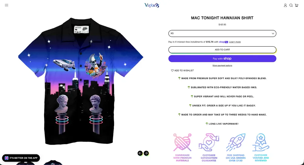
Vapor95’s product page is visually striking and immediately communicates that the design itself is the main value.
The purchase flow is simple and familiar, with clear sizing, payment options, and short bullet points that reassure buyers about print quality, durability, and fit.
The made-to-order messaging also reframes longer delivery times as a deliberate, handcrafted process rather than a drawback.
That said, the page leaves conversion upside on the table.
The product description is very light on concrete specifications, fabric weight, cut details, care instructions, or fit visuals, which could help less core fans feel more confident.
Product imagery is also limited mostly to flat or single-angle views. There’s little sense of how the shirt looks on a body, how the fabric drapes, or how the print behaves in real-world lighting.
I believe that adding lifestyle shots, close-up texture details, and a slightly richer description would strengthen clarity and reduce hesitation, without diluting the brand’s strong visual identity.
16. Rebel Youth
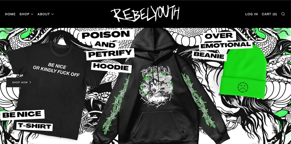
Rebel Youth leverages the founder effect. People buy because they like the creator. It makes the brand copy-proof.
- Positioning: Alternative, "dark-aesthetic" streetwear.
- Marketing: TikTok personal brand. The founder shows the "behind the scenes" of designing and running the business, which creates a deep bond with customers.
- Website: High-contrast, black-and-neon theme that mimics "nightlife/club" culture.
- Products: Hoodies, swimwear, and accessories with "edgy" graphics.
- Return/Shipping: Store credit only for returns (protects profit margins).
- Customer Profile: Gen Z "alt" kids, ravers, and gothic-style enthusiasts.
Rebel Youth Product Page Analysis
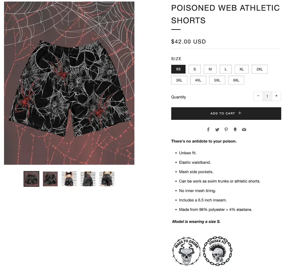
Rebel Youth’s product pages nail the alt brand vibe visually and keep buying friction low.
Powerful visuals, clear sizing, and enough image variants to understand the print and the item.
But the page doesn’t really sell the product beyond aesthetics.
The description misses the stuff people would commit. I am talking about things like fit guidance, material specs in plain terms, care, shipping timeline, and why the price is worth it.
Biggest gap is trust.
There’s basically no social proof on-page such as reviews, UGC, customer photos, or ratings. So, it feels like you’re buying on pure brand energy.
If they added real wear photos, a tighter spec-focused description, and visible reviews, conversion would jump without changing the identity.
Community And Mission-Led Print On Demand Brands
17. Afro Unicorn
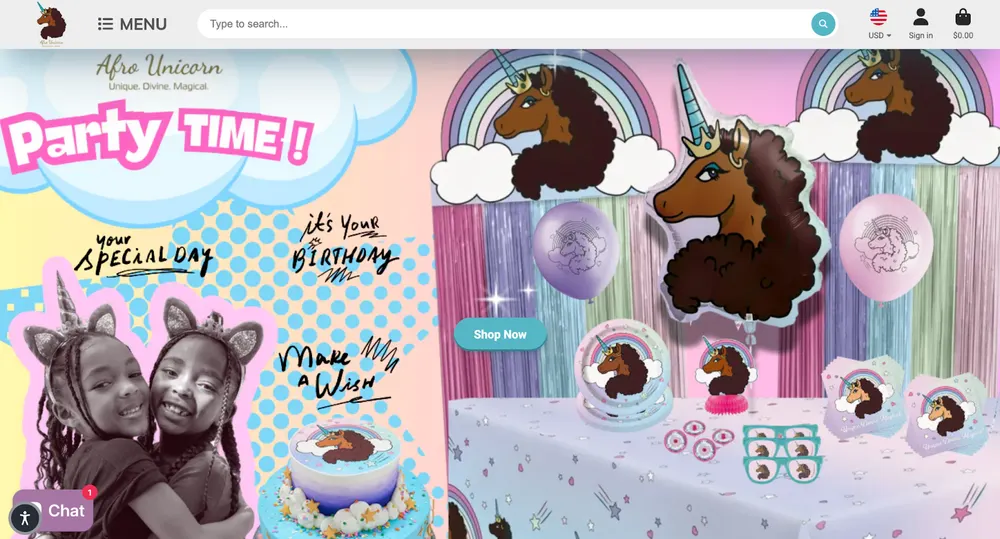
Afro Unicorn, April Showers, noticed that while unicorns were a massive global trend, they were almost always depicted as white with straight hair. She didn't just make a cool design, she identified a systemic gap in a huge market.
She used POD to prove the demand for a Black unicorn. Once she had the sales data from her Shopify store, she took that proof to Walmart, becoming the first Black woman-owned fully licensed character brand to be stocked in over 3,500 stores.
- Positioning: An inclusive "Character Brand" designed to normalize Black beauty and uplift women and children of color through an original unicorn character with an Afro.
- Marketing: They mastered the "Viral Loop." A single video of a little girl wearing an Afro Unicorn shirt went viral, and the founder, April Showers, used that momentum to get the brand into the hands of celebrities like Tiffany Haddish and Alicia Keys. They focus heavily on representation and "Black Girl Magic" as a movement, not just a design.
- Website: High-energy, joyful, and professional. It feels like a licensed media property (like Hello Kitty or Disney), which builds immediate trust with parents.
- Products: Apparel, backpacks, and accessories. While it began as a pure POD shirt shop, it has now expanded into party supplies and toys through massive licensing deals.
- Shipping & Returns: They utilized the POD model to handle their initial explosive growth without needing a warehouse. Now, they use a hybrid model with some items shipping from major retail partners like Walmart and Target.
- Customer Profile: Black women and mothers looking for representation for their daughters, as well as fans of inclusive fantasy art.
Afro Unicorn Product Page Analysis
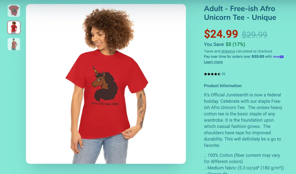
Afro Unicorn’s PDP sells the mission more than the shirt. The value is representation and identity.
I must say that I do love the brand and its positioning but somehow their product page feels off for some reason.
First of all, the the long unstructured product description makes it feel like a generic POD page. The second most important problem that caught my eye is with the readability because of the text and background color.
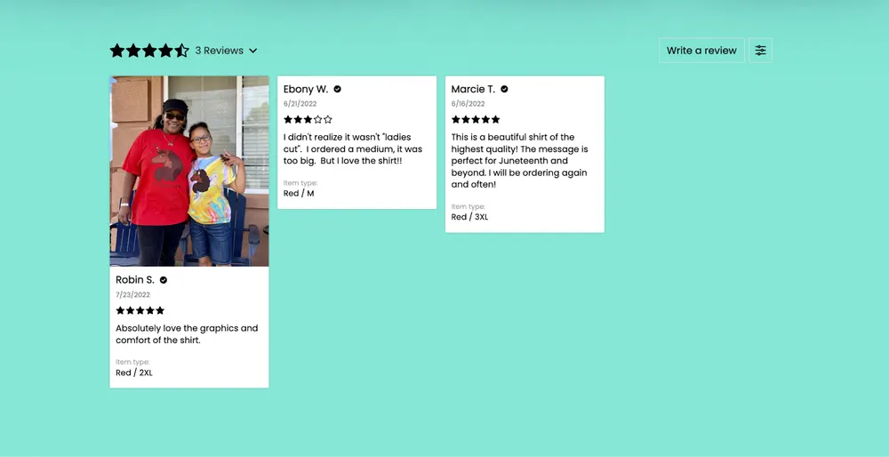
I love that each product has its own reviews, instead of all reviews being dumped into one generic reviews section that ignores differences between products.
18. Own Your Stigma
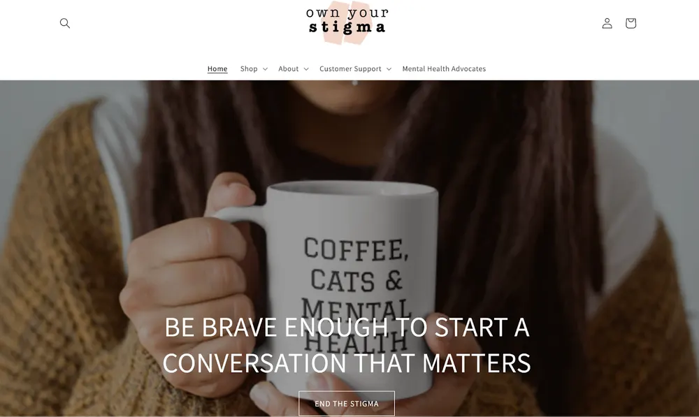
Own Your Stigma sells conversation starters. The shirt isn't just clothing, it's a way for the wearer to signal their values to the world. Honestly, I love the whole concept of Own Your Stigma alongside their products.
- Positioning: Mental health awareness and advocacy.
- Marketing: Advocacy-based. They partner with mental health influencers to discuss "breaking the stigma."
- Website: Minimalist, soothing, and resource-heavy with their blogs on mental health.
- Products: Text-based hoodies and shirts with empowering messages.
- Return/Shipping: Standard POD.
- Customer Profile: People in recovery, healthcare workers, and advocates.
Own Your Stigma Product Page Analysis
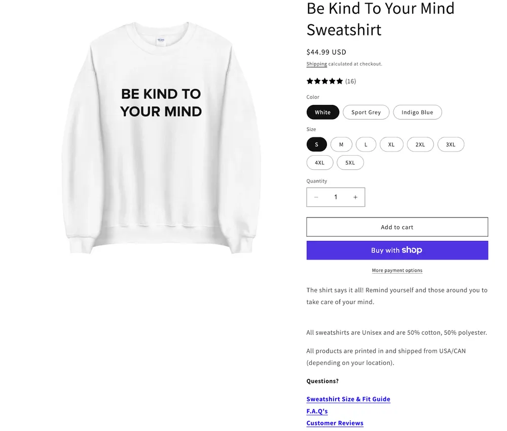
Own Your Stigma’s PDP is clean and low-friction. It has a big product visual, price, variants, straight-to-cart.
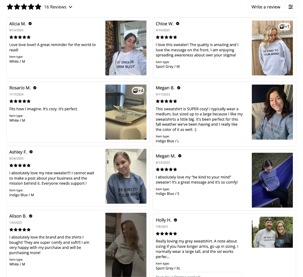
The best part is the trust stack. There are real reviews with photos and sizing notes do a lot of the selling for them.
I think that the problem is that the core “why buy this” section is too thin.
The description basically restates the slogan and leaves out the specs people actually need. The key reassurance like shipping timeline and return rules is pushed into links/secondary sections instead of being obvious where the decision happens.
So it converts off message + social proof, but it’s still leaving money on the table from anyone who needs concrete details before paying.
The weak part is the actual product storytelling.
The description reads very generic with a joke line on top, so they are not selling why this design is special, what the print feels like, how it holds up, or any real fit proof beyond text.
19. The Happy Givers
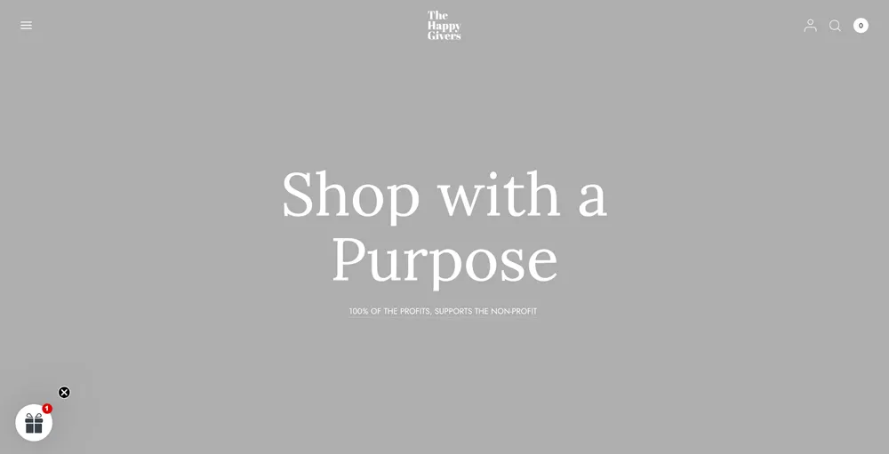
The Happy Givers converted a social mission into a sustainable business model where the product is the good deed. Like many of the other brands on our list, The Happy Givers is another proof becoming successful with your POD business depends on your story and positioning. I love that they directly emphasize “100% OF THE PROFITS, SUPPORTS THE NON-PROFIT” on their homepage.
- Positioning: Non-profit POD store focused on social justice and disaster relief.
- Marketing: Total Transparency. They show photos of the people their sales are helping.
- Website: Trust-centric, featuring badges and impact reports.
- Products: Mission-driven apparel and home goods.
- Return/Shipping: Standard POD; high focus on "Bulk/Group" orders.
- Customer Profile: Socially conscious Christians and activists.
The Happy Givers Product Page Analysis
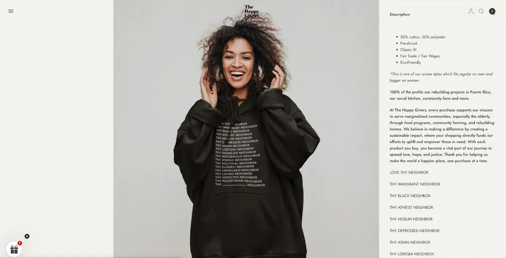
Compared to other brands on our list, I don’t think that The Happy Givers need much of a reviews section on their PDP. You trust them the moment you land on their homepage. When shopping from The Happy Givers, you know that you shop with a purpose and they sell with a purpose.
That said, I like how they clearly show the product details. And I like the whole Love Thy Neighbor concept for this specific product.
20. Classic Dad
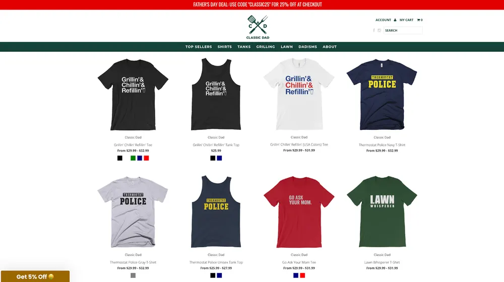
The actual genius of Classic Dad is that they built their community before they built their store. While most POD owners spend thousands on Facebook ads to find an audience, Classic Dad spent years building an audience through free memes. When they finally launched the store, their customer acquisition cost (CAC) was effectively zero. Love it!
- Positioning: The ultimate brand for dad Life tropes. They occupy the space of relatable, nostalgic, and slightly cheesy fatherhood humor such as, "World’s Okayest Dad", "Lawn Whisperer".
- Marketing: They are the masters of Content-First Commerce. They started as a viral social media page Classic Dad Moves posting dad memes. They don’t just run ads, they produce a YouTube series called Lawn Whisperers and maintain a massive organic following on Facebook and Instagram that acts as a 24/7 focus group for new designs.
- Website: A very clean, minimalist Shopify store. Instead of standard categories like men’s or women’s, they use categories like lawn, grilling, and dadisms. This keeps the customer in the dad mindset from start to finish.
- Products: A focused range of apparel such as tees, tanks, headwear, and functional home goods like aprons and coffee mugs. They use Printful as their primary POD partner to maintain high quality without holding inventory.
- Return and Shipping: They offer a very rare "No Questions Asked" 30-day free and easy exchange/return policy. This is unusual for many POD stores and creates trust.
- Customer Profile: There are two distinct groups: Modern Dads (ages 30–50) who embrace the dad identity, and family members looking for the perfect, safe, and funny gift for Father’s Day or birthdays.
Classic Dad Product Page Analysis
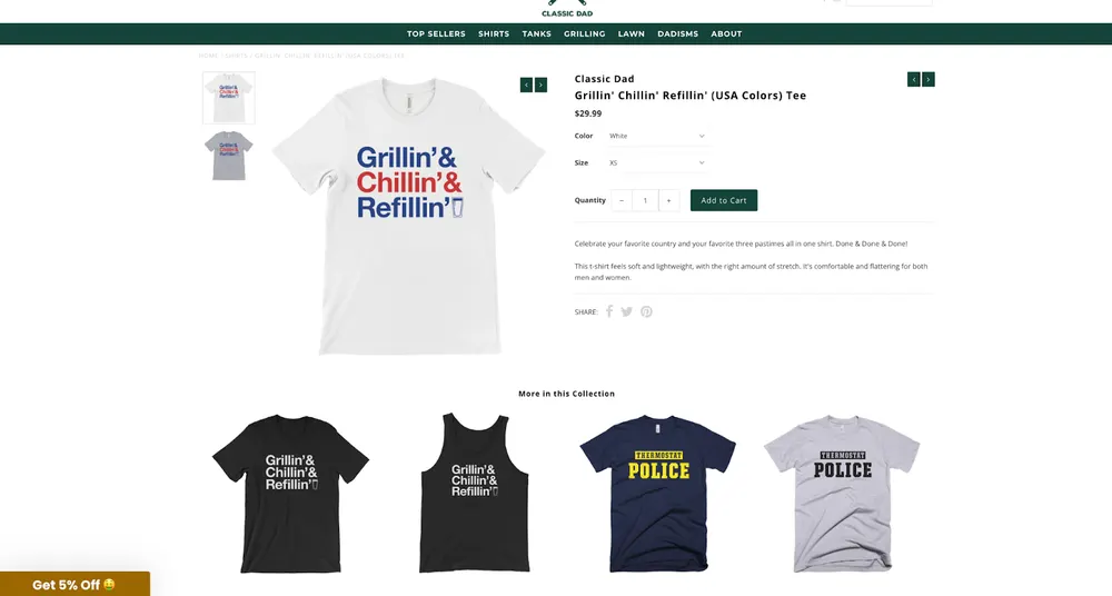
Even though I really like how Classic Dad started as a business, their PDPs are weak, full stop.
There’s basically no real product description, no material specs, no fit guidance, and often no reviews on the page, which kills trust fast.
The page relies almost entirely on brand familiarity and prior exposure instead of doing its job at the point of purchase.
Product images are clean but generic mockups, not convincing lifestyle or detail shots that justify price or quality. It works only because the audience already trusts the brand from social content, not because the PDP converts well.
The pattern behind every winning POD store
Across all twenty, the lesson is the same: the winners make you forget it's print on demand. They lead with a story or an aesthetic, design perceived quality instead of claiming it, and treat the product page as a guided decision, clear positioning, proof that actually helps, and one obvious next step. The fulfillment method disappears; the brand does the selling.
The same playbook, sharp positioning plus a product page that closes, is exactly what drives the best Shopify dropshipping stores. Copy the moves, not the niche. For more teardowns like this, browse our conversion playbooks.
Frequently asked questions
What makes a print-on-demand store successful?
A strong brand narrative paired with a product page that removes doubt. The winners pick one engine, emotion, identity, subculture, or volume, then back it with real reviews, close-up visuals, and clear policies so the buyer never feels the "POD anxiety."
Is print on demand still profitable in 2026?
Yes, but not as a generic catalog. The profitable stores treat POD purely as fulfillment and compete on positioning, perceived quality, and conversion. When the store looks and reads like a real brand, the margins follow.
Shopify dominates this list for a reason: the fastest path to a high-converting, on-brand product page, plus the app ecosystem, reviews, bundles, buy-now-pay-later, that the winners lean on.
How do successful POD stores make products feel premium?
They design perceived quality instead of claiming it, fabric weight, print method, packaging, close-up photography, and lifestyle shots. Specifics beat adjectives every time.
Do I need reviews on a print-on-demand product page?
Almost always. Reviews with real photos answer the two biggest objections, "will it feel cheap?" and "will it fit?", right at the moment of purchase. The few stores here without them are carried by an existing audience, not the page.
For anyone without that built-in community, this page would underperform hard.