Why Is Your E-Commerce Store Getting Traffic But No Sales?
Traffic without orders almost always has a specific, findable cause. Here is how to check whether it is your traffic, your product page, or friction in the buying journey, with the exact reports to look at in Shopify, GA4, Search Console, and Clarity.

Since AI lowered the barrier to entering e-commerce, this question comes up constantly.
"Why is my e-commerce website getting traffic but not any sales?"
I have seen it asked over and over on Reddit recently, and it made me realize something. I have heard it just as often in 10+ years of working on e-commerce growth, and if there is one thing that many different stores across many different years has taught me, it is that there is no single answer.
The reason could be where your traffic is coming from. It could be that you do not have a good product yet. It could be your branding. Or it could be your product pages, which opens up a whole set of sub-problems on its own: the copy, the images, the page structure, the trust signals, and more.
One thing is certain. Every item on that list is a lever that can make or break whether your traffic turns into revenue. So this post walks through each of the reasons that stop traffic from converting, and shows you exactly where to look in the tools you already have to figure out which one is happening to you.
- Check the landing page before you blame the traffic. A blog post converting near zero is normal, not broken. Recalculate your conversion rate using product and collection landing pages only.
- Judge channels on engagement, not sessions. 400 sessions at 70% engagement is worth more than 3,000 at 20%.
- Split your search queries into informational and commercial. "How to..." will never convert and should not be measured as if it could. "Best X" and "buy X" absolutely carry buying intent, so if those do not convert, the page lost a comparison.
- Most stores convert between 1.5% and 3%, but the range runs from under 1% in luxury to 6% in food. Compare against your category, not a single global number.
- Judge each funnel step against its benchmark, not against the raw drop. Losing 90-something percent before the cart is the normal state of e-commerce. Shopify averages 4.6% add-to-cart and 45% checkout completion, so whichever of your steps sits furthest below its own benchmark is the one to work on.
- Filter your session recordings, do not scroll the dashboard. URL contains /checkout, plus rage or dead clicks, plus a minimum session duration, gets you to the broken element in about five recordings.
- Trust signals are invisible in analytics. Hesitant buyers leave without ever firing an event that tells you why.
Let's get into it.
Why Doesn't Your E-Commerce Website's Traffic Convert to Sales?
There are many reasons an e-commerce website's traffic will not convert to sales. Sometimes it is as simple as a broken checkout button. Sometimes it is a friction problem, an extra step, a confusing form, a shipping cost that shows up too late. And in a lot of cases, the honest answer is that you simply do not have good-quality traffic to begin with.
To actually diagnose this instead of guessing, work through it in this order:
- Understand the source of your traffic. Where are people actually coming from, and does that traffic have buying intent?
- Understand which page that traffic is landing on. A visitor who lands on a blog post was never going to buy on that visit. A visitor who lands on a product page is a completely different signal.
- If traffic is not the problem, break the conversion funnel down into stages: sessions, product views, add to cart, checkout, purchase, and find exactly where people fall off.
- Look hard at your product page, the copy, the design, the images, the story you are telling.
- Watch real sessions with a tool like Microsoft Clarity to see, visually, where visitors hesitate and where they drop out.
- Check whether people are reaching checkout but failing to complete it. That is a different, and usually more fixable, problem than never reaching checkout at all.
Top Reasons Why Your E-Commerce Website's Traffic Doesn't Bring You Sales
Let's break down each of the top reasons your traffic is not turning into revenue, and exactly where to check for each one.
1. Your Website Doesn't Have Good-Quality Traffic
This is the first and most important thing to rule out. You may have traffic coming in, but that traffic might not have any intent to buy from you. Two questions matter here, and they are different questions.
Where is your traffic coming from? Someone who lands on your site from a random giveaway page, a bot, or a completely unrelated keyword is not a lost sale. They were never going to buy in the first place. The same goes for an ad that got the click but not the fit, a broad interest-based social campaign, or a piece of unrelated viral content that happened to link to you.
What page is that traffic actually landing on? This is the part people skip. A blog post ranking for an informational keyword can pull in thousands of sessions a month and contribute close to zero direct sales, and that is completely normal. That traffic's job is to build authority and bring people into your funnel over time, not to convert on the first visit. If most of your sessions are landing on content pages instead of product or collection pages, your "traffic but no sales" problem might not be a problem at all. It is a measurement mismatch, and the fix is to split performance out page by page before you panic about the overall number.
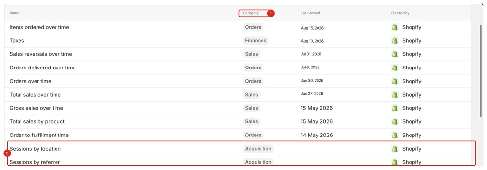
How to check this in Shopify. If you are on Shopify, go to Analytics → Reports. The report you want lives under the Acquisition category (callout 1), and the two that matter here are Sessions by referrer and Sessions by landing page (callout 2). On WooCommerce, BigCommerce, or a custom build the naming differs, but every serious platform ships an equivalent pair, and if yours does not, GA4 below covers it anyway.
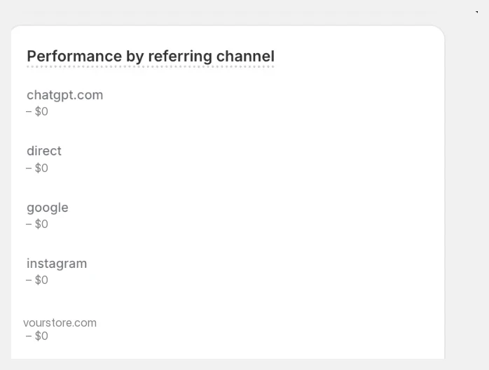
Once you are in Sessions by referrer, you will see a breakdown by channel, and it is worth knowing that this is not just "google" and "instagram" anymore. AI answer engines are already showing up as a referral source for a lot of stores, which is a shift we dug into separately in our report on how AI assistants pick products:
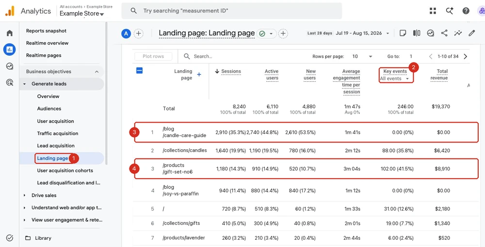
How to check this in Google Analytics 4. Skip the country and city cards. They are the first thing GA4 shows you and they answer a question you almost never have. The report that actually settles this argument is Landing page, because it puts sessions and conversions side by side per URL:
 If your left nav has no Landing page entry, it is filed under the Life cycle or Business objectives collection, depending on which navigation your property was set up with.
Read it in this order:
- Set the Key events dropdown to your actual purchase event (callout 2). It defaults to All events, which quietly counts newsletter signups, add-to-carts, and anything else you flagged as a key event. Left on the default it will tell you a page converts when it does not sell anything.
- Find your highest-traffic landing page and look straight across to revenue. In the example,
/blog/candle-care-guideis the single biggest source of sessions in the account, 35.3% of everything, and it produced zero orders (callout 3). That is not a broken page. That is a blog post doing a blog post's job. - Compare it to a commercial page.
/products/gift-set-no6pulls less than half the traffic and produced $8,910 (callout 4). If you average those two pages together you get a store-wide conversion rate that describes neither of them.
That is the whole trick: your store-wide conversion rate is a blend, and if content pages dominate your traffic mix the blend is meaningless. Recalculate using only sessions that landed on a product or collection URL, and compare that against the benchmarks below.
Two more GA4 moves worth knowing while you are in there. Add comparison (top of any report) lets you hold two segments side by side, so you can ask whether paid social converts worse than organic on the same landing page instead of guessing. And (not set) rows are a tracking gap, not a real page, so exclude them before you do any percentage math.
How to check this in Search Console. Search Console answers the question GA4 cannot: not how many people came, but what they were trying to do when they found you.
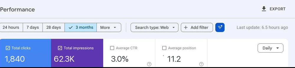 Set the range to 3 months. 28 days is too noisy to read intent off.
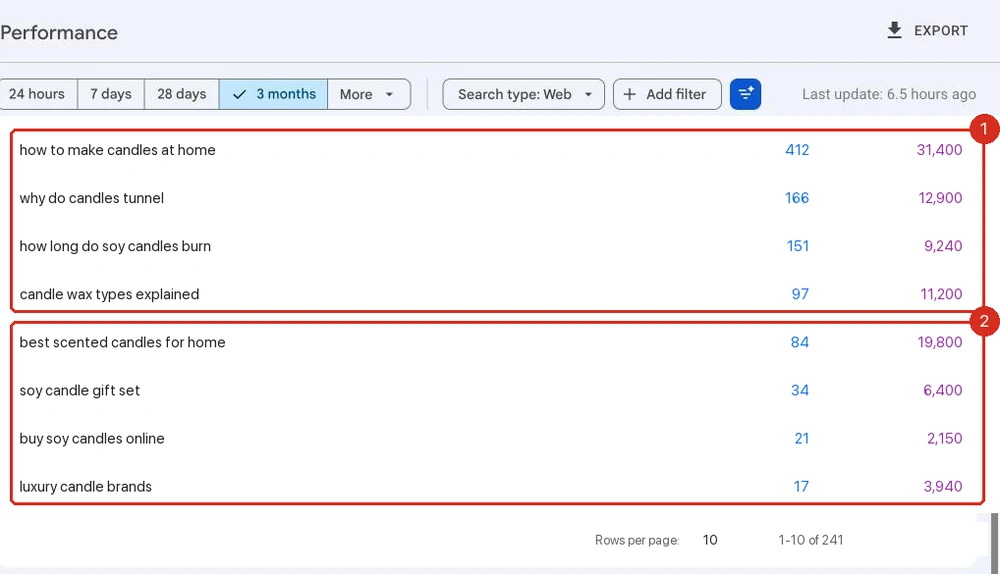
Now split that list into two buckets, because they are not the same traffic and they should not be judged the same way.
Group 1, informational queries (callout 1). "How to make candles at home", "why do candles tunnel", "how long do soy candles burn". Nobody searching these is buying today. They are learning. That traffic is doing real work for you in awareness and authority, but it will never post a decent conversion rate, and holding it to one is how people talk themselves into believing their store is broken.
Group 2, commercial queries (callout 2). "Best scented candles for home", "soy candle gift set", "buy soy candles online", "luxury candle brands". These absolutely carry buying intent. "Best X" in particular is late-stage comparison shopping, someone deciding between options with a card in hand, and it is one of the most valuable query types in e-commerce. If these queries bring people in and they still do not buy, that is not a traffic problem at all, that is your page losing a comparison it was invited to.
Then do the arithmetic that most people skip. In the example above, group 1 pulls 826 clicks and group 2 pulls 156. Roughly 84% of this store's search traffic was never going to check out on that visit. A store in that position does not have a conversion problem, it has a traffic-mix problem, and the fix is ranking for more of group 2, not redesigning the product page.
Use the Add filter control at the top of the Performance report to make this fast: filter queries containing "how", "why", or "what" to size group 1, then invert it. And once you know which commercial queries you actually want, it is worth watching your position on them week to week, because a slip from position 4 to 9 on a "best X" term reads exactly like a conversion collapse in your store analytics.
So what counts as "good" traffic? There is no universal number, but published 2026 benchmarks converge in a fairly tight band once you account for methodology differences. IRP Commerce puts the average at 1.70%, Dynamic Yield's global figure is 2.66%, and across 2,800 Shopify stores Littledata measured 1.4%.
In plain terms, most healthy stores convert somewhere between 1.5% and 3% of sessions into orders, and that range shifts a lot by category. Food and beverage and arts and crafts sit at the high end (4 to 6%), while luxury and baby products sit well under 1%. If you are getting real, on-intent traffic to your product pages and you are converting meaningfully below your category's number, traffic is not your problem anymore. Move to reason 2.
2. Your Product Pages Aren't Good Enough
If your traffic checks out, real people, real intent, landing on the right pages, and you are still not converting, the next place to look is the page itself.
This is a big bucket, worth breaking down rather than treating as one problem:
- The copy. Does it answer the visitor's actual question ("is this for me, and why should I trust it"), or is it just a spec sheet? Thin, templated descriptions are the single most common version of this, and also the easiest to fix at scale with copy generated from real product context.
- The images. Do they show the product being used, at scale, from the angles a buyer needs in order to decide? Listings that lean entirely on supplier stock photography underperform, which is why so many stores end up producing their own visuals instead.
- Trust and social proof. Reviews, ratings, "as seen in", return policy, security badges. Buyers who do not know your brand look for these before they look at anything else.
- The story. Why does this product or brand exist, and why should this visitor care? The print on demand brands worth studying all win on this one, not on fulfillment.
- Section order. Is the thing that closes the sale (reviews, guarantee, size or fit info) buried below three sections nobody asked for?
- The second offer. Once someone has decided to buy, the page should make the bigger basket the easy choice. A subscribe-and-save option, a multi-pack, a bundle with the obvious companion product. This is the cheapest revenue on the entire page and most stores simply do not have it.
Read as a list those six points are abstract, so here is a full product page with each of them marked where it actually sits. Open it to see the whole thing full size, the last two markers are further down the page:
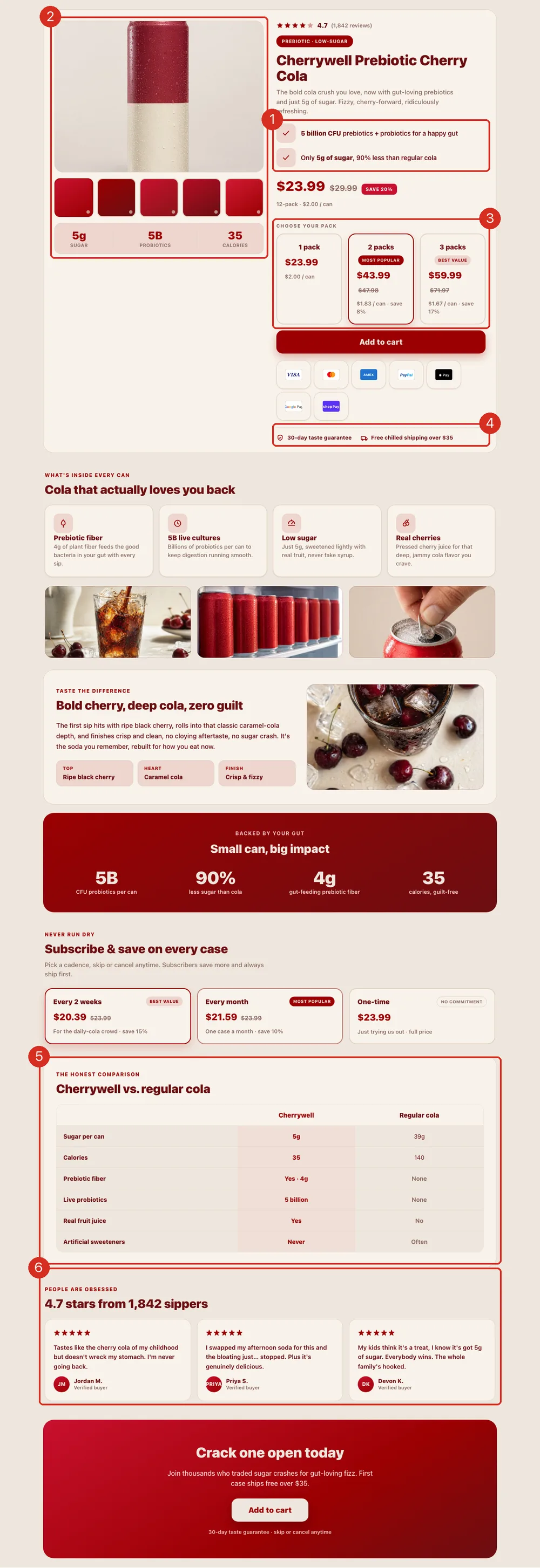
- The copy does not describe the product, it answers the objection. "5g of sugar, 90% less than regular cola" is the same fact as "low sugar" with the doubt removed.
- The images carry the weight the copy cannot. One hero shot is not enough; the strip underneath is the product in the hand, in the fridge, poured over ice.
- The second offer sits directly above the buy button, which is the one moment the shopper has already decided. Three pack sizes, the middle one flagged as most popular, the single pack still there for anyone not ready. Nobody is pushed, but the bigger basket is the path of least resistance, and the per-unit price does the arguing.
- The trust row sits under the buy button, exactly where the hesitation happens, not in the footer where most stores put it.
- The story is the honest comparison. Naming what you are being compared against, and losing a row or two, is more convincing than claiming to win everything.
- The proof is a review wall with names and a real count, placed after the argument has been made rather than buried at the bottom of the page.
The reason so many stores leave this bucket unfixed is that doing it by hand across a full catalog does not scale. Rewriting one page is an afternoon. Rewriting four hundred is a quarter.
That is the gap BrandyBee was built for. It reads your market before it writes anything, scanning what rival domains rank for so the gaps between their pages and yours become the brief rather than a blank prompt.
From there it rebuilds the page end to end: copy, structure, images, and the meta fields underneath, all generated against your brand's actual voice so the output still sounds like you wrote it.
It also checks the layer most merchants never look at. If your feed data is quietly failing Google's requirements, the page never gets distributed in the first place, and no amount of on-page work fixes a product that is not being shown.
The page above is one of the templates, and the point is not the layout. It is what fills it. The bullets come from your real product data, the comparison rows from what competitors actually rank for, and the section copy from the questions people are genuinely searching, which is the same Search Console data you were reading two sections ago.
If you would rather assemble pages yourself, that is a legitimate route too, and we compared the main Shopify page builders on price, page weight, and what each one leaves behind in your theme.
3. Friction Is Killing Your Checkout
This is the one that is easiest to prove and easiest to miss, because your traffic and product numbers can both look fine while this quietly eats your revenue.
Read your Shopify conversion funnel first. Under Analytics → Reports → Conversion rate breakdown, Shopify shows you sessions all the way through to completed checkout, stage by stage:
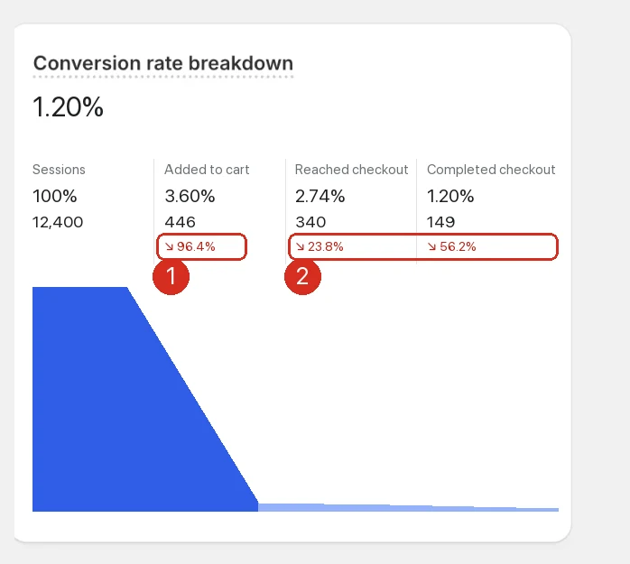
Do not just read the final number, and do not judge the drops against your gut. Judge them against published benchmarks, because the raw shape shocks everyone the first time and most of it is completely normal.
Three anchors are worth having in your head:
- Add to cart. The global average is around 6%. Littledata's Shopify-specific figure is lower still, 4.6% on average, with the top 10% of stores above 9.6%.
- Checkout completion. Of the people who reach checkout, about 45% finish on Shopify.
- Cart abandonment. Roughly 70% across all e-commerce, mostly over unexpected costs at checkout.
Read those numbers again, because they reframe the whole picture: losing 90-something percent of your traffic before the cart is the normal state of e-commerce, not a symptom. That is why the raw funnel is not the finding. The finding is which of your steps sits furthest from its benchmark.
Take the example above. The 96.4% who never add to cart (callout 1) looks catastrophic, but at 3.60% this store is only a little under Shopify's 4.6% average, so it is underperforming rather than broken. Now look at the two later steps (callout 2): 76% of people who add to cart go on to reach checkout, and 44% of those finish, against a 45% benchmark. The back half of this funnel is behaving exactly as expected.
So the diagnosis is the product page, and reason 2 is where the work is. Had the numbers fallen the other way, with a normal add-to-cart rate and checkout completion well under 45%, the answer would be friction instead: a forced account creation, a confusing cart page, shipping costs that appear too late, too few payment options, or a checkout that is simply slow to load.
One caveat that ruins a lot of these comparisons: seasonality. A florist in February or a gift shop in December will post add-to-cart and conversion rates they cannot hold in a normal month. Compare like for like, either against the same month last year or against a stretch with no peak in it, otherwise you will diagnose a problem that is really just August.
Then go watch it happen with Microsoft Clarity (or Hotjar, or any session-replay tool). Numbers tell you that people are dropping off. Session replay and heatmaps tell you why:
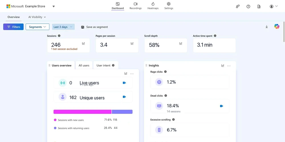
Two metrics on that dashboard are worth watching specifically:
- Dead clicks. Visitors clicking on something that does not respond. A high dead-click rate concentrated on your checkout or add-to-cart button usually means something is broken, not just unpersuasive.
- Rage clicks. Repeated, rapid clicking in the same spot. This is one of the clearest frustration signals a tool like Clarity gives you.
But the dashboard on its own is just a number wall, and this is where most people stop. The value is in the Filters panel, because it lets you cut the recordings down to the exact sessions worth watching instead of scrubbing through hundreds of them:
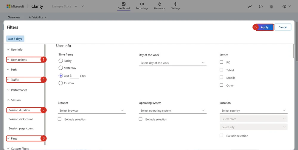 The Filters button sits top left on both the Dashboard and Recordings tabs.
Four filter groups do almost all the work, and they combine:
- User actions (callout 1) holds the frustration signals: rage clicks, dead clicks, excessive scrolling, quick backs. Ticking one of these leaves you with only the sessions where it happened. There is also a Page scroll depth min and max in here, which is how you find people who read the whole page and still left.
- Session → Session duration (callout 2) is your junk filter. Set a maximum of about 5 to 10 seconds and you are looking at bounces, bots, and misclicks, which tells you how much of your "traffic" was never real. Invert it, set a minimum of two or three minutes, and you get the opposite and far more useful group: people who genuinely considered buying and did not. Those recordings are the most valuable thing in the tool.
- Page (callout 3) filters by URL. This is how you stop looking at your whole site and start looking at the one step that is bleeding, for example only sessions that reached
/cartor/checkout. - Traffic (callout 4) filters by source, campaign and referrer, so you can check whether one specific ad set behaves differently from everyone else once it lands. If a campaign's sessions are all sub-10-second bounces, you have found where your budget is going.
Then hit Apply (callout 5) and switch to the Recordings tab.
The recipe that finds broken checkouts fastest is stacking three of them at once: Page contains /checkout, plus rage clicks or dead clicks, plus a session duration minimum. That leaves you with a short list of people who reached the last step, stayed long enough to be serious, and got angry at something. Watch five of those recordings and you will usually know exactly which element is broken.
The same stacking logic works in GA4 with Add comparison, and in both tools the principle is identical: an unfiltered dashboard describes an average customer who does not exist. Filter until you are looking at one specific failing behaviour, then go read the page yourself.
Finally, check whether people reach checkout but cannot finish it. This is different from never reaching checkout, and it is usually a smaller, much more fixable list of suspects. A payment method that is declining more than it should, a shipping calculator that returns no valid options for certain addresses, a discount code field that blocks submission when it is left empty, or a required field that is not clearly marked. This is the highest-leverage fix on this entire list, because these visitors already decided to buy. You just have to get out of their way.
4. You're Missing Trust Signals
Especially if you are a newer or unfamiliar brand, visitors are silently running a checklist before they hand you their card. Is this a real business? Will my order actually arrive? Can I return this if it is wrong? If your page does not answer those questions, hesitant buyers leave, and they leave without telling you why.
That last part is what makes this reason so easy to miss. There is no "lost trust" event in any analytics tool. But there is a fingerprint, and you can read it in GA4 under Pages and screens:
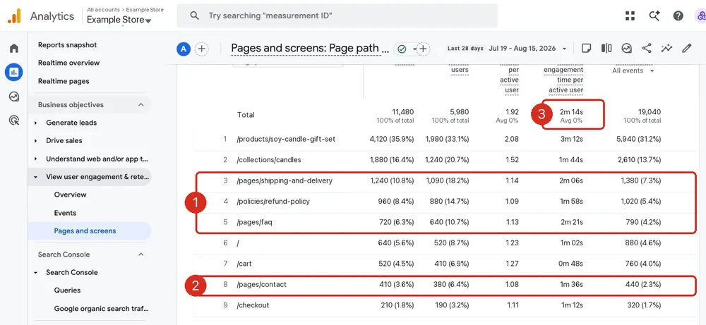
Look at what people are reading (callout 1). Shipping, refund policy and FAQ together pull 2,920 views, roughly a quarter of everything, and they hold people for around two minutes each (callout 3). Add the contact page (callout 2) and it is clearer still: a large share of this store's traffic is not shopping, it is investigating. They want to know what happens if the candle arrives broken, and the product page did not tell them, so they went hunting.
Every one of those detours is a chance to lose the sale. Some of those people find the answer and come back. Many close the tab.
The fix is not to delete the policy pages, it is to stop making people go and find them:
- Put the answer where the doubt is. Delivery window, return window and guarantee belong next to the buy button, not three clicks away. That is exactly the trust row marked in the product page further up this article.
- Show reviews with a real count, not a lone star icon. "4.7 from 1,842" is a different claim than five stars with no number.
- Make the business look real. Genuine contact details, recognizable payment badges, and any certifications or press you have actually earned.
None of this is honesty theater. It is removing the reason a genuinely interested buyer talks themselves out of the purchase. The dropshipping stores that scaled past the lookalike phase almost all over-invest here, precisely because they start with zero brand recognition.
A useful sanity check while you are in Clarity: filter to sessions with a long session duration that produced no purchase. People who read your whole page, twice, and still left are almost never a copy problem. They are a confidence problem.
5. Technical Issues You Haven't Noticed
Slow load times, a broken mobile layout, an app conflict that silently breaks your "Add to cart" button on one specific browser, a size chart that will not open on iOS. These cost you sales without ever showing up as "low traffic quality" or "bad product page" in your analytics. They just show up as a conversion rate that is mysteriously worse than it should be.
Start with a Lighthouse run on your best-selling product page. It is built into Chrome (DevTools → Lighthouse), and PageSpeed Insights runs the same thing in the browser if you would rather not open DevTools. Always test the mobile profile first, because that is where stores lose:
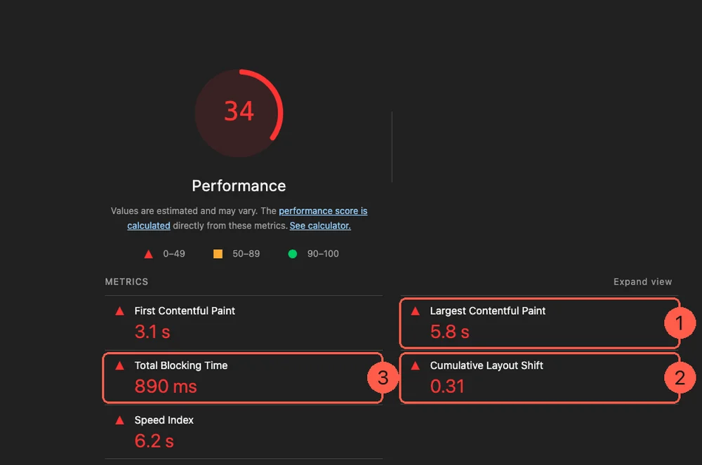
Three numbers on that report matter more than the score itself:
- Largest Contentful Paint is how long until the shopper sees your main product image. At 5.8 seconds most of them have already gone back to the search results. Under 2.5 seconds is the target.
- Cumulative Layout Shift is how much the page jumps while loading. At 0.31 that is a page where the buy button moves under your thumb as you reach for it, which on mobile means mis-taps and abandoned sessions. Under 0.1 is the target.
- Total Blocking Time is how long the page ignores taps because a script is busy. 890 ms is the difference between "this feels cheap" and "this feels solid".
But Lighthouse is a lab test: one page, one simulated device, on your machine. It tells you the page can be slow, not that it was slow for the person who left. That is what Clarity's Performance filter group is for, and this is the part almost nobody uses:
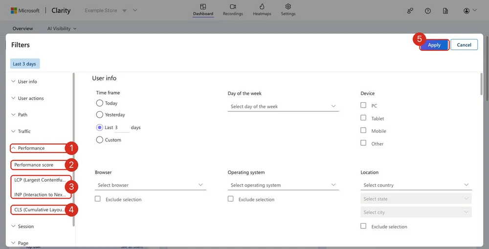
Clarity records the real Core Web Vitals of real sessions, so you can filter to the people who actually got the bad experience: LCP (callout 3) for the ones who waited, INP for the ones whose taps did nothing, CLS (callout 4) for the ones whose page jumped. Set the filter, hit Apply (callout 5), then open Recordings and watch what those specific visitors did next. Usually they leave, and now you have it on video rather than in a spreadsheet.
The two tools answer different questions and you need both. Lighthouse tells you what to fix. Clarity tells you how many real people hit it, and on which pages.
One blind spot worth naming: most merchants audit product pages and never look at collection pages, even though those often carry the broader search traffic. Category page performance is its own diagnosis, and it is worth running the same checks there once your product pages are clean.
Bringing It Together
If your traffic is getting to your site but not converting, do not jump straight to "I need more traffic" or "I need a redesign." Work the list in order.
- Confirm your traffic actually has buying intent, and check which pages it is landing on, using Shopify Analytics, GA4, and Search Console.
- Read the shape of your conversion funnel to find where people drop off, using Shopify's Conversion rate breakdown.
- Watch real sessions to find out why, using Microsoft Clarity or a similar tool.
- Fix product page, trust, and technical issues in the order your data actually points to, not the order you assume.
There is no universal fix, because there is no universal cause. But there is always a specific, findable one, and now you know exactly where to look for it. If you want to keep going, the rest of our conversion writing covers the individual pieces in more depth.
Frequently asked questions
What is a good e-commerce conversion rate?
Most published 2026 benchmarks put the average somewhere between 1.4% and 2.7%, with most healthy stores landing in a 1.5% to 3% range. It varies a lot by category: food and beverage and arts and crafts convert at 4 to 6%, while luxury and baby products often sit under 1%. Compare yourself to your category, not to a single overall number.
Why is my store getting traffic but no sales?
There is rarely one cause. Work through it in order: confirm your traffic has real buying intent and is landing on the right pages, check your product page for copy, image, and trust-signal gaps, then look for friction in your cart and checkout using your platform's conversion funnel report and a session-replay tool like Microsoft Clarity.
Does blog traffic count toward my conversion rate?
Not in a meaningful way, and it should not be measured the same way as product page traffic. Blog and informational content brings in visitors who are researching, not buying, and its job is awareness and search visibility, not an immediate sale. Segment your conversion rate by landing page so blog traffic does not distort the number.
What's the difference between Shopify Analytics and Google Analytics 4 for this?
Shopify Analytics is built around your store's own transaction data, so it is the fastest place to see your conversion funnel and referrer-level sales. GA4 is stronger for cross-channel comparison, engagement metrics like engagement rate, and geographic breakdowns. Most stores need both: Shopify for what happened, GA4 for which channel actually earned it.
How do I know if it's a traffic problem or a checkout problem?
Look at your conversion funnel's shape, not just the final number. A big drop between sessions and product views points to a traffic-quality or landing page problem. A big drop between add-to-cart and reached-checkout points to friction. A drop at reached-checkout without completion points to a checkout-specific bug, often a payment or shipping issue.
Can AI tools like ChatGPT actually send me traffic?
Yes, and it is growing. AI answer engines are already showing up as a referral source in Shopify's and GA4's channel reports for a lot of stores, alongside organic search and social. It is worth checking your referrer report specifically for this rather than assuming all non-search traffic is social.