Lifestyle or White Background: What Should a Meta Product Ad Image Show?
Every guide says to test both. I looked at 45 product ads that have run on Meta for six months or more to see what the image actually shows, and what to put in yours.

"Should my Meta ad show the product on a white background or in a lifestyle scene?" is one of the most asked questions by anyone who has just started running Facebook and Instagram ads for a physical product. Almost every answer ends the same way: test both and see.
That is true and not much help when you have one product, a small budget and no designer. So I went and looked at what real stores are actually running.
One limit first: this is about Meta, meaning Facebook and Instagram. Google works differently. Shopping ads take their image from your product feed, and search ads have no product image at all, so what runs well on Meta does not carry over one to one.
I searched Meta's Ad Library for image ads in two product areas, jewelry and home decor, using searches like gold necklace, silver ring, wall art and throw blanket. I kept the ads with a Shop now button that have been running since before April 2026, so six months or more, and I kept one ad per advertiser. That left 45 stores, after I dropped three that were not jewelry or decor at all: a reptile food shop, a romance novel and a mineral dealer.
An ad that keeps running is not proof that it works. Plenty of ads run for years because nobody switched them off. But a store that pays for an ad every day for half a year is at least not losing money fast enough to notice, so I treat it as a hint, not a verdict.
- The most common image is the product on its own. 19 of the 45 ads show the product alone, on a plain or lightly styled background.
- Lifestyle is not the default. 11 show the product in a staged room, 5 on a person. The choice follows what the product is, not a trend.
- Show the product the way it is used. Jewelry and clothing sit on a body, decor sits in a room, and small or simple items sit alone.
- Long running is a floor, not a ceiling. Several of the longest runners are plain. Copying them gets you an ad that survives, not one that wins.
- Do not test ten images. On a small budget compare two clearly different ones, and check the page before blaming the image.
The product on its own is still the most common ad
19 of the 45 show the product alone. Nothing around it, or only a flat colour or a soft surface behind it.
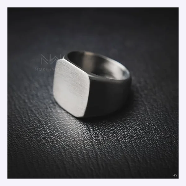
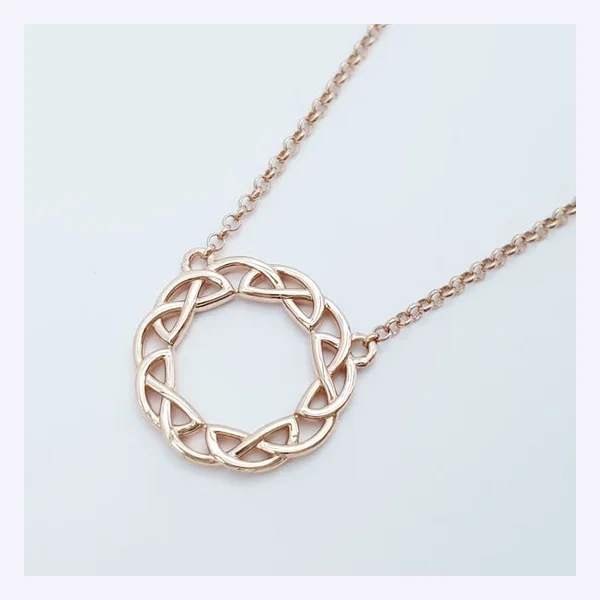
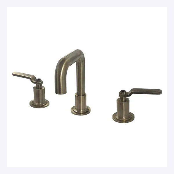
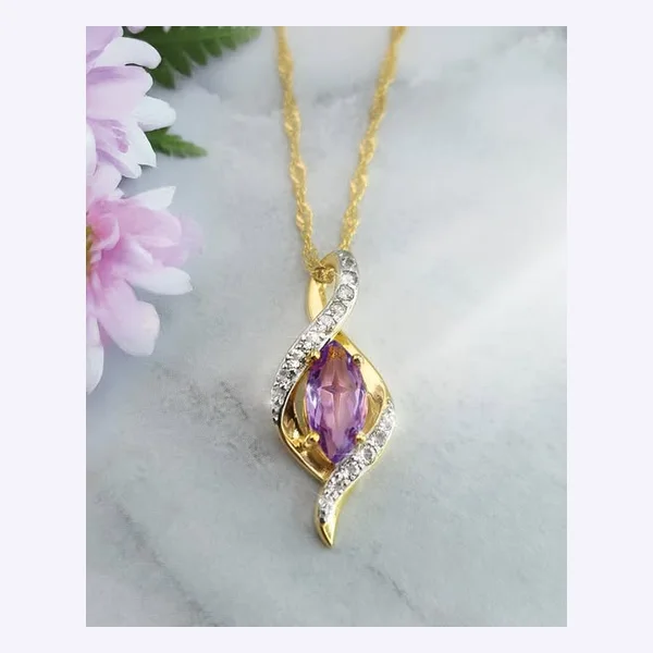
The oldest ad in the whole set is the first one below: a single ring on a dark surface, running since October 2019. The faucet is from 2021. These are not clever ads. The product is large, it is the only thing in the frame, and you know what is being sold in the first second.
That last part is the whole job of the image. It does not need to tell a story. It has to make a person who is scrolling fast stop long enough to recognise what it is.
A staged scene shows up when the product lives in a room
11 of the 45 put the product in a setting: a painting over a bed, a rug on a living room floor, a clock on a wall.
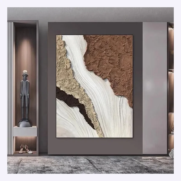
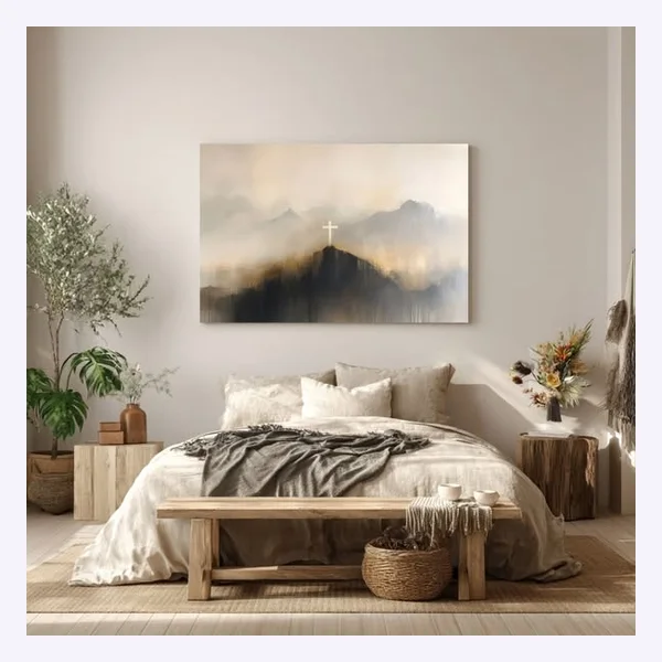
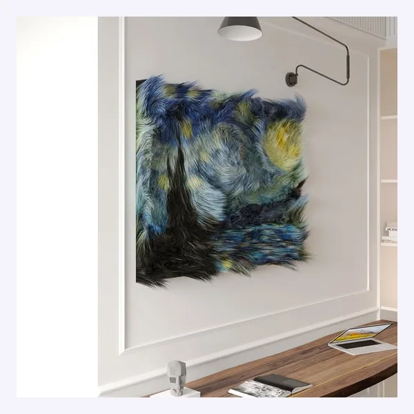
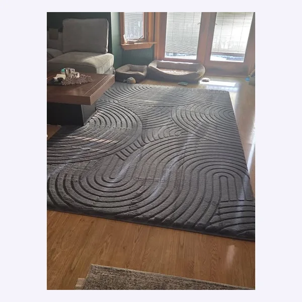
Look at what these have in common. Every one is something you hang, lay down or place in a space. A shopper cannot judge a painting or a rug from the product alone, because the question is how it looks in a home. The scene answers that question.
Jewelry and clothing get shown on a person
5 of the 45 show the product on a body: a necklace on a collarbone, earrings in an ear, a blouse worn on the street.
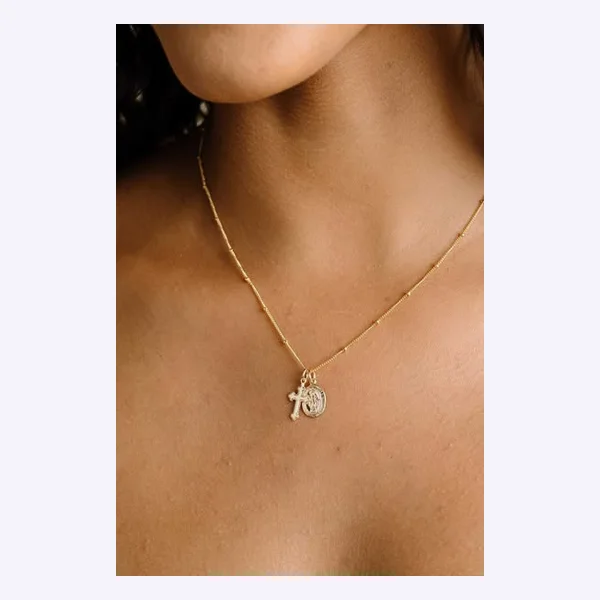
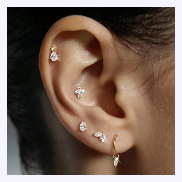
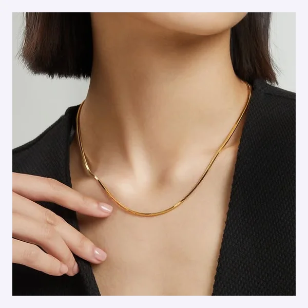
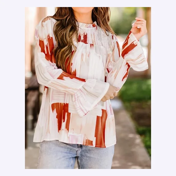
Three of the jewelry advertisers here use a crop that is close and quiet: no face, no styling, just the piece on skin. It shows scale, which a product on a plain background cannot. Five other jewelry ads in the set show the piece alone, so this is not a rule, but when the item is something you wear, how it looks on you is what the shopper wants to know.
Carousels and graphics are the minority
5 ads are carousels of several products, and 5 are something else: a text message graphic, a poster-style design, a pattern, a glowing-light picture with no product in it. Three of each are below, carousels first.
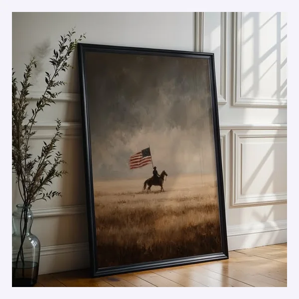
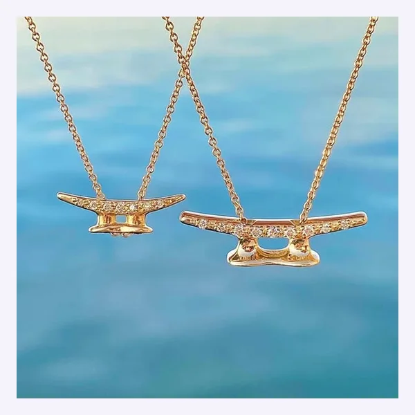
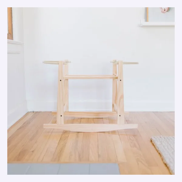
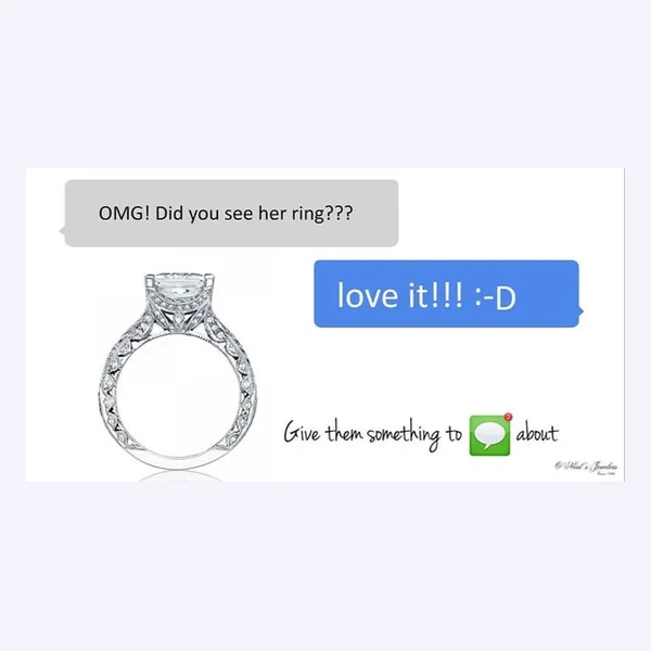

Carousels make sense when a store sells a range and wants to show it. The graphic ads are the ones that look most like an ad and least like a product. They exist in the data, but they are the smallest group.
Long running does not mean good
I want to be fair to the limits of this. Some of these ads are plainly not great: dated photos, a paragraph that describes the store instead of the product, an image that is not even cropped well. They are still running.
So read the 45 as a floor. They show what a store can get away with, not what the best possible ad looks like. The useful signal is the pattern across most of them: one product, large, recognisable, shown in the context a buyer would judge it in.
So what should your product ad show?
Ask one question: what does a shopper need to see to judge this product?
- Something you wear: show it on a person, close and simple. Add a plain shot as a second variant.
- Something that lives in a space: show it in a room, not only on white.
- A small, simple or self-explanatory item: show it alone, large, with a clean background. Do not add a scene just because lifestyle sounds modern.
- A range: a carousel, one product per card.
Whatever you choose, the product should be the biggest and clearest thing in the frame, and a stranger should be able to say what it is without reading anything.
How many images to test
Most agency guides land on the same rough advice for a small budget: run about two creatives at a time, make them genuinely different, and give each enough clicks before you decide. One guide for small ad budgets puts the minimum at a hundred or two hundred clicks per variant. These numbers come from vendors, so treat them as a rule of thumb, not a law.
Two different concepts beat four near-identical ones. A white-background shot against a lifestyle shot teaches you something. Two shades of the same background teach you nothing.
When the image is not the problem
If your ad gets clicks and no sales, the picture is rarely the cause. The usual suspects are the campaign objective, a missing tracking pixel, the wrong audience and the page the ad sends people to. People describe exactly this in this Shopify Community thread, and I go through where to look in why a store gets traffic but no sales.
The ad and the page also have to make the same promise. If the ad shows a necklace on a person and the page opens with a white cutout and a paragraph of supplier text, the click is wasted. A product page that matches the ad matters as much as the image itself, and the page builder comparison shows where most tools stop.
Making the images without a designer
You do not need a photoshoot for every variant. BrandyBee builds ad creatives from your product data for the channels you choose, makes product images without a photoshoot, and turns the same material into social posts, so the image, the page and the post say the same thing.
Meta product ad image FAQ
Should a Meta product ad use a lifestyle image or a white background?
Neither wins by default. In the 45 long-running ads I looked at, the product on its own was the most common (19), followed by a staged scene (11). Choose by what the shopper needs to judge: worn items on a body, decor in a room, simple items alone.
How many ad images should I test at once?
On a small budget, two that are clearly different. More variants split your clicks too thin to tell which one is better.
Why do my product ads get clicks but no sales?
Most often it is the objective, tracking, the audience or the landing page, not the image. Check those before changing the creative.
Do I need a designer to make product ads?
No. A clear product photo, large in the frame, is the core of most long-running ads here. Tools can produce the variants, and you decide which direction to test.
Does a person in the ad help?
For wearable products it is the most common way to show scale and fit. For things that are not worn it is rare in the ads I looked at.
Is a long-running ad a good model to copy?
Use it as a baseline, not a target. A long-running ad is not losing money fast, but it is not proof that it is the best ad that store could run.